 In the last few days we have seen all the nice updates from the giant of web searches. We have seen the introduction of their attempt of going into social network: Google+. But now they are updating the look and feel of their products into a much simple way. As they released this news in their Blog, Gmail will have a new look.
The new minimal look and feel of Gmail, in my opinion, is trying to give you a sense that no matter whether you are in gmail, calendar (yes, it was also changed) or google.com, you feel like you have never left the initial place.
Ok, but where do I check out this new layout?
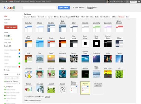
Simple. Go to your Themes tab and you will see something like in the image bellow.

As you can see, there are two new themes there: Preview and Preview (dense). This is because the new interface will expand dynamically to accommodate different screen sizes and user preferences. Anyway, you can select the one that fits your requirements. As part of the development, we can expect to see more themes with the same design/layout so we have something different to choose.
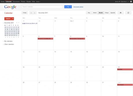
Other product that Google changed with the same look and feel as Gmail was the Calendar.

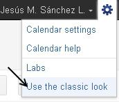
So far, the changes are just like in Gmail: Look and feel. Some people find it annoying because they don’t get used to it. But there is a way to turn them off. Go to your calendar, click on setting and select the “Use the classic look” and you will go back to the old layout.

So go and try this new themes and share your experience. You can also give Google some feedback the new Gmail.
Enjoy!

