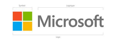
25 years later, Microsoft has a new look. The new logo is solid, four-pane colored window and simple. Just what the Software giant needed for a fresh look.
The symbol in the new logo should look familiar: it looks like the merge of the Microsoft Store logo with Windows 8 one. This new version is the first to incorporate a symbol next to Microsoft’s name. Previous editions simply spelled out Microsoft.
The logo has two components: the logotype and the symbol. For the logotype, we are using the Segoe font which is the same font we use in our products as well as our marketing communications. The symbol is important in a world of digital motion (as demonstrated in the video above.) The symbol’s squares of color are intended to express the company’s diverse portfolio of products.

Microsoft is attempting to move forward into a new chapter. The company is preparing to launch a range of products soon, including its Windows Phone 8 and Windows 8 operating systems and a new Surface tablet. The Xbox 360 is leading the charge against the cable operators. This will be exiting times for Microsoft’s corporate identity, which the new logo helps to represent the modern days of the company.
Jeff Hansen, General Manager (Brand Strategy) in Microsoft Said:
There may be other instances where you will see the old logo being used for some time
So with this in mind, the new logo will take time to be seen in all the products. In general, the new symbol is “important in a world of digital motion” says Hansen, one that the company is “excited about” using.
Source: The Official Microsoft Blog


posted on 29 August at 21:10
it's the first time I'm on your site and after reading the Samsung paying Apple with coins and this article.. I thought u're a Tech version of The Onion....