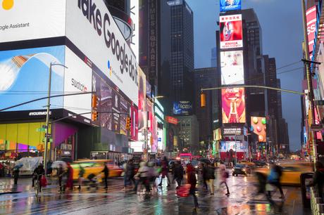

As digital signage becomes more commonplace and signs get bigger and flashier, the best way to make yours stand out is with well-designed, well-planned content. And the best way for integrated marketers to create content that sells is with these tried, trusted best practices that put everything in black and white - no guessing required!
Choose the Right LayoutYour layout should create a neat hierarchy that tells your audience what's most important, then moves them through the supporting text and visuals.
If you're designing with minimal copy - and you will be, after reading the next tip - design with a Z pattern (eyes move left to right, top to bottom) in mind.
However, if you're including video content, using an F pattern (eyes move across the top, down the left, then across the page) will be more engaging to your audience.
Keep Copy ConciseAnother one of those mathematical marketing mysteries settled: the right amount of copy for digital signage. Aim for no more than three lines of text with five or fewer words per line (or vice versa). This gives your audience ample time to digest each message.
Play the Numbers GameBlame it on Buzzfeed if you must: numbers, particularly when used in a headline, draw people in. Numbers make our brains happy, and in an increasingly attention-span-limited world, they convey concrete facts quickly. Incorporate them in your signage when you can, and follow a few simple considerations:
- Always use Arabic numerals (e.g., 1, 5, 57) rather than spelling numbers out (e.g., two,sixteen).
- Weird but true: odd numbers are more credible than even ones.
- Bonus: use numbers to generate social proof, especially if you have a strong following on social media. For example, if you have a signage frame asking customers to like or follow a page or feed, include the number of followers you already have.
Integrated marketers already use content calendars for social media, so why not adopt for your digital signage? But instead of weeks or months, think seconds and minutes. Here's the optimal timing, based on sign location and audience:
- Short-term viewing (foot traffic or casual shoppers): 30 seconds
- Mid-length viewing (reception desk, or quick-service restaurant): 30 seconds - two minutes
- Long-term viewing (office, sit-down restaurant, waiting area): two - 30 minutes
Looking for more tips on creating great content? Start with these writing tips from best-selling authors, then brush up on these signage essentials.
Last modified: September 3, 2019
