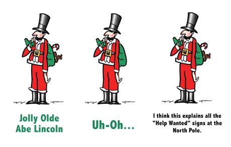
 Abe Lincoln as Santa Claus??– is there a marketing lesson here?
Yes. It’s about getting the most out of a visual. Something to think about when you commission an illustration.

I had an idea for a Christmas card featuring Abe: show him dressed in a Santa suit and looking very unconvincing (too skinny to be Santa, still wearing his stovepipe hat).

I had planned to just put “Abe Lincoln” under the drawing, then “Jolly Olde Abe Lincoln” popped into my head.

It was much funnier (given Abe’s dour expression), and it provided a better setup for the joke.

The inside greeting: “Great president, lousy Santa. Merry Christmas!!”

Then I asked myself: What else can I do with it?

Are there other inside greetings that would work with the same drawing?

I thought of two. Both required changing the setup text on the front of the card, but I could use the same drawing.

(Well, almost– you may have noticed that I clipped out the candy cane and the teddy bear in the middle figure above.)

The 2nd gag: “Uh-Oh… Looks like everyone’s getting Lincoln Logs this year. Merry Christmas!!”

The 3rd gag: “I think this explains all the “Help Wanted” signs at the North Pole… He just freed the elves. Merry Christmas!!”

Sometimes an illustration needs no words. Sometimes adding text takes it to a new level. (Illustration and copywriting make a great team.)

The lesson here applies to every visual you have. You can always get more mileage out of them. It just takes some imagination.

And you can get that extra mileage upfront by hiring an illustrator who enjoys this sort of thing. Someone ready to use their imagination to help your business succeed.


