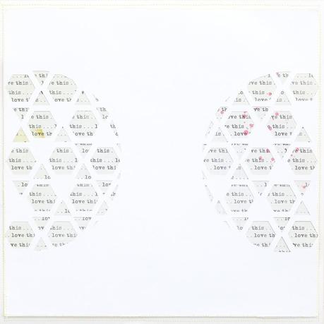
 I found this fun cut in the Silhouette online store. What I did was to remove some points in the Silhouette studio to suit my design, having to use the triangle studs in mind. After cutting the design onto a white card stock, I layered the back with a piece of patterned paper. Then, I sewed at the edges - all around the card stock. Next, I adhered another white cardstock (sewn at the edges as well) and created a little lift by using foam dots.
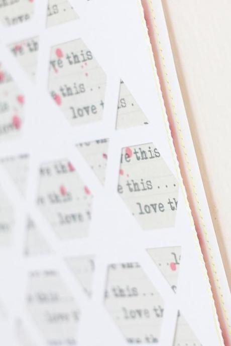
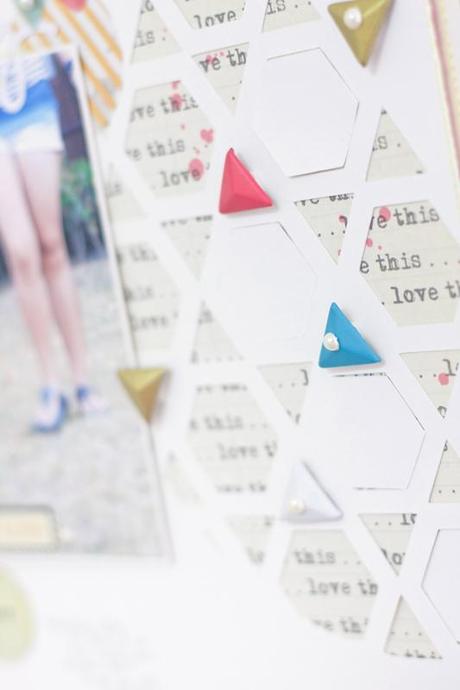
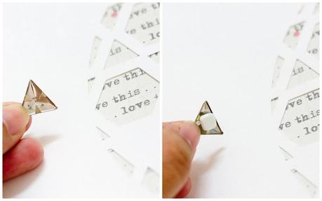 To apply these studs onto a layout is pretty easy. I bent the spikes using my thumbnail. Of course, you can use a plier to bend them. Next, I applied a foam dot in the middle.
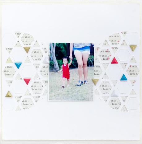 Don't you just love the studs placed all over the cuts? That's the whole intention, I wanted them to be part of the design. As you can observe, I pasted some of the hexagon cuts too so that the layout won't look too busy. After positioning my photo, I begun to embellish the layout with lots of fun ephemera & vellum shapes.
 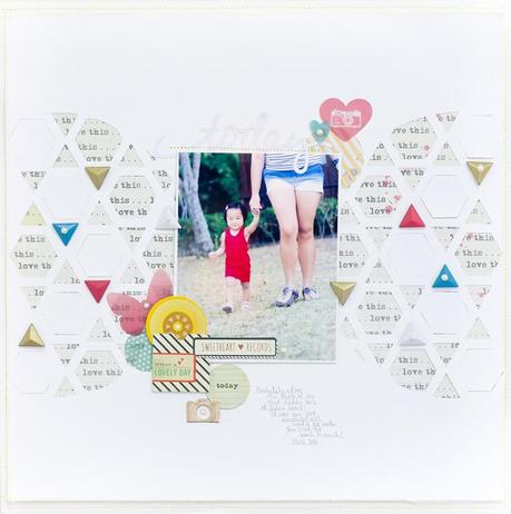 Ta daa.... here is the completed layout! All I did was to cluster a bunch of ephemera & vellum shapes together so that they matched with the colours of the studs and the photo as well.
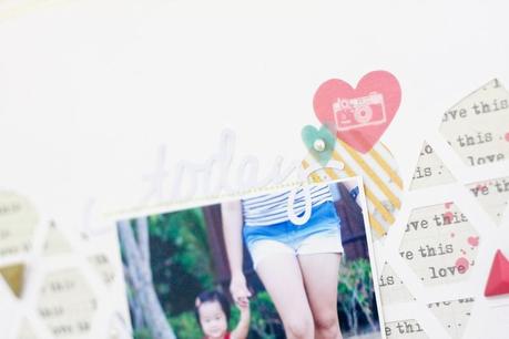
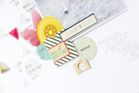
Supplies: Maggie Holmes Styleboard Remember 12X12 PaperMaggie Holmes Styleboard Vellum ShapesMaggie Holmes Styleboard Ephemera PackMaggie Holmes Styleboard Triangle Studs
Thanks for coming by!
Xoxo Jessy