 Textures, Lines, Color and Frames are elements of photography, and are among the “easiest to learn” and can have “the biggest impact”. Thus started my most recent photo-adventure. “Think about some locations where you might be able to put the lessons into action, and actually go and do the assignments”. My location of choice was the main Hancock campus in Santa Maria, California.
 Allan Hancock College is a public community college. It opened in 1920 as Santa Maria Junior College; now there are four campuses serving 17,000 students, most of them locals (98%). Like many public spaces in Santa Maria, the architecture and landscaping are uncluttered, bright, striking, colorful and photogenic. In the warm light of morning, it was a great place to work on my photography assignments.
1: Textures
Texture is everywhere yet it's “the very thing that beginning photographers tend to overlook”. Don’t obsess over big spectacular vistas; look close instead. There’s beauty in detail.
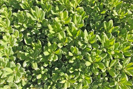 When you find texture of interest, make it the only thing in the photo, thereby “isolating the texture from any distracting elements.” Get close and intimate. You’ll find wonderful overlooked worlds.
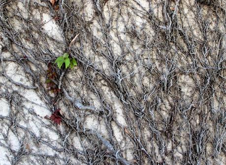 It’s easiest to start by shooting at a 90º angle, aiming for a flat uniform arrangement. For “very rough textures, often sidelight is the best” as it casts shadows. They add relief, enhancing the texture.
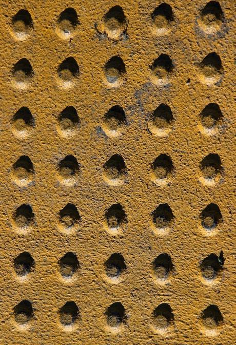
Holes in yellow.
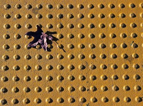
Bumps (do your eyes play the same tricks as mine?) in yellow and purple. More on complementary colors below.
“Patterns” might be another word for these things -- that’s the term I used before I took the Textures lesson.
Lines affect a viewer’s emotions and reactions in ways I hadn’t considered. Horizontal lines are the norm for many of us (we generally process information from side to side, especially left to right), and often are calming. None of the photos I took featured horizontal lines alone. Maybe their calmness makes it difficult to create interesting compositions.Vertical lines are more exciting. They can suggest strength -- for example trees or towers or waterfalls. Or not, for example a cast iron drainage ditch cover. But even here vertical strikes me as more attention-getting than horizontal.

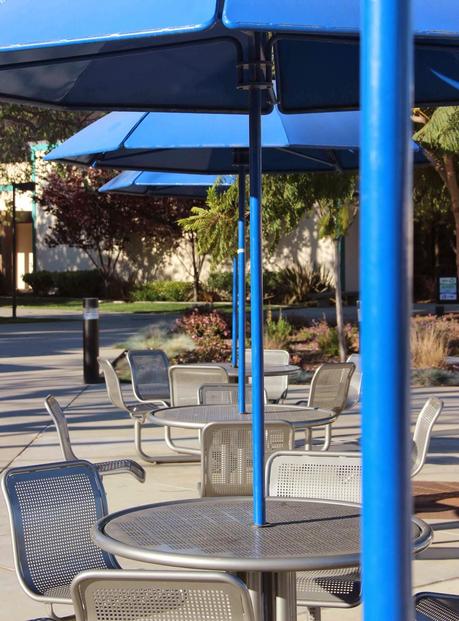
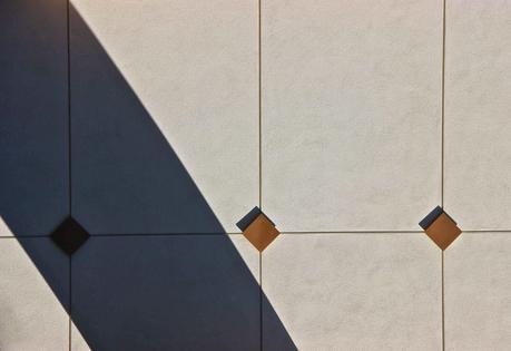
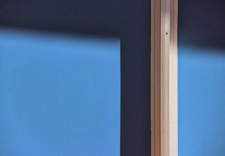

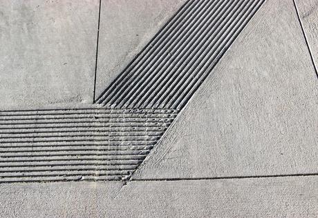
Lines in a sidewalk may be mundane, but I find them engrossing.
Mix a bunch together -- vertical, horizontal, diagonal -- and the eye will be either totally captivated by the excitement, or confused.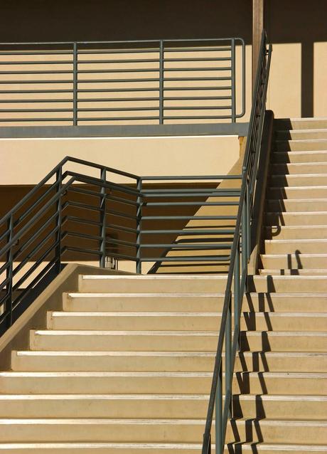
Intriguing? ... or over-whelming?
Lines also provide paths for the eye to follow. A line can direct a viewer to an object, in this case a few plants in a concrete ecosystem.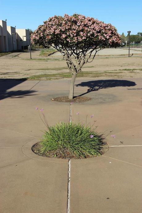
The color lesson was more challenging. I skipped the monochromatic section. I couldn’t find suitable subjects, but maybe I just need to be more open-minded. In contrast, complementary colors quickly drew me in. These are positioned opposite each other on the color wheel: red and green, yellow and purple, blue and orange. In combination they’re powerful. I was surprised to find complementary pairs, and in interesting situations.
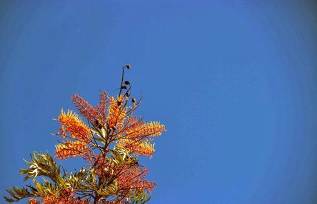
Blue Orange 1

Blue Orange 2
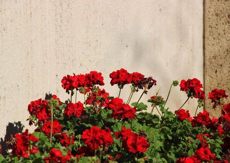
Red Green 1

Red Green 2
In Red Green 2, I captured both complementary colors and a warm accent in a cool background -- “one of the best color interactions”. Cool green leaves fill the photo but the hot red flower grabs the eye. It’s irresistible.7: FramesI found many frames to include within the overall frame of a photo. A second frame is a bit unexpected, and can “add a new dimension” or “create a story”.
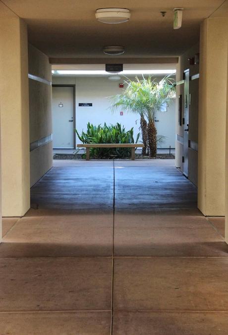
Entrance and ...
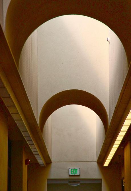
... Exit, with frames and lines to direct the eye.
As always, I became absorbed in abstract compositions of shapes, colors, shadows and light. They fascinate me for reasons I don’t understand. But maybe after I read Book 2 ...
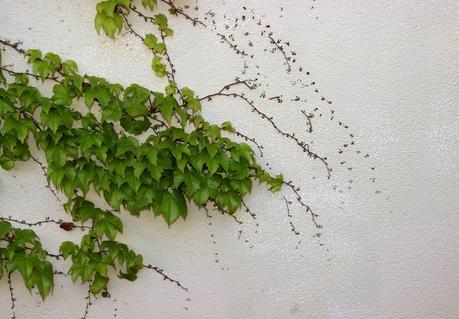
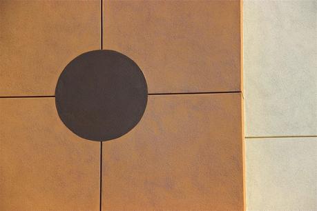
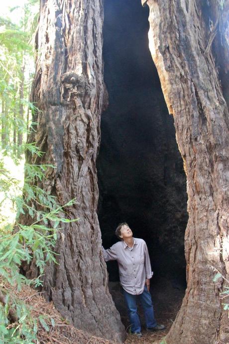
Vertical line and frame -- power and story.
