 It's no secret that choosing a color scheme can be intimidating. It doesn't matter whether you're deliberating over paint-chips, fashion accessories, or sheets of paper to make a party-invitation; mixing and matching colors takes practice.
 When I was studying Architecture at University, my mentor suggested that while learning to design, I should only work with 3 materials, one of which was glass, and three colors, one of which was white. It doesn't sound like enough to work with but it is. Most flags are only 3 colors. Some of your own, most successful, craft projects will inevitably be made of less than 3 materials (not including invisible items such as glue and so on). Look at your favorite Pinterest pictures of weddings or birthday parites and you'll see that most work with a limited color palette for extra punch and rely heavily on a set of key materials; linen, paper, organza, fresh flowers.
As you get more comfortable discriminating between infinite choices, you can slowly increase your palette to 5. White should automatically be one of those colours, and black may well be another.
So how to choose the colors to go into your next pallet? My best tip is to squint. OK, let me explain. To best demonstrate I need you to look out your window towards your favorite view, hold your number one most-loved dress in your hands, go to the room in the house you feel most comfortable, lay your party-dinner plates on the table, or hold an inspirational photo before you - now squint.
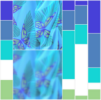
When you squint, the details in the scene disappear and what becomes most obvious are the colors. I've given the example with a favorite butterfly dress. While squinting the butterflies are blurred, but the blue-greens remain obvious.
Open your eyes again and write down the top 5 colours that you remember. These may be shades of the same color (dark blue, light blue, greeny-blue and so on). If you can't get to 5, don't worry.
You've just created a color palette that is right for you. It resonates with who you are, what you enjoy, and like to look at. Well done! In my example the 4 colours I see when I squint are on the left of the photos, and I added white into the mix, because it feels right to do so.
Now you get to personalise it.
I've created three versions of the original palette. Let's have a look at them from left to right (as always you can click on the image to enlarge it) and imagine together what kind of parties they could be used for;
Left - these colours are mostly blue, they conjure up 'seaside' party themes, sailors, fisherman, mermaids and the like. Pool parties, summer-holidays, lazy-days. Relaxed daytime parties of any sort would benefit from this palette, and of course, boy-parties would suit the triple-blue and a little lashing of limey green. Imagine stationary in baby-blue with cute-as-a-button bits and bobs added in the other colours.
Middle - the large amount of white says freshness and innocence to me. I can imagine a baby-boy-shower, a first birthday party, or maybe even a winter-wonderland event, where snow-white linen is teemed up with icy-blue sparkles and a few fir-green accessories.
Right - the rich dark colours in this palette make me think 'Arabian Nights' and would be perfect for a formal, black-tie, or evening event. The darker colors could be used extensively, with little details (imagine ribbon trims on a dark envelope) in the paler shades.
I've said it before, and I'll say it again - there's no right or wrong in the world of parties and craft, and that includes the use of colours - if you love it, then it's perfect!
There's more inforatmion in a How-To craft guide on my business website, and the free "How To Host a Themed Party" craft ebook has some other tips that might help. Good luck, and have fun!

