Hmm. A little late for a Christmas post. The 12 Days Of Christmas have expired… 😕
I look forward to doing a Christmas cover for Eric Meisfjord every year. Eric is the editor of the Inland Register, the newspaper for the Roman Catholic Diocese of Spokane in Washington State, USA.
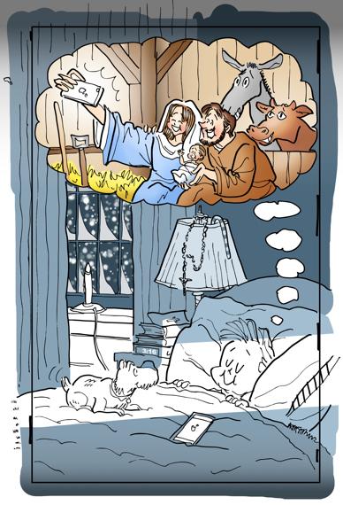
Here’s the 2015 cover:

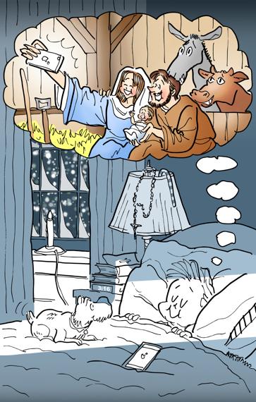


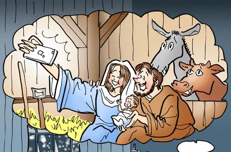

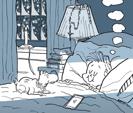
That’s a rosary draped on the bedside table lamp. I used a cross to imply a softcover Bible on top of the digital alarm clock.
The time on the clock is a subtle reference to a famous Bible passage well known to Christians: Chapter 3, verse 16 from the Gospel of St. John. It’s a perfect fit for Christmas, which marks the birth of Jesus Christ.

For God so loved the world that he gave his only Son, so that everyone who believes in him might not perish but might have eternal life. (Jn 3:16)


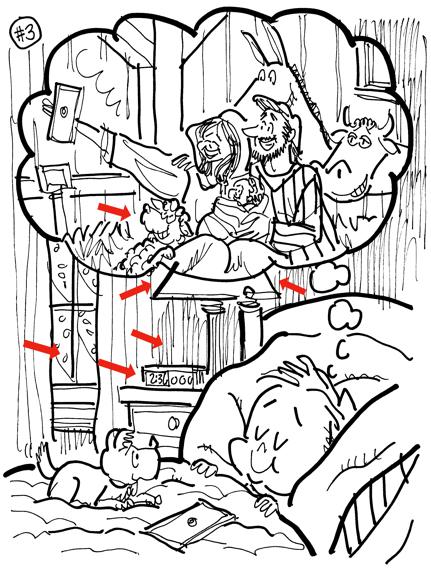
I start every assignment by submitting ideas as rough sketches. Here’s the original rough, the third of six ideas.
You can see a lot of little details came later: the candle in the window, the bedside Bible, the rosary and candy cane on the lamp, the 3:16.
I hadn’t looked at this rough since mid-December. When I saw that sheep in there mugging for the camera, I busted out laughing. Why did I delete the sheep? Too over
the top? I honestly can’t remember. I’m feeling regretful now– it’s a very funny bit!


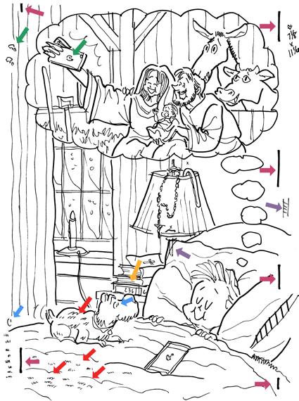
Here’s the original line drawing (below). As you can see, it’s pretty messy.

The maroon arrows show my width guidelines. The note in upper righthand corner reminds me that the final has to be 7 1/8″ wide by 11 1/4″ tall.
The green arrows show I wasn’t happy with the Apple logo on Mary’s camera– so I redrew it a couple of times off to the side.
The yellow arrow shows that even at this point, I hadn’t thought of using 3:16 on the clock– which proves you should stay open to inspiration even while you’re working on the final.
Purple arrows: the column of the lamp looked too thin. I redrew it off to the side so I could patch in a correction.
The blue arrows show I was having “eye problems.” After inking the pencil drawing, I could see the dog’s gaze was wrong: he wasn’t looking at the boy’s face. I redrew the dog’s pupil, then redrew the entire eye off to the side– just in case I needed it.
Finally the red arrows: I was unhappy with the dog hair lines. There were too many. I wasn’t sure how to correct the situation, so I drew a number of “dog hair alternatives,” and decided to experiment as I went along.





* * * * * * * * * * * * * * * *

Is there anyone reading this who has not taken a selfie?? (besides myself, I mean)
Do you do a final message check on your phone before heading for Dreamland?
OK: Should I have included the sheep??

