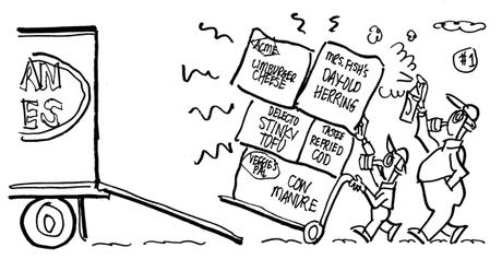
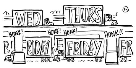
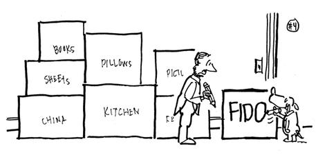
 If you were moving somewhere, would you pack your treasures in beat-up, smelly old boxes?? Well, I probably would, but pay no attention to me… 😊


I recently read a post called Moving Myths Busted on the American Van Lines blog. I liked it. It was short and to the point. Not preachy at all. No hard sell. No don’t-do-it-yourself, because-you-need-a-professional-mover, and-you’d-better-call-us.

Here are the four myths cited in the post, along with related excerpts:

Myth 1: Free Boxes are the Best Boxes
“I’m not saying don’t use used boxes, but for fragile items, heavy things, or when you want to fit as much stuff into the largest box possible, go for new. Plus, new boxes (are) designed specifically
for moving.”

Myth 2: Packing at the Last Minute is Best
“Tempting though it may be, it’s the worst idea ever unless you
live in a single room, don’t have more gear than will fit in your hatchback, and are not going to be dealing with a lot strategizing
to make that move happen.”

Myth 3: Friday is the Best Day to Move
“Moving on a Friday (is) the most common day of the week to move… (so) moving company rates can often be drastically higher (on Fridays)… Middle of the week moves… (mean) you may not have to spend your entire weekend unpacking; you may actually be able to enjoy some downtime in your new home before heading back to work on Monday.”

Myth 4: A Marker is a Marker
“No, definitely not… have an available assortment of high-quality permanent markers ready to go. They’re better for writing on cardboard, and you can be sure they won’t be smearing or running if your box gets water or rain splashed on it.”

So what was the lost opportunity? It was a missed chance to take advantage of the humor in the post.

Oh, yes. There’s humor there– definitely. It’s a matter of being alert to it. The post conjures up some funny images– more on that in a minute.

Here’s the header image for the post. It’s a nice shot of an American Van Lines van, and two guys doing a careful job. It’s on-brand (you can see part of the AVL logo), but the image doesn’t really relate to the post. There’s nothing there that references moving myths. It’s a generic image. It could be used for any number of moving-related topics.


A post with some humor offers an opportunity to break out and get attention for your brand. It’s also a chance to humanize your brand: to show people you’re likable, approachable, someone they’d like to do business with. A shared laugh creates a bond. Humor helps people relax and drop the shields we all have up against today’s non-stop marketing and sales.


I thought the post could benefit from a funny header illustration. I decided to do one.

I spent an hour thinking and scratching out ideas. It’s always a mess at this stage– like so:
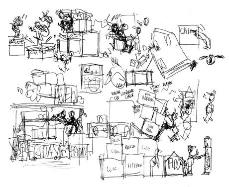


One of my many mantras is: There’s a funny visual hidden in
every subject– and in every subtopic. So I did a rough sketch for each of the four myths.

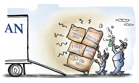
I loved the idea of used boxes that still reeked of their prior contents. I googled “smelly foods.” I’d never heard of Stinky
Tofu– perfect!!


