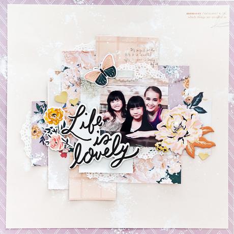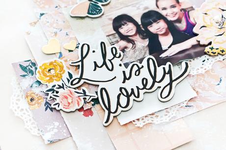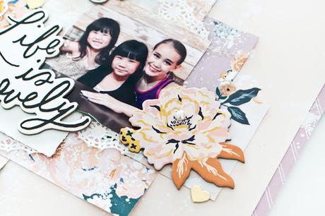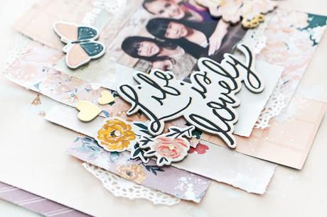
For this layout, I started off with gathering some paper scraps that I was left with from the previous project. I cut them into squares and rectangular blocks. Then I adhered them after I have composed I positioned my photo somewhere in the middle towards the right side. Next, I layered some gold floral vellum to create the classy look. Just by adding more stickers and more fussy cutting elements really gave the dimension I was going for! To complete the layout, just add some tiny bits of paper doilies and a patterned paper as the frame for the layout.
 To create fun dimension on your layout, use thicker embellishments like chipboard stickers. It will instantly create the dimension and added textures too.
 Layering has been one of my preferred techniques whenever I create. It definitely gives a very interesting outcome to my creations. I hope you will give it a try!
Thanks for coming by!
Xoxo JessySupplies : Maggie Holmes