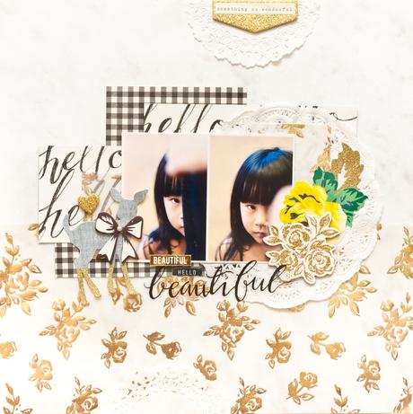
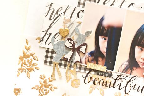
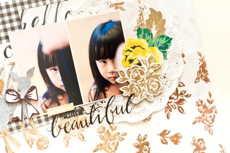
 To begin, I used the marbled-like background paper as my base + layered the gold rose vellum at the bottom. Next, I placed the photos in the middle and slowly added b&w design patterned paper to give interest to the photos. I slowly worked my way by adding more embellishments like paper doilies, chipboard stickers, sentiments & ephemera as well. Once I'm happy with the composition, I'll snap a photo for reference, just in case I forget of the placement while gluing the elements down. By snapping photo from the bird's eye view gives you a different perspective to your layout too. That way, you can make the necessary adjustment to your layout.
 Supplies: Maggie Holmes Bloom 12x12 Patterned Paper - DelightMaggie Holmes Bloom 12x12 Patterned Paper - AfternoonMaggie Holmes Bloom 12x12 Patterned Paper - Hello, HelloMaggie Holmes Bloom 12x12 Foiled Vellum - DelightMaggie Holmes Bloom Chipboard StickersMaggie Holmes Bloom Ephemera Die-CutsMaggie Holmes Bloom Cardstock StickersMaggie Holmes Bloom Foiled Clear Stickers
Thank you for coming by! Have a great week!Xoxo Jessy
