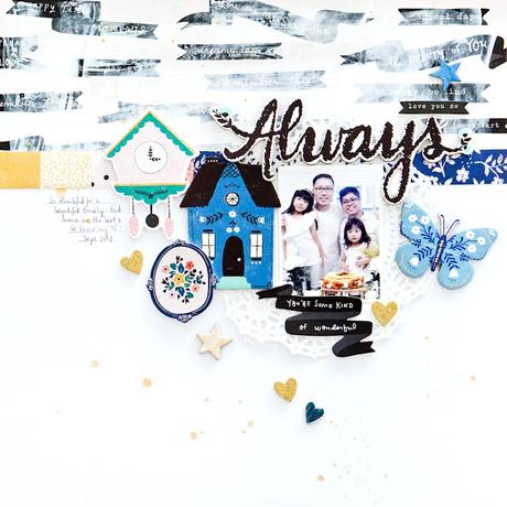
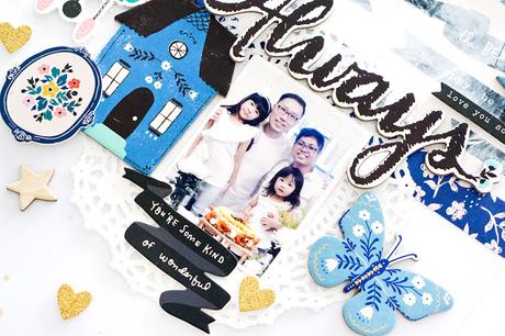
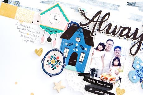
 To begin, I picked out as many blue products + other embellishments that matched as well. Once that is done, I tried to match them side by side to see what matches and what didn't. I went with a white cardstock, a patterned paper & stickers! Next, I decided to 'tone down' the patterned paper by applying gesso with the intention to allow the photo and all the little elements pop out. Once that gesso is dried, I adhered the family photo and also some stickers around it. I also added gold glittered stickers & splatters to jazz it up a little.
  Adding foam & chipboard stickers sure give the dimension that I was going for!
Thanks again for coming by! Happy crafting!
Xoxo Jessy ––