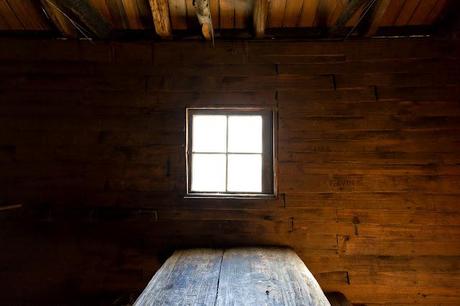
Interior of Du Cane Hut, Overland Track, Tasmania
See that photo above? Have a good look at it and I'll return to it later on in this post. In the meantime I thought I'd do a shorter entry for a change. Those whopping big trip reports are so time consuming. Do you realize my last post took a week to write?! A few hours every night after work and then at least a day of tinkering before publishing. Man, it's ridiculous, but then I'll turn around and do it again, so it's a wonder I get any actual walking done.
Now, images. I've discussed images and words in a post before. My conclusion is that online writing can be a bit hard to take in, so I always try and break up a few paragraphs with a picture. You know what? This post is no different! I've tinkered a bit on this blog with photo sizes and I've finally reached what I think is an ideal method (for me that is!)
I've read a lot of articles online about what's the ideal size of file to upload for online viewing. Unfortunately, there's a million ideas and no real definitive answer amongst the ton of stuff I've waded through (surprised?!). I'll mention some of what seems to make sense, but instead of me explaining it as I don't really have the technical expertise, I'll give you some links which I've found to be really informative. Oh yeah, most of this only applies to Lightroom users. Sorry about that!
So, I've taken a punt and here's what I've decided to do for all of my images in the past few months. I process my pictures through Adobe Lightroom 3 (Lightroom 4 is out, I'd better upgrade!) which as a program I find intuitive to use. I've never understood Photoshop, so Lightroom is a good alternative for my brain. In fact here's a screenshot of Lightroom settings I'm using. I always shoot in RAW because I was told a few years back to think of it film terms. The RAW image is your negative and the JPEG you produce from it is your photo. I mean, you always want to have the negative don't you? The massive file size sucks, but that's the way it goes. Anyway...
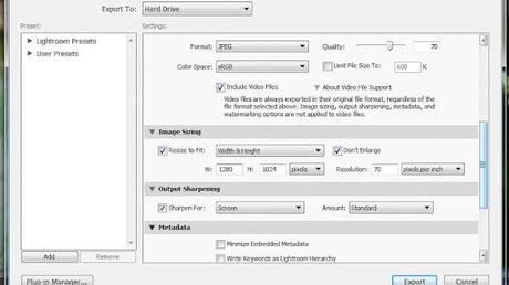
Adobe Lightroom export settings
I process the RAW files and create a JPEG for uploading to the blog, I set the image sizing width and height in pixels to 1280 x 1024. This is a big picture and more than enough for blogging. The top right has a setting called 'quality' and I leave it 70 which keeps the file size down. If I increase it to 100 then the size gets large without any difference to the image quality that I can see. I found a great guide for Lightroom users regarding what the 'quality' means in this case. I won't rehash what he says, but you can find it at Jeffrey Friedl's blog. I think that 70 is sufficient after playing around with different settings (taking into account Friedl's suggestions) and the file size of the Du Cane Hut picture is 260 KB which seems reasonable.
Now, one thing that's all over the internet is talk about dpi (dots per inch) and ppi (pixels per inch). In fact you'll come across a lot of stuff that says to set your pictures to 72 dpi for uploading to the internet as it keeps the file size down. Well, I'm afraid to say, but that's completely wrong. Dpi solely relates to printing a photo. We're not doing that are we? Instead of rehashing stuff I've read, this bloke has a simple explanation between the two and a quote from that link regarding ppi is, ..."number of pixels per inch in your image. This will affect the print size of your photo..." Again, this is only to do with printing a photo and makes no difference to a pictures file size for use on the internet.
How do I know? Well, I tried it. I kept the width and height of a picture identical and processed one at 1 ppi and the other at 100 ppi. Guess what? The image file sizes are identical between the two. Ppi and dpi only relates to the printing of a photo, Again this bloke Andrew Dacey has an article called, 'dispelling the dpi myth' which explains things way easier than I could ever do. It doesn't convince people though, as there's a comment in that link that says, "...saving at 72 ppi saves server space and bandwidth..." Well, I'm sorry to say, but it's a complete myth as the file size is identical!! I can't say more than that, other than to try it out and see what I mean. Why is mine on 70 in the Lightroom screenshot? No idea, but I think the default is 72, but remember it makes no difference to a photo for use online.
So, that's my settings and I don't declare that it's a definitive method. It seems to be working okay though and I've got a bit of uniformity with my images for the time being.
Now, back to what's on an image itself. I worked with a person who's a professional photographer and I'd bug her for information about images and how a photo should 'look'. My view of a photo was always that it recorded a moment in time. Post production can enhance contrast etc, but not what's in the actual photo overall. Remember the photo above? Well, this what it really looks like inside that hut.
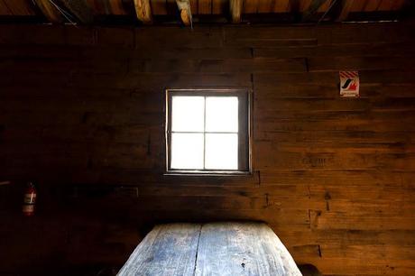
The Du Cane Hut interior doesn't look so rustic with a fire blanket and extinguisher on the wall does it?! In Lightroom, I just cloned some of the panelling around the items and voilà! Gone! If you didn't know they were there you wouldn't know any different. Yes, the picture looks better, but it's not really showing a moment in time is it? Do other people do this? I felt a little queasy about it as it goes against my photography principles! Not according to the photographer I mentioned earlier who says editing like that is 'normal'. Piece of rubbish on the ground in a landscape photo? Just clone it out. I could suggest to pick it up, but you know what I mean. This is how easy it is and I'll show you. The photo below is at Hanging Rock.
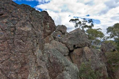
Well, it's okay, other than the person in a pink top and blue jeans lying down in the middle of the photo! That's kind of annoying, so guess what?

Yep, gone. It's that easy. Yet I must be some sort of photo romantic as it still doesn't sit with me very well. Then again, in the history of photography this 'removal' of things has being going on for years. There's lots of cases, but one picture that comes to mind is the famous Kent State photo taken by John Filo. In that photo the fence post was airbrushed out in the early 1970's and you can still see that photo around without it there. Does the post ruin the shot? I wouldn't have thought so, and I reckon I'd never noticed it until it was pointed out. Now I know it's there, I see it all the time! People talk about digital manipulation which is not really correct when photographers have been doing the same thing with film for years. It's just easier to do now, that's all.
Oh yeah, manipulation can't make a crap photo suddenly look like a world beater. It still comes down to the composition and lighting and all the post production stuff can only enhance a picture. Well, that's what I reckon and I'm sticking to it!
My photographer colleague can be a bit of a ball breaker though and mentioned things I would never have thought of in a hundred years. In fact, it sort of puts me off photography a little when I hear this stuff. I showed her some photos and asked for an opinion. Firstly, here's some rocks in the Ovens River near Harrietville which I quite like.
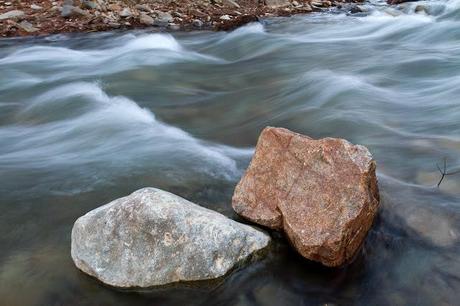
Photographers opinion? "No, the problem you have is the rocks aren't wet". Huh? Do you realize that she would carry a water bottle around and squirt rocks to get a glistening sheen on them or in this case have thrown water from the river across them? What? Yep, apparently that's what you do. The photo is crap unless your rocks are wet! By the way, it's not her who made this up, but it's what she was taught during her photography courses.
Okay, fail. So, I thought I'd show her another rock and this time I knew it was wet. It was during a stroll on the George Bass Coastal Walk and I liked the soufflé look of the foamy water.
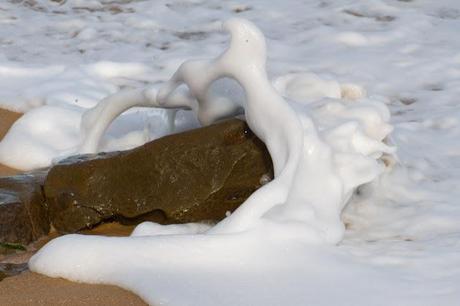
Photographers opinion? "You took that in the middle of the day didn't you? The light is wrong. It should be at either dusk or sunrise for the best light". What? I replied that I was on a walk and it's a bit hard to get the photo at the ideal time whilst needing to cover a number of kilometres in a day. Answer? "Well, if you don't do it properly, you shouldn't do it at all". Grrr...
Okay, time for something different. How about a feather shot? Surely I can't go wrong here?
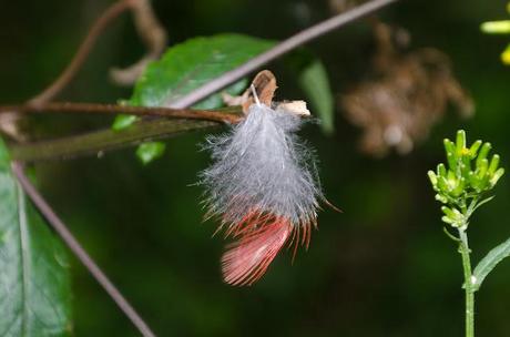
Photographers opinion? "Yeah, it's too green. We don't do green. It doesn't photograph well. If you wanted to do it properly you should have put a black piece of felt behind it". WTF?! It's tough work impressing these photography people. You know what else? She carries a pair of secateurs everywhere and if a small branch is in the way she'll just snip it off. In fact all of the photographers she knows do the same thing. What? I tend to push a small branch out of the way, not snip the bloody thing. Maybe I'm not cut out to do photography for a living!
So, there you go. A shorter post for a change (whew). I can't say I've altered many photos over the years, but apparently it's okay if I do! Oh yeah, next time you're out hiking, don't forget to get your secateurs out, wet your rocks, carry your black felt blanket and only take beach photos at sunrise or sunset...

