We’ve been talking about getting a new header for the website for months. The conversation has gone something like this:
Spenser,
“you know, we don’t have that big trailer anymore…kinda weird to still have it in the header on the blog.”
Me,
“yea, we should do something about that…”
Since our last post was as graphic as we’re ever going to get, this short conversation was followed by: [Silence]
A few weeks ago, there was a new development.
Me,
“you know, we haven’t had that big trailer in almost a year…we should really change the header on the blog.”
Spenser,
“yea, we should do something about that… Wait, what about asking Andrea to design a new header?”
Sometimes, my man is a GENIUS!
Enter Andrea Rivera. An LSU Graphic Design & Visual Communications student who also designed our logo way back when… (Wow, it was last June! Had to look that one up.)
Multiple emails and a couple weeks later, we had an awesome new header thanks to Andrea!
The ties we create on the road define the road trip for us, and Andrea was one of the first connections we made. When we met Andrea at Horse Pens 40 in Alabama last April, it was pretty clear we would hit it off. She was outgoing, motivated, and happened to come pre-approved from two our favorite people (Glenn & Ryan, for those familiar). HP40 was The RV Project honeymoon phase- Byron, Spenser, and I worked hard to create videos that I know we are all proud of. When Andrea met us, the trip was at a high point.
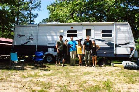
The original RV Project with Austin, Andrea & Michelle in front of Ernie (I can’t believe we used to own such a monster!).
Shortly thereafter, Byron left the RV Project and things seemed to be falling apart. Most of the RV Project’s creative energy was gone, as well as 95% of its collective understanding of graphic design. We were scrambling like mad. We needed help.
Spenser contacted Andrea and by summer she had created a logo, all by working with us diligently via email & Facebook. Our mutual inexperience became a shared benefit, but it was truly huge for us at that time. Andrea chose to spend her free time creating a logo for us, patiently working with us despite our inability to pay her, or give clear instructions.In doing so, Andrea gave Spenser and I something tangible to hold on to. She was a crucial part of the support we needed to stay on the road.
Not to mention, the logo is rad. Over a year later, our logo still makes me smile whenever I see it. It reminds me how far we’ve come and the incredible people who have helped us throughout our travels.
When Spenser wrote to Andrea again to ask about a new header, she didn’t bat an eye and got to work immediately. She patiently stuck it out through the frustrations of working together over long distances, and we were able to keep tabs on each other through this hybrid work/friend arrangement. Asking someone else to depict you involves a lot of trust. Andrea always listened to our ideas, but also gave her honest input when she felt that we were heading in the wrong direction. We never felt misrepresented- even though we haven’t actually seen Andrea since our first encounter at HP40 (proving all those against working remotely wrong!). All three of us wanted it to be right, and in the end I’m glad we took our time with it.
In the end, this post is about how Andrea is an incredibly talented artist who is equally as great to work with. I wanted to plug Andrea, but there was no way I could just write “you should hit her up for all your graphic design needs” and not give the back story.
Since this post has been lengthy enough, I’ll let Andrea & the breadth of her work do the rest of the talking.
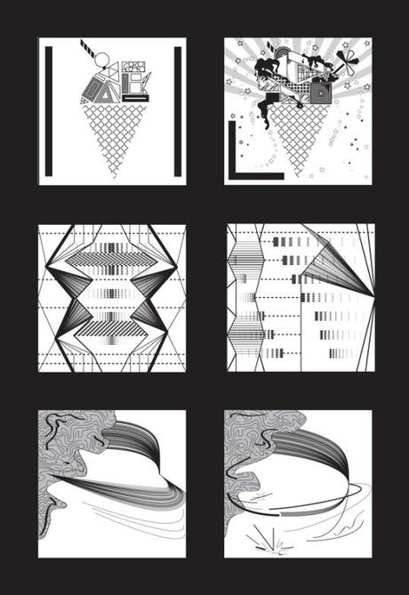
Andrea: This Project Represents the valuable process of learning. Each pair of boxes represent opposite words as “Simple-Complex”, “Symmetry- Asymmetry” and “Balance- Unbalance”. What I love the most about this project is that it was my very first illustrator file back in 2011. It is literally the “learning illustrator” project which also introduced me to the representation of a concept through abstraction.
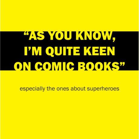
Kill Bill’s Typographic Monologue
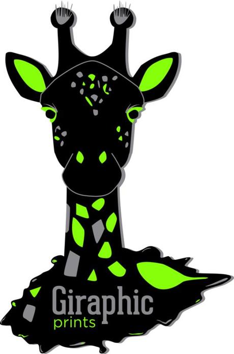
Promotional design for Giraphic Prints.
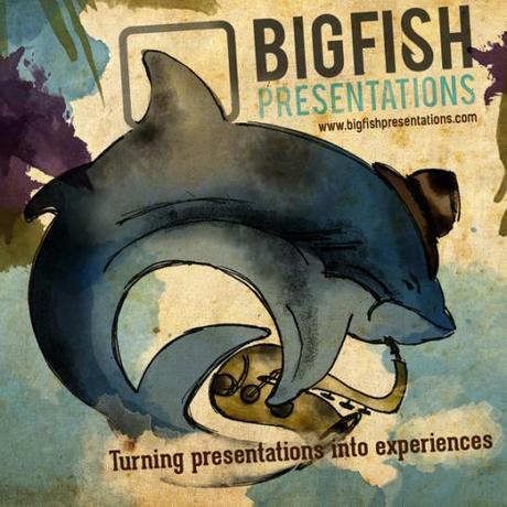
An album cover for a contest hosted by the agency Bigfish Presentations. The object was to represent the company as if they were a band.
Game of Thrones Titles Sequence from Andrea Rivera on Vimeo.
One of my favorites was a Game of Thrones opening titles sequence. It was my first serious motion graphic project, so I had to learn how to use the software. I pushed myself to design the type in a way that people could relate it to some of the characters on the show, so it was really challenging. Those are the kind of projects that I enjoy the most.
Check out the rest of Andrea’s portfolio on Behance and hit her up via: [FACEBOOK] or [TWITTER]
