Font Love! (Wedding fonts advice)
Claire (the brains behind this blog) and I were recently talking about how the US weddings and blogs seem so much more passionate about stationery on average than here in the UK. I pondered this and in some ways US weddings, at least on blogs, do seem comparatively big budget affairs. There are also suppliers of there that I wish we had an equivalent of here but we just don’t unfortunately. But after all that maybe there is still a bit more love for stationery in the US than here. So I thought I should share some of my passion for stationery and design in a way that could help many people whether they a potential client of mine www.artemisstationery.co.uk, Claire’s calligraphy business calligraphy-for-weddings.com or another stationer (apparently they do exist!) to someone making their own stationery.
So with that in mind obviously not everyone is that arty or crafty but I want to talk about something that everyone can indulge in. Which brings me to fonts. If you don’t want to really dwell on your choice of fonts then use Times New Roman: it’s so commonly seen it won’t break any style or look you are trying to achieve for your wedding and it’s actually a very well designed and good looking font. But if you think that the invitation is important and sets the tone for what is to come and can spare a few minutes please read on.
The marvellous, almost wondrous thing about wedding fonts is there is such an amazing and broad range out there. There is probably a font for any style or look you could think of and you don’t need any ability to create a font to use it. You might be thinking now if you’re making your own wedding stationery that Microsoft Word or Publisher doesn’t really give you much choice and that they’re all a bit so so. Don’t panic! — there is a whole world of fonts out there and many are free. Just google ‘free fonts’ and you will find tonnes of websites with fonts free for private use. Download them and if on a PC right click, select install and done! I really love them and think they’re very useful in helping define the style and atmosphere of a wedding, so I offer my clients a lot to choose from with many more on the way when the new website launches.
Some possibilities for wedding fonts:
With script fonts you can create an elegant and opulent look or one which is whimsical and jovial. The letters flow with ease and grace and I think the capitals from some of these fonts are mini works of art in themselves. There is more on script fonts on AS Invites (my stationery blog) — Script wedding fonts blog
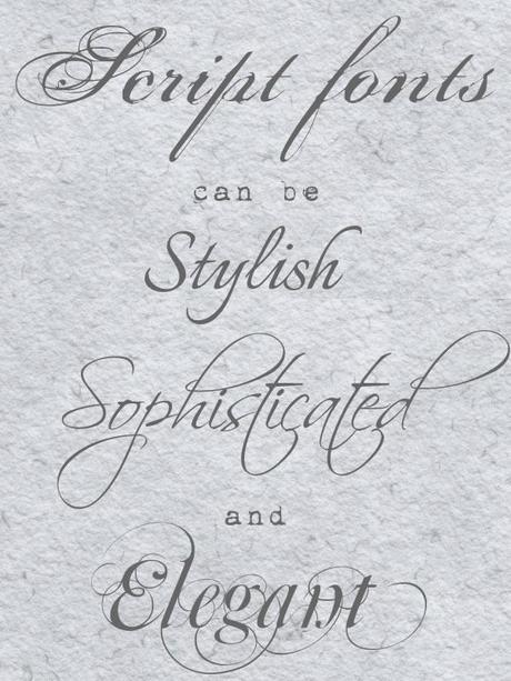
Script wedding fonts ideas compiled by Artemis Stationery www.artemisstationery.co.uk
With Art Deco fonts you can hark back to the roaring twenties and the period which the Great Gatsby was set in. When western economies were booming and the industrial age and modernism brought a stylish, clean look with influences from global travel and antiquity (see my article on Art Deco if you would like to know more) .
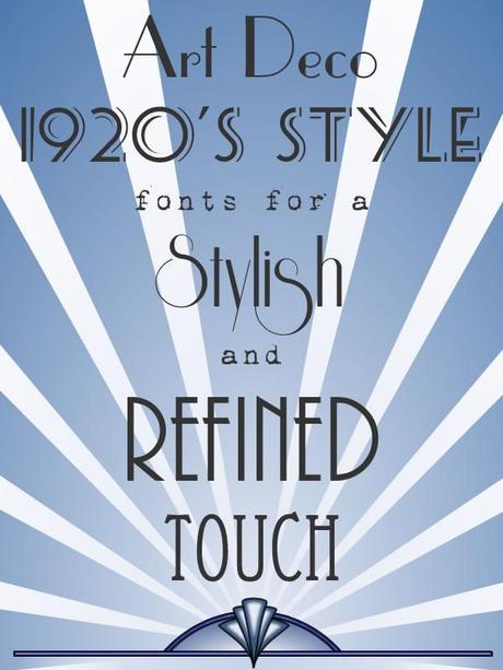
wedding fonts ideas compiled by Artemis Stationery www.artemisstationery.co.uk
If you’re after a vintage or retro look there are so many fonts you can use. Think of Victorian posters or turn of the century carnivals. Open face fonts where the thick part of the fonts are essentially cut out look wonderful and you could also look for distressed typewriter or stencil fonts. Visit my blog for more specific ideas on wedding fonts to create a vintage style.
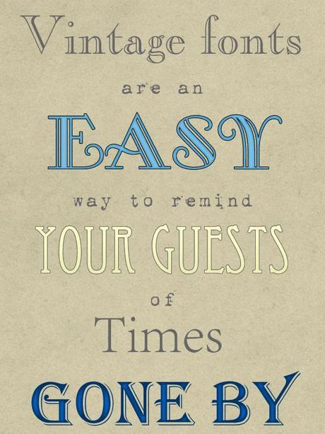
wedding fonts ideas compiled by Artemis Stationery www.artemisstationery.co.uk
Fonts that look like handwriting can give a more informal look which is good for a relaxed occasion.
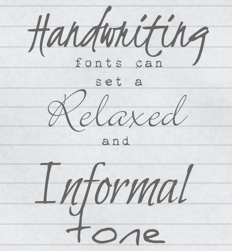
wedding fonts ideas compiled by Artemis Stationery www.artemisstationery.co.uk
Take a more quirky or eccentric look on things or use big and blocky fonts with bright colours for a fun and bold look.
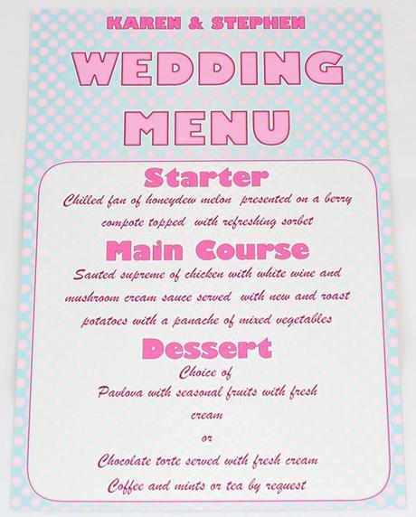
wedding fonts ideas compiled by Artemis Stationery www.artemisstationery.co.uk
Wedding fonts: a little extra knowledge:
If you’ve heard of serif and sans serif fonts but don’t know what they are, consider the fonts Times New Roman and Arial. If you think of a T from each font, the Arial T is formed by two strokes, one vertical and one horizontal. The T in Times New Roman also has these stokes but additionally had some little decorative elements at the bottom and the ends of the horizontal stroke. These are called serifs. So you have fonts with them, these are serif and without them sans serif.

Calligraphic fonts you see online are likely to be ones that are made to look like they were made by a pen with a wide nib where changes in the thickness of the stroke are achieved by moving the pen at a different angle. If you look at some of Claire’s work though you’ll see that calligraphy can cover more script like fonts.
Brush fonts are fonts that are made to look like they were done with a paint brush.
Blackletter fonts look very medieval and are also used for the names of newspapers like the Daily Telegraph.
Script may also be known as cursive. It describes the style of writing that was able to start with the introduction of paper which is much smoother than parchment and allowed a different quicker style of writing.
A little technique with wedding fonts
(for those making their own invites)
So you might be thinking this is all very well but most of these fonts are really hard to read, if you use them things are just going to get complicated. You’d be right, that is a risk but there are ways around it. That is by using the very decorative but hard-to-read font as a feature font and using a more readable one for the main text.
For example, if you’re doing the text for your invites why not put your names and the guests’ names in a feature font and the rest of the text in a plainer font? When I design information pages in invitations I may put section titles like Accommodation, Location etc. in the feature font rather than using bold to pick the titles out.
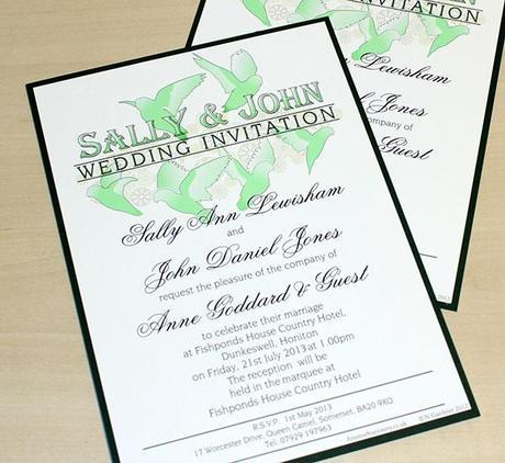
wedding fonts ideas compiled by Artemis Stationery www.artemisstationery.co.uk
If you are sold on the joy of fonts you may be thinking it’s all very well but they’re going to be in the middle of your card and you have to do something for the cover as you’re making them yourself. Why not just get some really nice card to print on and make it single sided, these flat invitations can look really good if you do a good job of laying out the text. You could mount them on a second sheet of card or maybe experiment with ribbons and bows if you think that looks too plain.
A Conclusion:
If you’re looking and now convinced and want to find your own wedding fonts, get on Google or check out my own blog’s articles on fonts http://asinvites.com/ . If you’re looking for a wedding stationer who is passionate about making unique and bespoke stationery for their clients come and check out my website Artemis Stationery http://www.artemisstationery.co.uk.

