**Note: click on any of the images in this post to see a larger version.
OK, here’s a question for you:

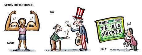
You need to plan for retirement. Do you:

A. Put money in your employer’s 401K plan and/or Individual Retirement Accounts
B. Assume Social Security will be enough for you to live on
C. Buy lottery tickets hoping you can fund your retirement with a big win




Zions Bank, headquartered in Salt Lake City, has a great blog. Only they don’t call it a blog. They call it Stories From Our Community.

It’s a brilliant bit of marketing which humanizes their brand and gives it a very genuine, neighborly touch.

I read one of their posts called Financial Planning Strategies: The Good, The Bad and The Ugly. I was smiling just reading the title.

Anything with a Good-Bad-Ugly format is bound to be funny on some level. We’re already anxious to know what’s going to win the Ugly prize.

The post was concise and easy to understand. It covered four aspects of financial planning. Here are brief summaries:


1. Establish An Emergency Fund
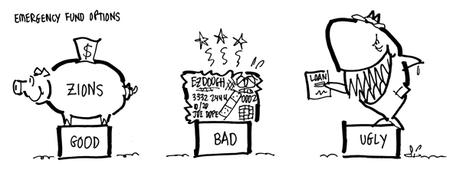
Good idea: Create an automatic bank transfer from your checking account to your savings account to occur every pay period.
Bad idea: Use your credit card for your emergency fund. It could cost you as much as 15% interest per year.
Ugly idea: Rely on payday loans which can exceed 500% interest.


2. Purchase A Home
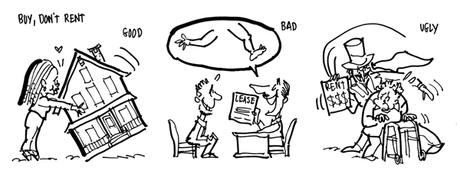
Good idea: Buy a home. The equity that grows in a home as it increases in value becomes part of your wealth.
Bad idea: Sign up for a high-end rental property. Better plan: find a modest rental and save the difference for a down payment for a home.
Ugly situation: Rent after you retire. You’ll be faced with increasing rents on a fixed income.


Good idea: Do a unique budget each and every month. If you make $4,000 in November, have a plan for how you will use all $4,000.
Bad idea: Track past spending with Mint or Quicken– that’s like driving by looking in your rearview mirror.
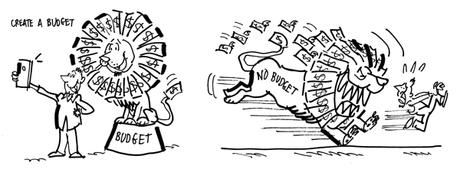
Ugly method: Use your overdraft notice as a red light to cut back on spending until the next payday.


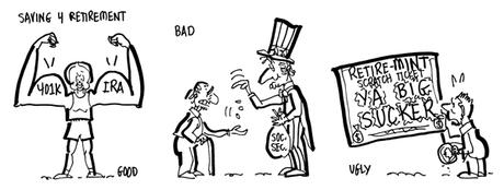
Good idea: Participate in your employer’s 401k program. If your employer does not have a 401k program, set up an individual retirement account.
Bad idea: rely only on Social Security for your retirement needs. Social Security is designed to replace about 20% of your working income.
Ugly plan: Buy lottery tickets, gamble, or look for high risk, too-good-to-be true investments. Get-rich-quick schemes usually translate to stay-poor-long.


e.g., the idea of a loan shark being an emergency fund “strategy”; buying lotto tickets to help you save for retirement, because you are going to win, right?

Here’s the header image Zions Bank used for that Good-Bad-Ugly post. A generic stock photo: a happy couple smiling and laughing at a sheaf of papers. A pretty picture, but utterly forgettable. Lots of wasted space, too.


I decided to do just that.

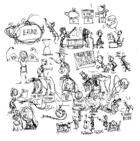
I reread the post and scratched out some ideas for the four topics covered:


Emergency Fund Strategies: feed the piggy bank, max out your credit card, see a loan shark.




Strategies: Buy a house and accumulate wealth; pay an arm and a leg for an apartment; have Snidely Whiplash show up each month to collect the rent when you’re old.




I like how the dollars are sprouting wings and flying away as the lion chases the poor sap (click on it to see a larger version).






The Zions Bank post was excellent: compact, well written, easy to understand, a fun format (The Good, The Bad & The Ugly). It was warm, welcoming, accessible.

The stock photo header image was bland and generic: pretty much the opposite of warm and welcoming.

Incorporating some of that GBU humor into a custom image makes sense for the following reasons:

1. A custom image reflects post content: it’s a visual preview of what the post is about.

2. As such, it arouses curiosity (nobody is ever curious about pretty people laughing at some papers).


