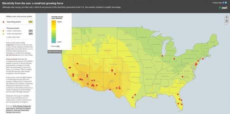
Here is an interactive Esri online web map story featuring the various places in America that are generating electricity from the sun. It is a small amount compared to other traditional methods, less then 1 percent of electricity generated in the U.S. comes from solar energy but that amount has been starting to grow.
A second component of the map is the solar potential (yellow to green colors) that indicates the average annual amount of available energy in a region that comes from the sun. Interesting enough, “Despite the relatively low solar potential on the eastern seaboard, a cluster of plants in the Northeast serves cities with high demand.”
Check out the interactive online web map yourself, scroll around and into the map for higher resolution satellite views. Then click on one of the red points and you will be provided with more details about solar plants in that area with photos, info and links to their respective web sites.
For more GIS and online web map stories like this check out CanadianGIS.com

