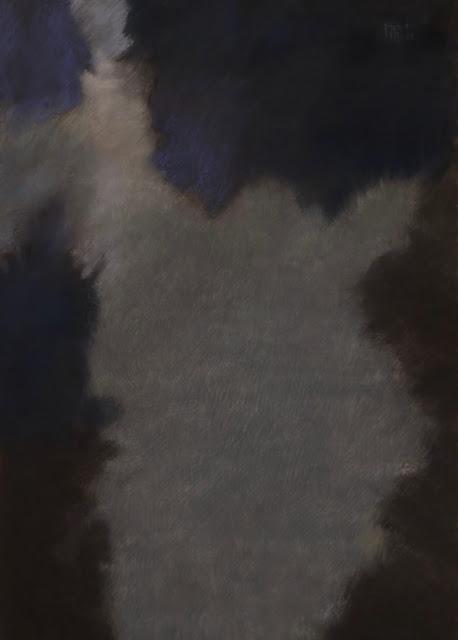
Another color composition. This time, I started by darkening my paper with a mix of dark pastels and charcoal. Perhaps my mood is following the current atmosphere... and while I am, most of the time, using my art as a way to evade, abstraction is forcing me to some kind of introspection.
Yet, I cannot say all goes wrong... as the darken colors association is not threatening, rather inviting to deeper and inner thoughts - as always, I am dreaming in blue.
Here it is :

Color composition - 65X50CM.
I love working on this surface... I can alternate brush work and soft pastel... work and rework, correct... I'll keep going on this one! A bit frustrated though - my gray palet is quite poor. To reach the desired depth in the central part, I had to mix and apply multiple layers of strokes. But I got to where I aimed, somehow...
