I entered a poster design contest last fall. Alas, I didn’t win. Years ago, I would have labeled this a failure. Now I’m smarter: I call it a “learning experience.” : )
Here’s my losing entry:
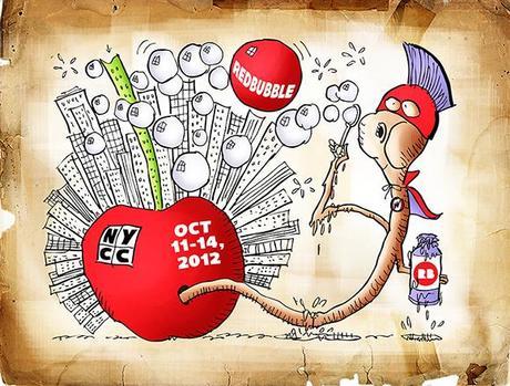
It’s the sort of thing that begs an explanation, isn’t it??
I’ll start by telling you that Redbubble is an online store for artists and illustrators. I have a Redbubble account, but I’ve been using Fine Art America to sell my work. There are many such online stores. They handle the printing, framing, and mailing, and they take the lion’s share of the sale price.
The New York Comic Con is an annual convention in New York City for fans of comics and pop culture. Redbubble is one of many exhibitors at this convention.
Redbubble held a show poster challenge: design a poster to publicize Redbubble’s presence at the 2012 New York Comic Con. The only requirements were that it mention Redbubble, New York Comic Con or NYCC, and the convention dates, October 11-14, 2012.
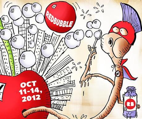
I did some research, and learned that much of the focus at the convention is on superhero comics. My brilliant concept: a Superworm emerging from a Big Apple covered with skyscrapers, and blowing soap bubbles– especially a big red one. Here’s a larger detail image:
There were 69 entries. Redbubble awarded first, second, and third prizes. The winner (left) and the runner-up are shown below:
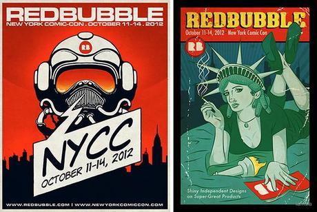
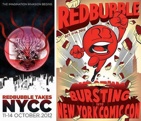
Below, left: the third place winner. On the right: the most popular entry, which received the most votes from Redbubble members themselves. I really admire the bold design and energy of the latter, and I like it much better than the three winners.
So what did I learn from my learning experience? My conclusions:

A poster is usually vertical. My horizontal design was a mistake.
A poster is supposed to promote. My text was much too small.
Most entries had a single bold image. Mine lacked focus.
Mine was the most “cartoony” image. It may have appeared trite or disrespectful.
Giving my poster an “old paper” look made no sense– what was I thinking??

* * * * * * * * * * * * * * * *

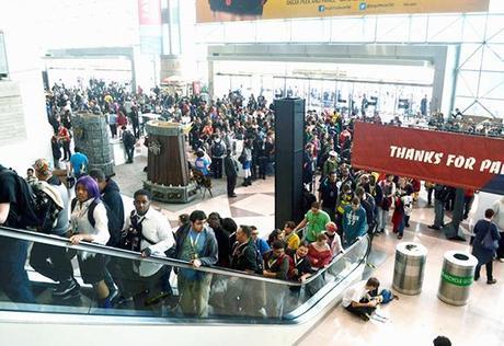
Attendance at the 2012 conference over its 4-day run was 116,000. Here’s a shot of fans pouring into the convention center. I suspect there may have been a rumor that I’d be making a personal appearance… : )
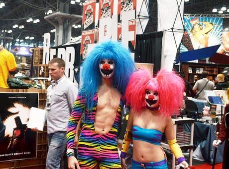
A lot of fans dress as their favorite superheroes. These people look like they’re from New Hampshire.
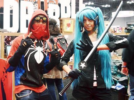
So do these people…
And here I am, making my personal appearance. Just kidding. I’m not that muscular… : )
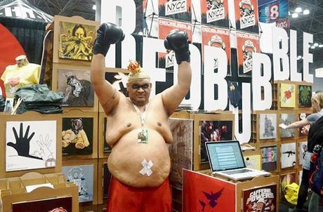
Note: the above four photos courtesy of Redbubble.

What do you think? Did you like any of the NYCC posters? Ever had a poster that really caught your eye and stands out in your memory? Ever been to a fan convention or dressed up as a superhero? Hope you’ll leave a comment.

