There’s so much that you do on your website to get more visitors to buy from you, or download your eBook, or increase your blog subscription list.
Given below are 3 quick changes you can make right now to improve the conversion rate of your website.
1. Change Your Call-to-Action Links to Buttons
When your call-to-actions don’t stand out on your page, it will hurt your conversions. If people don’t see it, how will they take action?
Take this page for example:
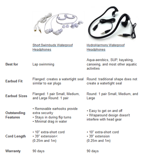
It will take a couple of seconds before visitors on this page realize that the name of the products are actually text links that will take them to the next step.
Text links mostly merge with the rest of the elements on the page and are often missed in normal user flow. You cannot afford that if you want people to actually take your desired action.
See how adding call-to-action buttons on the above page make it obvious for people where they have to go to make a purchase:
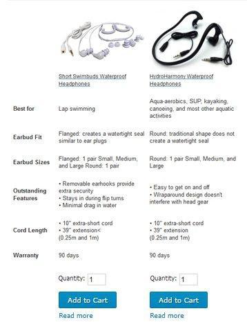
You might feel that it might take only a few seconds extra for a visitor to make out a text CTA on a page vs a contrasting CTA button, but if you actually run a test and see what a huge difference it can make to your conversion rate, you’ll be amazed.
For instance, SAP BusinessObjects turned their blue links into huge red buttons, which increased their conversions by 32.5%.
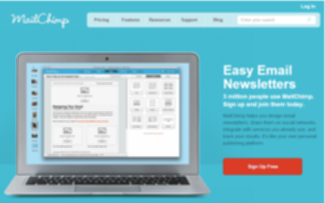
The best way to check how clearly your CTA stands out on a page is to do a squint test. You can see how Mailchimp‘s call-to-action button stands out in a squint test below:
Pro Tip: Placement of your call-to-action can also impact conversions to a great extent.
One of our customers over at Visual Website Optimizer changed the placement of their call-to-action button to alter user flow so that the testimonial on their homepage gets read before people see their call-to-action button.
Result? 35.6% increase in sales. Read the case study here.
To learn more about how you can optimize your CTA for better conversions, you can read my article here.
2. Test Your Form Headlines
Although page headlines are very important and highly impact conversion rates, form headlines are often ignored.
Don’t worry, I won’t judge you if you tell me that you don’t even have one. But hey, please don’t have a headline that says something like this:
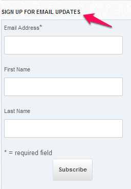
What email updates are these?
Are you going to send me post updates from your blog? Your free eBooks? Or, maybe you’re just going to spam my inbox by sending me annoying promotional emails every second day?
Don’t make your visitors wonder what it’s about and tell them exactly what they should expect.
For instance, Hubspot makes it absolutely clear on their form headline why they are asking for my personal information.
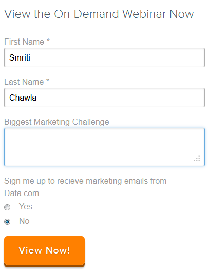
Pro Tip: Give your readers a good reason to sign-up. Offer something exclusive only for your subscribers.
Glen from Viperchill tempts more subscriber sign-ups by offering them exclusive SEO tools and PDF:

3. Use Relevant Images
Images are not used for “decorative” purposes. Not when you want your site to work like a high-converting machine for you.
No matter how pretty stock photos might make your website, they look fake and reduce the credibility of your website. Discard them right away before they hurt your conversions any further.
Use a picture of your company employees instead, or an influential person, like the Founder or the CEO of the company. A great example at Traffic Generation Café is the picture of Ana in the header.

Even if you choose to use some other image instead of human photos, make sure they are relevant to your site message or goal.
For instance, a hosting website ran a test on their homepage. This was the original page:

They tested this against the challenger page given below with a changed image that better emphasized their unique selling proposition of being a secure, and reliable hosting provider:

The challenger page converted 2-3 times better than the original page. You can read the complete case study here.
Optimizing your website for conversions is an ongoing process. While there are conversion optimization best practices, they might not work for everyone.
That’s why it is important that you A/B test every change that you make on your website to see how it impacts the conversion rate of your website.
Smriti Chawla
Smriti Chawla is a Content Marketer at Visual Website Optimizer, which is an easy-to-use A/B testing tool for marketers. You can run tests, segment your audience, and increase your website conversion rates by investing only a few minutes of your time. Sign-up for their 30-day free trial here. To read more posts on A/B testing or converting visitors into customers, you can visit their split testing blog.

