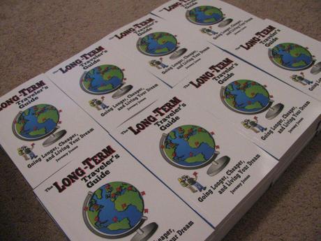
 During our time putting together our first self-published travel book, The Long-Term Traveler's Guide, we had to spend a lot of time learning about the self-publishing process and the travel book industry in general. In order to save future author's time and money, this ten-part Writing a Travel Book series was born!
 The following is a quick list of the entries into this special feature. To learn more about our book launch and other information associated, please check out the Travel Book sidebar on this site.
Part 1 - Finding a Niche and Writing
Part 2 - Editing and Formatting
Part 3 - Evolution of a Cover Design
Part 4 - Digital Packages and Special Features
Part 5 - Developing a Website for Sales
Part 6 - Distribution Companies
Part 7 - Pricing Development and Launch
Part 8 - Affiliate Sales Programs and Tips to Succeed
Part 9 - The Cost of Writing and Sales Summary
Part 10 - Final Thoughts
Writing a Travel Book Part 3 - Evolution of a Cover Design
For some authors, writing the book is the hardest part of the whole process. For others, it is the formatting. For a select few; however, the cover design becomes the bane of their existence, and the cover evolution for The Long-Term Traveler's Guide was definitely an interesting process for us to say the least.
I should make the statement up-front that the design process for the cover of the guide was one of the most enjoyable experiences of the entire process. The reason that it was one of my least favorites part is that I waited until the last possible second to commission the cover, which helped contribute to me delaying the book launch by two months. This is at no fault to my wonderful designer, and is only due to my negligence in waiting to hire her.
So, the most important point for designing a cover? Start early and find your artist!
There are three main topics that should be considered when developing a cover for your book. If you can answer these three questions, you'll be well on your way to a great design.
Who is the designer?

The designer is the number one concern all authors should have in commissioning a cover. You must be absolutely sure that their comfortable styles are in line with the style you wish to achieve for your book. Hiring a vector based artist just because they may charge less than a photography expert is silly if you want a photography based cover design. Do not only become comfortable with their portfolio, but become a fan! If you love their work, the odds are greater you will love what they produce for you.
Likewise, your designer's understanding of you and your book is equally as important as your love for their work. Part of the reason why I chose Deidra from Spotlite Studios to be my designer was not only because I loved her work, but because she has been on a long-term trip before, understands what my book is about, and even contributed to it! The second I told her my design, she jumped on the idea and offered suggestions for making it better. When I gave her free reign on the back cover design, she came back with a perfect cover just like that, all because we understood each other.
Your designer does not have to contribute to your book to understand what you are looking for. But it certainly does not hurt if they do.
How much will it cost?

There is no easy way to say it, but book covers are expensive. Designing a cover takes time, and graphic designers have to make a living too. Unless you go through a major firm, graphic designers will charge a freelance rate, which is often higher than what they would be making when working for a corporation.
For a vector based cover, like the one developed for The Long-Term Traveler's Guide it is not unlikely to be quoted a minimum requirement of at least 6 hours of work, plus additional hours for modifications, changes, and final touch ups. For a more lifelike cover design, it could take even more depending on how much work needs to be done to obtain the images for use, not to mention extra costs associated. Couple that with freelance salaries of $25 to $100 per hour or more, and you have one expensive cover.
When negotiating, be sure to understand how many design options the designer will provide, what formats the final cover will come in, and confirm if it will be print-ready for easy upload to self-publishing sites.
In the interest of full disclosure, we paid $380 for 8 hours of work on the cover which included 3 designs for both front and back as well as a delivery of a print-ready file for easy publishing. Regardless of what you choose for your cover, having a print-ready cover file will save quite a bit of headaches when it comes time to publish.
Do you know what you want?
Knowing what you want for a cover design could be a make-or-break experience during the design process. While talking to my artist, I thought my excessive requests for a specific cover were on the annoying and controlling end of the spectrum. As I came to find out, she preferred that I had a lot of requests as she was working for me and the more she could do to help satisfy my design criteria the happier customer I would be. Of course, she gave her opinions at every step, but she was much more appreciative for us to work together on the design rather than me being a customer who has no idea what they want and is passive about the whole design process.
A clear direction will help your artist make something that not only you enjoy, but your future readers as well. Starting the creation process with a book title and three sentence description is not the path to a successful cover. Have ideas, know your plot, and understand what your cover is trying to convey before beginning the design process. If you have these, your design process will be much smoother and ultimately have less of a hit to your wallet.
The last tip in the previous statement "understand what your cover is trying to convey" is of special concern. A good cover should pass a ten second test if you are using it as a way to describe your content in one powerful image. A potential reader should be able to look at your cover for no more than ten seconds and understand what is going on and what your book is about. The only cover design where this does not hold true is for those who want a cover to touch on a small feature of the book and prefer a design more for artistic effect than a literal representation of the whole book. For these situations a good cover should, at the very least, entice you to look at the back cover, read the Foreword, or peruse the Index to learn more.
If you cannot do this, you will lose out on a significant amount of sales in the long run as people truly do judge a book by its cover.
Evolution of a Cover Design
The front cover design for The Long-Term Traveler's Guide came about after a quick five minute scribble on a piece of paper when brainstorming ideas. Yes, I settled on my cover design that fast. It looked like this:

I will not argue with you that I stink at drawing, which is why it was worthwhile to hire a graphic designer to make the cover! Since I liked the design so much, I decided to put a ten minute effort into making the cover look a bit better to avoid being laughed at when I sent it out to designers.

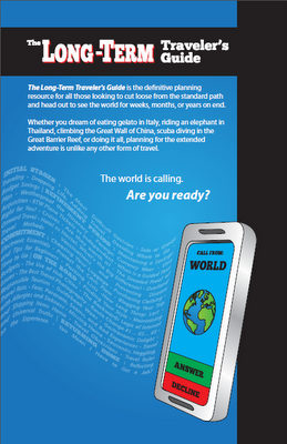
With many amazing comments from our Facebook Fans, we knew we had a winner and off to the graphic designer it went. About a month later, we received three cover options and posted them for comments. Through a couple iterations, we developed the title font and oriented the text on all three designs to make it pop more.

The comments came in, and we picked our winner. Oddly enough, this was an incredibly difficult decision as I was personally torn on the second and third option, while the overwhelming majority voted for the second one. I caved.

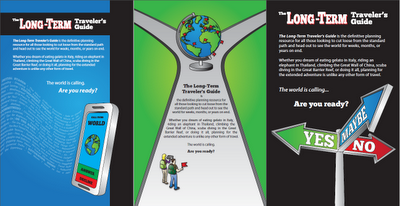
For the back cover we let our designer run wild. As she was quite familiar with the content of the book, all we provided her was the text and waited for the surprise!

We went back to our Facebook Fans to get insight to the cover and had a varied response to all three designs. While positive, the votes were split evenly between all three and left us with a difficult decision. As the first option was the one we were both instantly drawn to, and uniquely displays the chapter titles for the whole book, we chose it!

Overall, our cover design took about 2 1/2 months from first contact to final delivery of a print-ready design that we absolutely love. Most cover designs will not take this long to develop as we did not press our designer to work over the holidays while we were commissioning it as well as other major life events that took place. Even so, my overall statement of start early rings true. Unless you have a major overhaul of your book during the writing process or may want the cover to be an obscure reference to a small phrase or feature, it is unlikely that your dream cover page will change. Get the process started early to avoid all delays prior to publishing!

A special thanks goes out to our designer Deidra for all her great work. If you need a cover made from a great designer, check out her portfolio or read about her travels at her travel blog!
-----------------------------------------------------------
This ten part feature on writing and self-publishing a travel book is based on our experiences with our first book, The Long-Term Traveler's Guide, and is provided free of charge for those looking to write a book or e-book themselves. Other authors typically charge a modest price for an e-book that contains this information in such a fashion. Rather than requiring a purchase for this information, if you like what you have read please Reweet, Stumble, or 'Like' this post, use our affiliate links when registering for the companies we've recommended, or purchase a copy of The Long-Term Traveler's Guide to help us out!
Thank you for your support and happy travels!
