If you're a return visitor to our website, you may have noticed the crazy color and layout changes that have been happening multiple times a day.
Gary's eyesight has made reading more difficult not only here, but on a lot of online sites he likes to visit. Web accessibility is vital to people with disabilities, so we felt an obligation to try removing barriers that prevent natural interaction with our content. Our primary audience is people with disabilities. Sites like this one have a responsibility to develop content all users can enjoy equal access to both information and functionality.
So we've done a little winter clean-up, changed the front page photos and found a new color theme. Because honestly, it's rather sad seeing the same thing for two years.
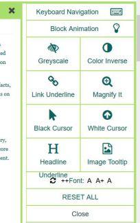
We've added two new features this week. The first is located on the top right corner of our site. If you click on the accessibility


The next feature is a Symptom Definition Glossary. You can find each definition link not only on our symptom list page, but you can search through your choice of an alphabetized listing or by symptom category. The menu boxes are on the


