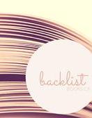
This week's Top Ten Tuesday on The Broke and the Bookish is: Top Ten Cover Trends I Like/Dislike. This is going to be a slightly more boring post for two reasons: 1 - I don't have much time this week for blogging, and 2 - I don't want to use cover images because I feel like if I do that for the things I like then I have to do it for things I don't like, and that would just make me feel mean!
Things I like:
1. Creative covers.
2. Covers that could just as easily be works of art.
3. Careful color selection.
4. Pictures that make me feel something (good).
5. Font, font, font! It's gotta be good, and it's gotta work with the cover design and grahics.
Things I dislike:
1. Creepy covers. I CANNOT with creepy.
2. Boring covers. I don't mean plain covers - sometimes those can work really well. I mean covers that either have no image or a bad one, and use fonts that aren't visually appealing.
3. Elements that don't go together. Like really awesome, modern, appealing fonts.... over a cheesy image.
4. Covers that don't represent or relate to the book they're for.
5. Movie tie-ins that aren't re-designed to work as a book cover, they're just the movie poster shrunk down.
Okay, so that's it for this week. Sorry it's not so great - this is one of my busiest times at work, so I don't have much spare time! I'll try to get back to normal (and reply to your comments!) ASAP!