
This Calls For A Celebration...
Yesterday was my birthday (61, yay!) but we had to scrap plans for going out to brunch as we'd both come down with wicked colds. (Caught from Jeune Homme who stayed with us the weekend prior.) So we celebrated both my birthday and the 99% completion of our kitchen remodel project with a bit of bubbly.
I love those home makeover shows. Seeing the "Before and After" comparisons is my favorite part. I'm lacking a professional camera crew and lighting, but I think you'll see a dramatic difference even so.
Kitchen Remodel: Before
When we moved into our house 21 years ago, the kitchen hadn't been worked on since the late 1960's. Picture everything Harvest Gold and Avocado Green...and then throw in blue floral wallpaper. 😝 We didn't have much of a budget for renovation at that point, so we focused on the cosmetic updates and vowed to do a major overhaul "someday." We replaced the countertops and flooring, added a small pantry, painted, and added laminate to the existing cabinets. It was meant to be a temporary fix, but 20 years later we were still living with it.
Here are the Before photos. These were taken right before demolition began, so forgive the messy state.
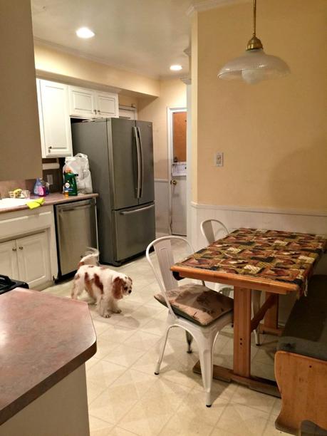
The original kitchen was dark and cramped. There was an eating nook, but I always thought the space could be better utilized.
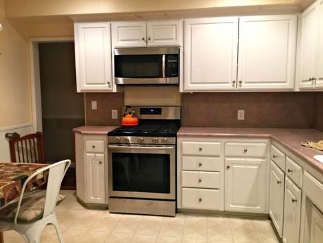
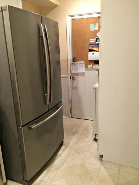
This area was one of our biggest annoyances. We'd added that narrow, deep pantry when we moved in (right) and stuffed an apartment-sized stacked washer/dryer into the corner behind it. Behind the door in the back was a small 1/2 bath that we never used because it was too inconvenient. We mostly used it for storage. On the other side of the fridge was the door to the backyard.
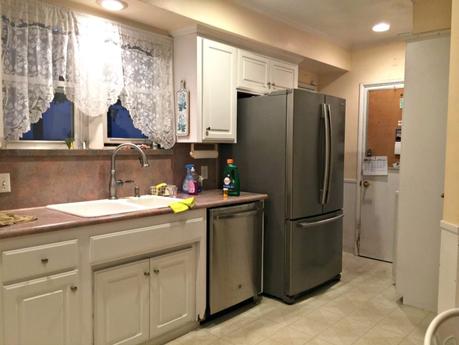
Here's a photo you can refer back to. The sink, dishwasher and fridge are all in the same places in the new kitchen. We replaced that fridge with a counter-depth model, otherwise we kept the existing appliances.
Kitchen Remodel: After
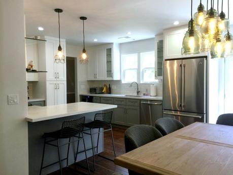
We knocked out a couple of walls, moved a doorway, and created more of an open floor plan. We relinquished the 1/2 bath (we still have 2 full baths in a 3-bedroom house). The whole area is now lighter as well as more open, and flows much better.
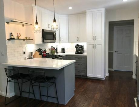
Instead of an eating nook, we now have a counter that can also be used as a gathering and serving space when we entertain.
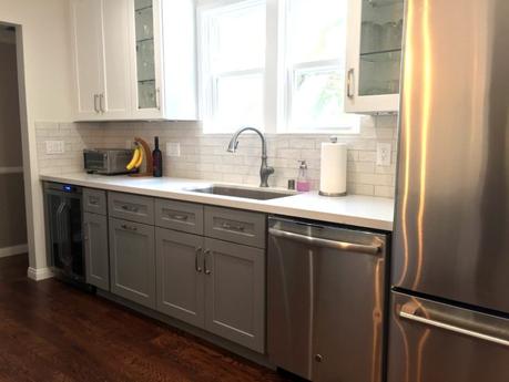
We chose grey and white cabinets, which I'm quite happy with.
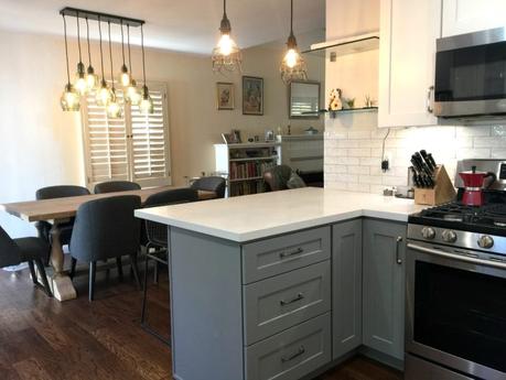
There's a nice flow now between the kitchen, dining area and the living room (which I'm not showing you because it's still a mess).
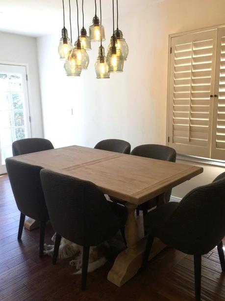
That's Byron taking a nap under the table. We decided to go with a "rustic modern" furniture mix for the dining area, and keep it casual and relaxed. (I wanted some cafe-style wicker chairs, but Le Monsieur was insistent that he wanted something comfortable. And these are very, very comfortable.)
The table expands to seat 8 with two leaves that go on either end.
We also went in a very different direction with the chandelier than what we'd originally been considering but think this one coordinates nicely.
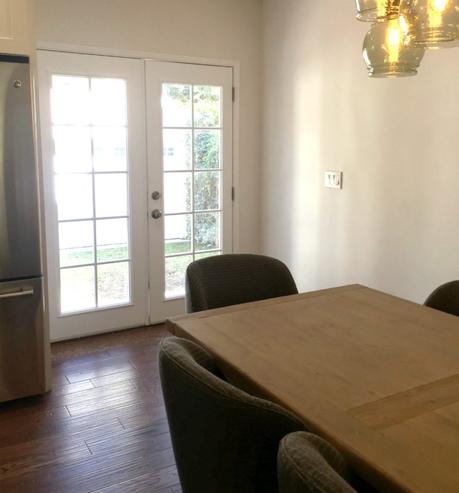
And instead of a cramped little passageway, we now have a double French door that not only creates a better indoor-outdoor flow for entertaining, but also lets lots more light into the kitchen. We're going to be replacing the shuttered window and painting that wall. After that's done, we'll hang some artwork in that area. We're also planning to add simple sheer curtains over both the window and French doors.
Details...
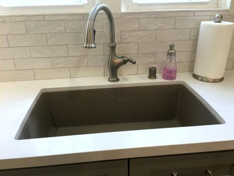
The countertops are Caesarstone (hard to tell from this image, but there's a subtle marbling pattern). The sink is Blanco Silgranit. That was suggested by the kitchen designer and I'm very happy with its low-maintenance finish after years of scrubbing marks off a white porcelain sink. We toyed with doing a farmhouse sink, but they were much more expensive than the under-mount. I'm happy with that choice too. The backsplash is slightly shiny and has a nice texture which I like. Since we went with a very neutral color scheme the texture keeps it from being too bland.
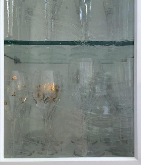
The "semi-custom" cabinets came with plain glass panes, which we replaced with this textured glass.
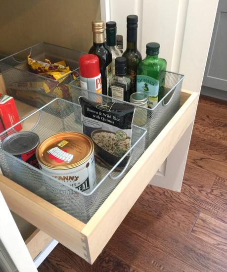
We each had a few items on our wish list for the new kitchen. For me, it was that every bit of storage below counter level either pulls or rolls out. No more getting down on hands and knees to get at that thing in the back of the lower cabinet!
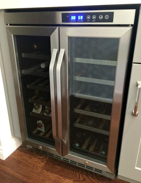
Le Monsieur's number one wish list item was a wine storage/cooler unit.
There are a few little tweaks yet to do, but overall we're quite pleased with the new design.
A few more details:
pendant lights | barstools ( cushions) | dining table | dining chairs | chandelier | pantry organizer
Have you done a kitchen remodel? What were you most pleased with? Anything you wish you'd done differently?

Affiliate links in posts may generate commissions for unefemme.net. See my complete disclosure policy here.
