by Paul Pelkonen

We've gone from this....

...to this. Granted, this is cheaper.
The art of the classical music album cover has enjoyed a steep downward spiral in the past decade. Faced with the prospect of compressing their catalogues into boxed sets that have very low sales numbers to begin with, the major labels have resorted to cheap-o artwork that is designed to look good on the touch-screen of an iPhone.
In the quest to create these "iconic" images for their back catalogues, the few record companies that survive have come up with some covers that look like they were done by a kindergarten student. Others are awesomely tasteless, and a few are just plain dull. We offer ten examples below, and we save the best for last.

The Egyptian slave would be rolling in her grave if he saw this kiddie-style design
for Aida. The whole Opera! series from Universal suffers from similar art.

This boxed set reissue is just confusing, especially as there is no full eclipse,
comet attack or flaming meatball in Götterdämmerung.

Classical music critics get their discs in bubble envelopes.
Is this box an attempt to replicate that experience?
You can't even pop the bubble wrap, which is just not fair.

Less-than brilliant art from Brilliant. Back to Winnipeg.

If one more album designer pairs Mahler with Gustav Klimt, I'll...

I'll get Wild and Crazy. Yeah!

When a maestro thinks he's as important as the music, you get art like this.
Notice how it hides the comb-over and makes Daniel Barenboim look tall. (He's not.)

I love these recordings but this packaging sucks. There. I used the s-word. Happy?

Run for your lives! It's Zombie von Karajan! Reissued to squeeze some money
out of buyers who didn't know he'd been dead for 20 years.

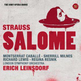
Finally, in the "tasteless" wing, this Salome from the 1970s.

