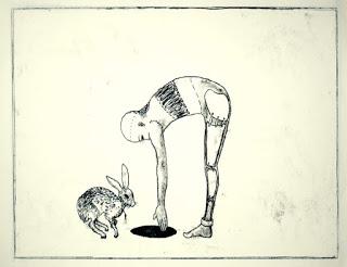
 Originally in the field of fine art - I trained as a 'painter'. but you know......I was never settled or content with what I was doing. Of course there were some good pieces...but something just wasn't 'right'. One thing I began to realize over time was that I liked very much working on paper. AND the technique that I employed over many years before I got into printmaking 'properly' was trace monotype.
 Above: trace monotype on 30gsm Lokta paper 30x20cm
 Of course the other problem was that I was always 'financially challenged' so of course, that affected the kinds of art materials that I was able to buy.
 From the time I stopped more or less making paintings on canvas in my attic studio......I tended to use 'trace monotype' at the initial stages of creating new works.
I even remember that I used to like pressing the edge of the plate with my fingers to get that emboss-like mark at the edge of the image area.
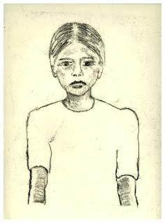
Left: trace monotype on Lokta 30 gsm paper
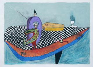 I would say that about 50% of the time I would leave the monotype prints as they were. The remaining 50%, I would work into them further using oil pastels, watercolour pencils and watercolour crayons. Of course that doesn't account for the ones that were just a total disaster and 'didn't even qualify for working on their back sides'!..This is something I do now - well given that printmaking paper isn't exactly 'cheap' you can understand.
Above: an example of a 'developed' trace monotype print
with oil pastel, carbothello pencils and soft pastels
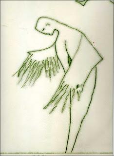 On a good day I would create, about 12 prints. The size was approximately 44 x 64 cm and they were made on good grade Cartridge paper using oil based etching ink. I didn't have an etching press at that time. At some point I experimented with using a very small amount of microcrystalline wax mixed in with the etching ink...and was very pleased with the result a unique velvet-like effect.
It's definitely the kind of thing that you can only truly appreciate by seeing it with your own eyes. But this image of green ink on white paper (using the wax), gives a sense of the image.
Here is a link to a previous blog post about the procedure
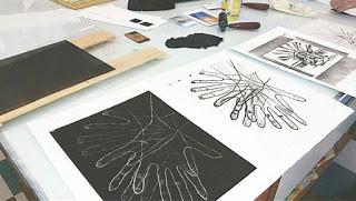 PROCESS * TRACE MONOTYPE
For those who are unaware of this technique
Essentially, using a brayer you roll out a thin layer of intaglio printing ink onto a non porous surface eg metal or a perspex-like material (hereafter referred to as a plate / in printmaking terms). You can use any shiny surface really. I like to use a plate because I can then press around the edges to get that embossed mark. Additionally with the 'negative' left on the ink plate - I can run that, through my etching press. Sometimes these negatives have potential for further development.
image is from hotforwords on instagram........
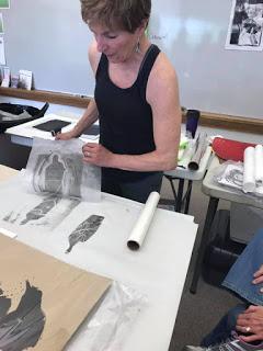 There after, place your paper on top of the inked plate. Use masking tape along the top edge of the plate to keep it in place. You do not want it to be moving about as you are drawing/ impressing the pencil line onto the paper so that it picks up the ink.... then start drawing, mark-making and be aware that wherever pressure is put onto that paper, you are working on, marks, will result. So don't just place your other hand on half of your paper area, else you might just end up with a big U.F.O., blob of black ink, which might 'spoil' an otherwise fairly good trace monotype print.
image is from PaperWorks-Sonoran Collective
Trouble shooting
Check from time to time by lifting the paper to see how the 'ink pick up' is going if it is very faint you may need to press harder with your pencil. It could also be that you have not applied enough ink. another possibility could be that you are using paper that is just too thick (100 gsm and above).
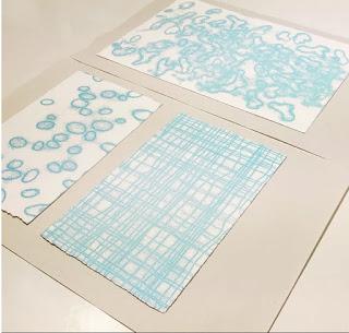 A certain amount of "dotty-ness" is par for the course, as in, that is the unique characteristic of the technique. I suggest you do a test plate where you use a pencil, a stick of graphite, different grades of pencil ie. 2h 3b and so on etc, I like being able to see what I have drawn on the paper so that I can anticipate the 'look' of my finished artwork.
image: (from copius.stones on instagram)
Using light blue ink random circular shapes demonstrates the "dotty-ness". I have heard people refer to this as "noise" so its a term that is used by printmakers. Some noise is desirable but too much and the image is kind of wrecked. You need to do this activity for a few times and by then you will be fine with it.
In order to remove the top layer of ink, you place an old newspaper over the top of the plate and rub it all over the 'plate' in order to remove a 'layer' of ink.
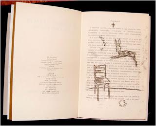 Otherwise the lines that you draw onto the paper, with your pencil, will be too thick.I think for the first few images it is best to already have a drawing on your paper.
Image: I did some trace monotypes into a book of poetry that was written in English and in Japanese. I had to bear in mind the orientation of the image so I had to draw it the 'opposite way round' to how I wanted it to appear on the page.
You can have your 'design' drawn on your paper with lightweight pencil lines, that way when you start pressing the lines in the image, onto the paper placed over the inked plate, you will be able to see where you have 'drawn' your lines to pick up the ink on the plate.
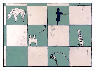
Image one of my trace monotypes developed further with chalk pastels
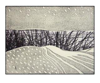
Image: which I found on the internet absolutely ages ago - I think it's an excellent use of trace monotype. The way it sits between the two horizontal areas of Lino cut. I have been unable to attribute this artwork what a shame......
First an overview all in video by Belinda Del Pesco
Secondly a tutorial in 4 parts where all of the variables are explored including papers
These videos are by someone called "Craftybirdie" who is a UK based artist - that's all I could find out.
Trace Monotype Printmaking Part 1
Trace Monotype Printmaking Part 2
Trace Monotype Printmaking Part 3
Trace Monotype Printmaking Part 4
+++++++++++++++++++++++++++++++++++++++++++++
