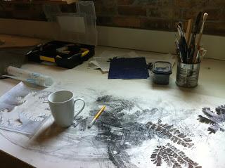
 I first came across the wonderful artwork of Rina Yoon while the INKTERACTION.ning printmakers community website was still up and running. That shut down about 5 years ago now.
 The first of Rina's prints that I saw were her collagraphs and I remember I thought "mmh wow...... I like this artwork!"
Being that I have seen so many 'animal-scapes', landscapes/ seascapes or 'still life' from the past few centuries and even the past few weeks for 'gawds sake' ...by now it should be apparent that I am always seeking 'something more' I am looking for something that is 'human' that is about us. About us living our lives alone, together and apart - with all of the tenderness, fragility and complexity. As long as it's the individual artists 'take' on life - their own autograph.From my viewpoint her artwork had an ethereal quality that was personal and universal and certainly not trying to follow any 'trend' in terms of prevailing concepts etc.
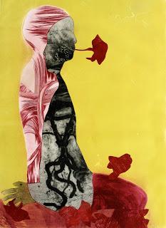 Most importantly it was / is authentic. The colours were appealing and yet not 'outstanding' they were just integrated. I also liked that she used 'empty space' as an element in her work. Her use of a 'silhouette' figure immediately invites the viewer to place themselves within the picture space....with its curved forms and layers.
It seemed to me that there is a kind of 'open-ness' in these 'hands-on' very directly-created intaglio prints.Left a print from her "Sympathetic Fibers" series
Rina Yoon lives in Milwaukee and is a professional fine artist printmaker. Her art practice is sustained through her professorship at the Milwaukee Institute of Art, where she has been involved in its educational evolution since 1999 vis-a-vis the printmaking department.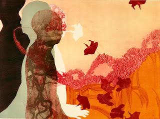
Her earlier works as far as I can discern seem to have been those created using mainly collagraph techniques. Knowing me, I probably dropped her a line and asked her if that was the case, through that inKteraction printmakers platform.
Collagraph being a process whereby a range of materials are layered and manipulated onto a plate, mount or matt board, a range of metals and plastics can also be used. At the same time one must not allow this material to become too high. When one says 'too high', we are talking an eight of an inch or a quarter of a centimeter. So you really need to know what you are doing in order to be able to get the high quality outcomes that Rina achieves with this series of prints. Taking a guess, I would say that Rina has also used an inked monotype 'background' plate, on which to 'build' the image. She has thereafter layered shaped collagraph plates and used stencilled shapes for positive and negative visual effects.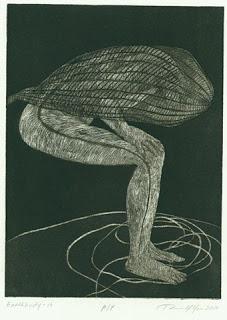
Although a photographic process is being used here as an agent towards a particular outcome, this series is very much about a transformative process.
Rina has made marks onto the surface of the body images and they then seem to work together - almost interacting like a violin and piano duet.I quite like how if I didn't know the technical process by which these were made - I might have interpreted that they were very fine woodcut or even a relief etching or drypoint.
left: one of the prints from the "Earthbody" series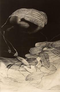
I can see a body on the upper left which I can tell has a photographic source although it is very softened through the use of tone........then I realize that it is partially enveloped by a leaf like form...then I am taken down the picture space to this pale coloured ground of other leaves...leaving me in no doubt that the one is connected / related to the other.
It seems unique to me, that is, the means by which she has achieved this outcome. Perhaps Rina took an initial proof and then made some photocopies of it and then worked on to these using eg white gauche paint and fine-liner black felt tip pens. I can think of a way that I might have achieved this effect and would be fairly sure that it is different from the method that Rina has used.
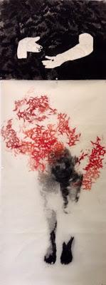
I like how she has used a technique she studied in Korea as part of the upper area of this work(the hands).
Lower down we see the impression of a figure firmly standing on a ground. Whether this has been a result of etching lithography or even silkscreen I am not entirely sure....whats important to me is its effectiveness. The red leaves are printed in various 'weights' of translucency - this could be by relief print, rubber stamp, maybe even stencils. I really think that we printmakers could make better use of using stencilling although its proper name is 'pochoir'.
It all seems to have been printed onto Washi paper (lightweight but strong Japanese handmade paper). Having said this there are also handmade Korean and Chinese papers.
Finally I like very much how all of the techniques work so well together.
Her work has been exhibited throughout the United States and internationally.To see more of her artwork here is a link to the website of Rina Yoon.
