Today was one of my favorite days of the year. It's never the same day every year. It's often a toss up as to which month it will fall in.
It's the day our Christmas cards arrive.  I love coming home to find a cardboard box on the doorstep, stopping for an instant to wonder, "Hmm, what could that be?" then nearly falling over myself to get it inside and rip it open to see how this year's edition has turned out. I've had a few folks ask me about our Christmas cards. I design our cards myself and have for a number of years now. As the "Diversions" (or Arts and Leisure) editor of a local paper a few years back, I picked up some graphic design skills, for which I will be eternally grateful, because I found not just a hobby, but truly a labor of love. I find few things as pleasurable as creating something, anything - an invitation, a poster, a web graphic, a Christmas card - on my computer screen. I have created so many things that will never make their way to ink and paper (or cyberspace), but it doesn't matter. It's good for my soul and my brain. (Don't get me wrong - I'd love for it to be good for my pocketbook, so do holla if you can use my services.) I can't teach you a whole lot about graphic design in one post, but I can show you what I do and give you some tips, not just about design but about how to get Christmas cards printed economically. Now there are some really lovely designs out there to be had for a price, but I just won't pay it. On the other hand, I personally want a card that feels like a card, not just an odd-sized photo. I want the custom look at the Wal-Mart price. I want it all. I'm cheap, but I really love a nice Christmas card. What's a girl to do? So here it is. Step One: Photo(s)You probably want a photo to include in your Christmas card, particularly if you have cute kids (or pets) that you want to show off.
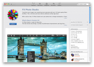
FX Photo Studio
The photo can set the tone for the whole card. Sometimes, with kids, particularly very young ones, you have to take what you can get. Photos can of course be edited to achieve a certain look, i.e., black and white, sepia tone, etc. Right now, my favorite software for photo editing is FX Photo Studio. The regular version, which I have, is $11.99 in the Mac App Store. (The pro version, which I don't think was available when I first downloaded it, is currently $19.99.) Not only can you apply various filters and effects to a photo, you can also easily lighten (or darken), crop, and make other adjustments. So, do you plan your photo with a certain card design in mind or do you take the best photo you can and work your design around that? That's up to you! Either way works.Last year, we actually had proper family photos taken by a photographer, which doesn't happen that often. Hence, I myself actually made it onto the Christmas card!
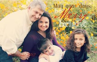

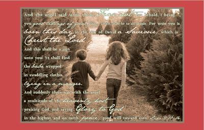
I didn't even ask them to hold hands!
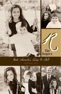
This year, I decided we would again just use photos of the kids, not us, but I wanted to use photos that showed off the kids' personalities on just a regular day (hence the school uniforms), and also some taken on a special occasion, a fall weekend in New Orleans. To bring all these photos together in some sort of cohesive look, I chose to convert them all to black and white.
Step Two: Design
I have, in the past, had access to expensive design programs like Adobe Indesign and Illustrator because of my job. I'm back to lawyering now, so that's no longer the case. Since this is essentially a hobby at this point, I can't justify dropping $600 plus or whatever on the Adobe Creative Suite. (That said, I have just discovered that Adobe is now offering its software online via its Creative Cloud and individual apps on a monthly pricing plan. I will have to look into that, particularly because I'm really jonesing to do something for Minted's Design Challenge, which requires either an Adobe Indesign or Illustrator file. And if I ever just find 600 bucks lying around, that's probably how I'll spend it.) A couple of years ago, I discovered an app (for my Mac) called iStudio Publisher. I don't remember what the price was at the time, but currently, it's $17.99 in the app store. It's also available with a free trial at http://www.istudiopublisher.com.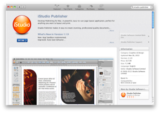
iStudio Publisher
It works much like InDesign. It is more rudimentary, of course, but I have yet to discover much if anything that I need it to do that it won't.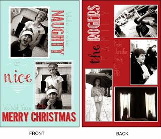
This year's card.
A how-to post on iStudio will have to wait for another day, but I dare you, even if you don't have any design experience, to try it. Here's the basics: make a box, fill it with text or an image, and dress it up. Add as many boxes as you like, the sky's the limit. Play with it until you like it. Sleep on it, then play with it some more. You might eventually get the hang of it! (If not, no worries. In Step Three, I'm about to introduce you to Vistaprint, where I normally get my cards printed. Should you care to skip this whole design process, Vistaprint has lots of great designs that can easily be customized with your photos and by altering some of the typography to your liking.) Of course, for uploading to Vistaprint, or for any commercial printer, export you design in iStudio to a pdf. Also, most (if not all) commercial printers use CMYK color, so make sure the color selector is set to CMYK rather than RGB. (However, if you are printing at home yourself, check your printer to see if you should format in CMYK or RGB color.)Step Three: Printing So I've already given away my secret on this step - I use Vistaprint for printing my Christmas cards. In past years, I have used the "Invitations & Announcement" size, approximately 5" x 7", and chosen the "upload your own design" option. I have always managed to get cards printed economically at Vistaprint, even printing in full color on two sides. DO sign up to receive emails from Vistaprint. They run specials and send coupons on a fairly regular basis. This year, however, I got really smart. It occurred to me to check out the "Oversized Postcard" size, which is more like 8.5" x 5.5". Whereas invitations/announcements are sold in quantities of 10 or more, postcards are sold in quantities of 100 or more, but they are both printed on cardstock, and the "upload your own design" feature is available for both. The difference (other than the size)? The postcards, though larger, are much cheaper. This year, I paid about $70 for 250 two-sided, full color cards, with envelopes, including shipping. Y'all, that ain't bad. You can't do that well at Wal-Mart. (Just to show you the difference in price, last year, I paid roughly the same amount for 150 slightly smaller cards, which wasn't enough. The "postcards" are the way to go if you can design your own.) So that's my process. I'm always on the lookout for ways to do things better (and cheaper - the less I spend on Christmas cards, the better), so if you've got any tips to share, feel free to bring them! (And feel free to contact me with questions. I will answer as best I can, but do beware, this ain't my day job.)


