- May 22, 2014
- 0
- Email This Post
- Print This Post
Signage Lessons from Hollywoodland
Signs are supposed to draw attention to your business. That’s their job. But truly great signs can become just as iconic as the things they’re meant to identify and promote.
Take the world-famous Hollywood sign in Southern California, for example. Everyone knows what it looks like, even if you’ve never actually been to Hollywood.
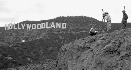
But its purpose has changed over the years. It’s interesting to note that the city did not put up the Hollywood sign. In fact, a real-estate developer built it in 1923 as part of an outdoor ad campaign to promote his remote suburban subdivision, Hollywoodland. How about that? An early example of integrated marketing!
Make Your Sign a Landmark
The best signs get noticed even when people aren’t looking for them. Even if you don’t have the space for 45-foot tall letters, you can still make your signage a local landmark by taking some lessons from the Hollywood sign, as noted by Roy Williams in Entrepreneur.
Dare To Be Dramatic
Think larger than life, as in grossly oversized, three-dimensional or prominently placed. The Hollywood sign succeeds on each count. Having your message on the top of a mountain in the Hollywood Hills is definitely dramatic. But for your message to be effective, remember also to keep it brief. The Hollywood sign doesn’t try to say too much. (Think about it: It’s even been shortened!
Dare To Be Different
Blending in with your surroundings is the surest route to failure with signage. The Hollywood sign stands out for a number of reasons.
- Color – Bright white letters provide a stark contrast against the brown and green hillside.
- Installation – Instead of resting atop a pole or billboard, the sign is comprised of individual letters that sit on the ground.
- Location – The Hollywood sign is all by itself without anything to distract from it.
Dare To Be Wrong
The sign’s letters appear to be placed unevenly, rising and falling with the terrain, which makes it far more memorable. (However, when viewed at eye level, the sign letters look more even.)
Even though your sign’s message and look should strive to stand out from the signage crowd, your sign still has the same job as its competitors: to get the attention of passersby and get them to remember your brand name.
