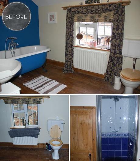
Last year I shared the ‘befores’ from our very bold bathroom. I’m very happy that this room is now all done and without further ado, here’s the ‘afters’. 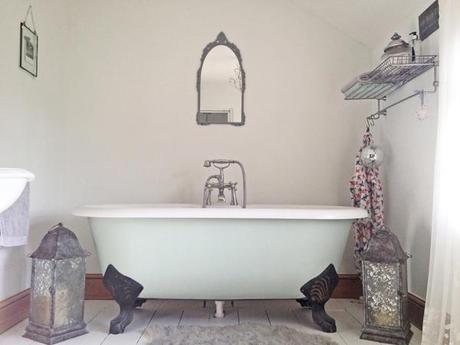
We kept the claw foot tub and rest of the suite but everything else in the room had a big make-over.
The walls were accidentally painted in Crown’s Milk White. (I had meant to pick up Sail White but must have got distracted). It has a very slight green tinge that complements the Laura Ashley Eau de Nil that we used to paint the bath.
The floor was sanded back and then painted with several coats of Ronseal Diamond Floor Paint in Brilliant White. So far, it’s holding up fairly well but I’m not sure how it would fare if it was used in a high traffic room and it was to be walked on in anything other than bare feet or slippers.
With all the white, the room did feel a bit stark to start with and so I added a faux sheepskin rug instead of a bath mat. (We hardly use the bath as we have a power shower).
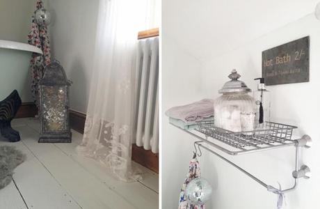
I adore a bit of sparkle and so couldn’t resist hanging one of my glitter balls from the shelf. Depending on the time of the day, you get a lovely light effect across the wall.
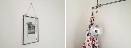
I would still like to add a few more prints to the wall but at the moment I just have a beautiful glass frame with a Washi taped polaroid postcard from my trip to Barcelona.
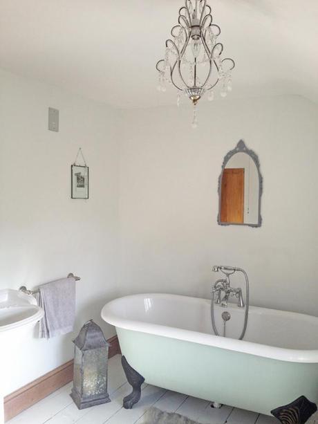
Other additions are two mirrors; one from eBay and one I picked up from the local tip. They were both spray painted gray to complement the bathroom palette. The lanterns were bought originally as wedding decor (suspended from the ceiling in our barn venue) but now have a home on the bathroom floor. Also making its way from our wedding is the three arm candelabra that sits proudly on the top of the loo!
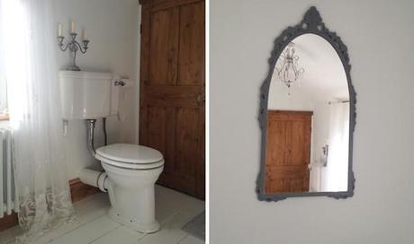
I have always wanted a chandelier in the bathroom, but electrically speaking they can be a bit of a safety nightmare. I found the Grace Pendant on sale in Homebase for next to nothing. As it was a pendant, it didn’t need to be hard wired and thankfully the previous light fitting had been pendant style so there was minimal work required to get it in place.
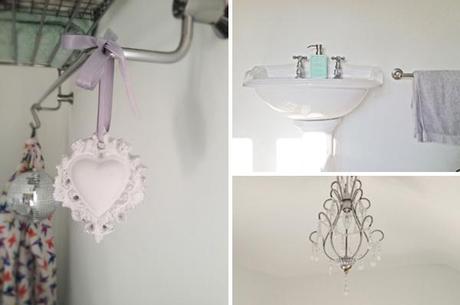
With this glamorous feature, I then opted for a faceted curtain pole, shower pull and cupboard handle to add a little elegance to the room. To top it all off I wanted to add a little bit of lace to soften the room. The H&M lace panels fitted the bill perfectly.
On the shower front we ummed and ahhed about how to tackle the blue tiles that were in place. Even after a lot of research that suggested tiling over previous tiles wasn’t advisable, we still went ahead anyway! We chose subway tiles and applied directly to the previous ones rather than risk removing them and the whole shower enclosure fall to bits!
The final change to the room was made a few weeks ago when Mr C replaced the old rusty radiator with a column style version.
So to finish, here’s the before shots from the week we moved in.
Hope you like.
Lauren x
P.S. You can take a look at the bathroom progress and the moodboard in previous posts
