Pink has had a bad rap over the years. For a long time used in children’s bedrooms and without gumption, many of us now won’t consider using it in our homes. But paint manufacturers and designers alike have shown a renewed interest in this underused color and as such there are mature, sophisticated shades to choose from. Here are some of our favorite schemes we hope resonate with you…
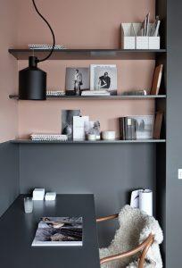
Pairing faded salmon pink with dark greys, or even blacks, helps to ground a space and prevent it looking like your daughter’s bedroom. Try this color pairing with full height walls of each colour, switching it up from the norm with the larger walls in the dark gray and smaller accents in pink.
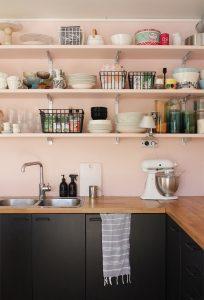
Dusty pinks can be subdued in your room with textural elements; be it furniture, rugs or textiles, you can add depth to your design in surprising ways.
In living spaces, you may use rustic wooden flooring but in kitchens and bathrooms you may opt for marble or textured stone.
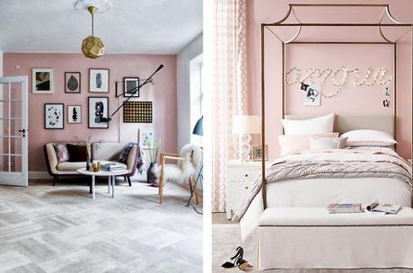
Use pink to highlight the architectural features of the room. Paint the features you like to stand out a bright, matte white and shade around them with a light pink. This look builds great contrast whilst keeping the room light and airy.
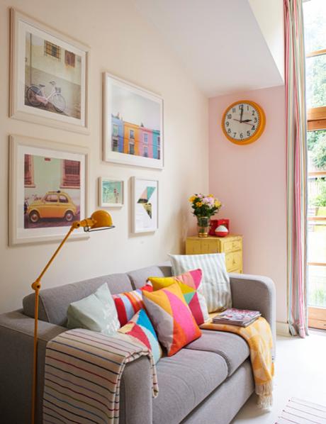
brightbazaarblog
If daring is your middle name then bright, ‘Barbie’ pinks look fantastic against dark navy blues and aqua greens. Use accessories like light fittings, lamps and furniture to break up the look and add dimension.
You might notice that the above colours are very similar to the Pantone colours of the year: Rose Quartz and Serenity. They are! Check out our post on the Colours of the Year for 2016.
Still not sure which shade of pink to go for? Here’s a handy guide to help you out:
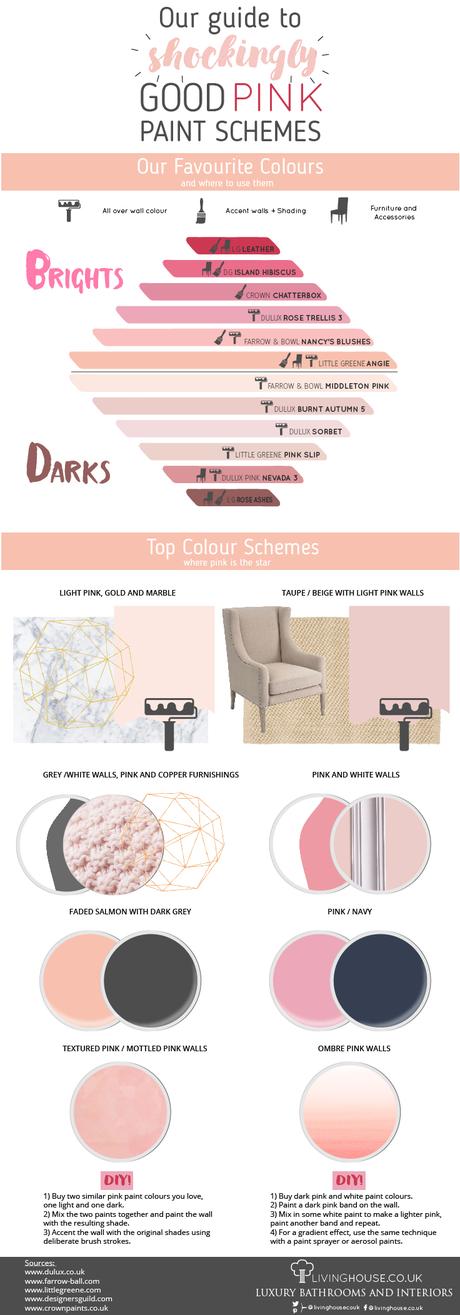
click to enlarge
