Sharon Hockenhull talks us through ‘Embrace’, her latest show garden at RHS Tatton Park Flower Show 2011. Sharon has kindly offered some background into how the design came to be and how one mans words and another’s artistic ability helped to form it.
‘Embrace’ is a garden that captures the unique personality of one of the oldest Hospices in the country. Celebrating its 40th anniversary, St Ann's Hospice is world-renowned for its incredible approach to patient care and treatment. At its core is an overwhelming sense of life; enveloping people that come in contact with positive, healing and therapeutic experiences.’
My approach to designing the garden has been very different to any that I have designed so far. Branding and the charity’s key objectives have been central to developing a brief and theme for the garden, as opposed to the everyday practicalities and needs people tend to demand from a garden space.
As an outsider with no experience of a hospice my first port of call was to understand what St Ann’s is all about. What care it provides, who it cares for and how that care translates to the individuals that go there. I was given lots of information, including annual reports, leaflets, and video stories, to sift through to help me to gain better insight and understanding. It felt like I was back in my old job as a graphic designer. After a while I stumbled across a video on youtube called ‘Why St Ann's Hospice needs your support’, presented by the current Chief Executive Jayne Bessant. There is a gentleman featured in this short film called Kenneth Charles Weston and it was his words that set the seed for the ‘Embrace’ concept. His words are very poignant but it is the simplicity of Kenneth’s experiences with the Hospice that stand out. He describes how he has never felt so much love and affection. In particular, from when he first started going to the hospice, carers hugged him and put their arms around him; he had never had this before.
From here the theme started to take shape in the form of a collection of words, concept words that were very important to the Hospice’s approach to care. Life, healing, hope, reflective, therapeutic, positive, secure, a great sense of life, energy, surprise and forty (this year marks their 40th anniversary) and embrace. The title brings together all these words and evokes the idea of a physical, emotional and spiritual embrace. The garden is aimed at patients as a place to escape. A garden in which to feel secure, to think, relax and reflect.
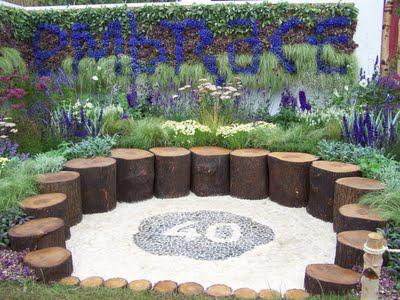
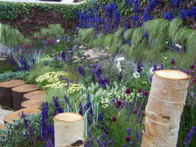
 Embrace is overflowing and abundant with plant life. Closely hugging the curve of the tree trunk seat is a therapeutic band of richly textured specimens with an emphasis on plants possessing medicinal properties and tactile, contrasting foliage. This soft, inner green band gives way to a vibrant scheme, blue hues (reflecting St Ann's brand colour), blue/purple/pink tones, whites and splashes of rich red.
Earth surrounding the central seating is carefully sculpted up from ground level at the front of the exhibit, increasing in height towards the garden's boundaries to create an extra sense of enveloping plant life.
A unique living wall mural adds to the abundance and illustrates how life can thrive in the most unlikely of places. An additional special feature to the mural is lettering picked out using blue lobelia spelling ‘Embrace’. The lettering has been a little experiment and has been designed in conjunction with the Manchester based artist/cartographer Stephen Raw.
Stephen was recently commissioned to create a wall mural for the Hospice, which features a collection of words taken from conversations he had with the patients, the staff, the families etc. This piece of artwork was unknown to me until after I developed the brief; when I discovered the mural I saw a link through the conceptual words to the Embrace garden.
You can see more of Sharon’s experience at Tatton on her blog here and don’t forget to check out the main site for more information.

