Without doubt a well made trailer can give the audience a whole lot more than a poster can. But, the power of an eye catching poster should not be taken lightly. A good poster can not only inform the audience about the cast of the film, but more importantly it can make them curious about the film. A poster can be simple and yet catch the eye of the audience making them interested in the movie. The other most important plus point of having a poster is that it can be easily made accessible to the movie going public. Besides huge hoardings or on the walls, posters can be found in smaller format in numerous magazines. Unlike an audio-visual preview you do not have to be in a special place (TV/Theatre) or perform a special activity (Search the Net) in order to view it. I have always been a huge fan of poster art and I feel that at times it is something that is often left under-appreciated.
So here are just a few posters, mostly new, that I found interesting enough to make me want to watch the movie they were promoting.
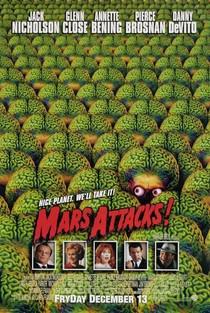
Besides mentioning the stellar cast of the film, what I really loved about the poster was how just the two eyes of the one martian are showing. I also liked the comic book font used to write the tile of the film, Mars Attacks.
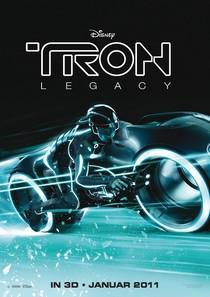
Most of my regular readers would be aware of my fascination with neon lights. This Tron Legacy poster comes only third to the real deal. The second being the visually stunning film. Add to that the fact that it features a must have in my dream list, a light cycle, and we have a must have poster.
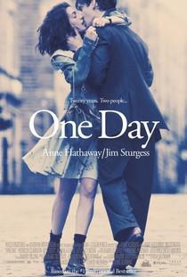
This is probably the newest poster in my list. I haven't read the book the movie is based on, but I am aware of the basic plot line which is about two people meeting on the same date every year for twenty years. What the poster does is capture that in a wonderful way. Two people meeting and kissing, but look how it is as if they are doing this while walking in opposite directions. As if just passing by they decided to kiss each other. There is also the blurry background and the almost sepia like finish to the poster which brings about a certain nostalgia to the whole affair. Lastly, Anne Hathaway is in it... enough said :-)
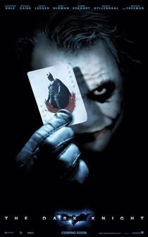
The posters of The Dark Knight were rather popular. Almost all of the ones that people grabbed featured The Joker. Here we have one such poster with the Joker being true to his nature by showing his cockiness. Not only does the joker card now feature Batman, but the Joker's trademark of the red smile is on it as well. What is more interesting is the menacing evil look that Heath Ledger's Joker has in the poster. It's as if he is trying to tell the audience that don't just go by my name because I can be extremely dangerous.
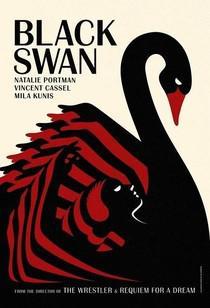
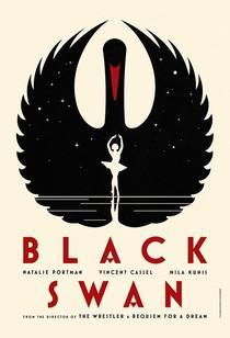
These series of retro and classic styled posters for the movie Black Swan were a welcome change from the posters we are so used to. If you can get your hands on one of these, make sure you frame them and put them up somewhere because they literally are the definition of über chic.

Sometimes a poster can tell a thousand stories. Okay! maybe not a thousand, but a few at least. Take this relatively new poster of an Indian movie. First, the bright colours are something that attracts the audience to give the poster a look. Well that and maybe the fact that majority of poster consist of a scantily dressed woman. There are no actors mentioned. The title of the film is actually a tattoo on the waist of the girl who has smoke coming out of her mouth. There is a man holding a gun on one side and a palm tree at the other end. In the back you can almost see a rave scene of sorts. So for those who are unaware, the movie is about the drug scene in Goa. I am yet to watch the movie, but the movie also has elements of a whodunnit (the man holding a gun in the poster maybe?). So without telling much the poster is able to convey a lot.
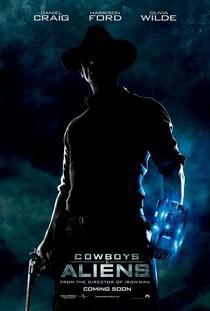
If the title of the movie Cowboys and Aliens is not catchy enough for you, then the poster should at minimum make you want to know more. We have a man (Daniel Craig) in a cowboy hat holding a gun in one hand, but what is prominent in the poster is the brightly lit futuristic gadget in his other hand. To put things mildly... I'm Sold!
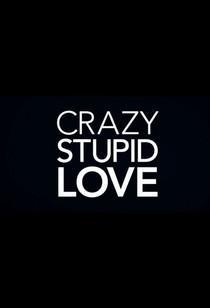
It's as simple as a poster can get. No mention of the star cast. No mention of when the movie will release. No mention of anything but the title of the film. Why? Because the tile is good enough to tell you that the movie will be a sort of romantic comedy. What it also does, for me, is tell me that if the makers can come out with a simple yet weirdly intelligent poster like this, that the movie will definitely be worth a watch.
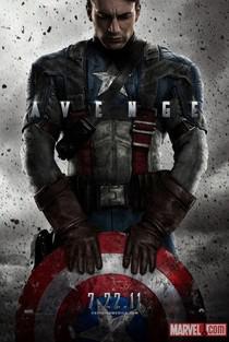
It is all there. The serious look a superhero has. The grainy battle like background. The costume and in this case the shield. What I really liked about this particular poster of Captain America is the word "Avenge" written in the center. Not only is Captain America considered as The First Avenger, but it also works in favour of the Avengers movie coming out hopefully in 2012. Obviously, the people at Marvel are confident enough about their superhero that just having the shield is enough and there is no mention of the character or the movie.
So there, just a small look at posters. In case poster art was something you never paid any attention to, I hope that in the future you do, and when you do, maybe remember this post.
Thank you
Raghav
Location:Gurgaon, India

