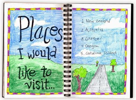
 I used two laws of perspective to help give
this drawing some depth. With distance, similar shapes appear to get
smaller, and colors in general get lighter.
I used two laws of perspective to help give
this drawing some depth. With distance, similar shapes appear to get
smaller, and colors in general get lighter.1. Draw a border around the edge. Add a horizon line about 2/3 down the page. Draw a road and trees that got smaller and smaller.
2. With the lettering, try experimenting with staggered placement to loosen up the look. A journal should be one place where you don’t have to worry about keeping things in straight lines. Trace everything with a black Sharpie, going over the headline letters twice to make them darker.
3. Color in the pages with colored pencils. My favorite are the Prismacolor brand. I used the lightest shade of green for the distance fields, and a darker for the area that is up close. Different shades of blue could be used for the sky too.
