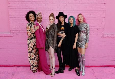
Pandora unveils anticipated global brand relaunch. To coincide with the release of its Autumn 2019 collection, Pandora unveiled its new brand positioning worldwide with a range of activations, partnerships and a new visual identity. The company wide transformation aims to empower people around the world to voice, share and celebrate their loves.
Taking from extensive consumer insights showing jewelry to be an expression of your identity, the brand has been turning Downtown Los Angeles pink since 28 August and curating a stage for sharing stories. The color pink is a key part of Pandora’s world and is being amplified to represent the brand’s and consumers’ playful, inclusive, personal, fearless, creative and empowered attitude.
As part of its activations to mark its re-launch, Pandora invited graffiti artist C. Finley to lead a collective of six female graffiti artists to curate a landmark mural interpreting their own loves. Pandora’s Street of Loves, located at 1239 South Grand Avenue, is open to the public after the event.
Alongside the event in Los Angeles and other global activation’s, the innovative, hand-finished Autumn 2019 collection brings new ways to wear and collect jewelry in the shape of the Pandora O Pendant. Inspired by iconic elements of Pandora’s design language, the circular symbol represents the unifying power of jewelry and its limitless personal expressions.

Pandora unveils anticipated global brand relaunch
By taking a new approach to charms and collectability, the looped pendant holds adornments that can be changed at the click of a lock — and can be attached not only to necklaces, but also to bags, belt loops, shoes and more for new ways to express personal style.
But it’s not just jewelry that marks this exciting new shift. Reinterpreting Pandora for a changing audience, the brand’s expression and visual identity are also changing, repositioning Pandora to encompass unique, personal stories and customer experiences.
The soft, uppercase logo is replaced by a sleek, minimalist word mark, retaining its black color with bold, symmetrical sans-serif letters. The Pandora crown O also features as an updated, standalone emblem of the brand. Marking the first new logo design for Pandora since its launch in 1982, the new visual identity will appear across all Pandora channels, as well as advertising campaigns together with Pandora’s updated nomenclature in a fresh, modern tone.
“Balancing our legacy with modernity, we continue to craft meaningful, high-quality jewelry with purpose, allowing people to wear it to show the things they love and the stories of who they are in a more personal, experiential context,” says Stephen Fairchild, Chief Creative & Brand Officer at Pandora. “Collaborations with global franchises, celebrities and influencers will also underpin our repositioning,” he adds.
Pandora unveils anticipated global brand relaunch
“We’re excited to reveal our brand repositioning and new collection at our event in Los Angeles. We’re committed to creating jewelry pieces that allow women to express the different facets of their personality, not only as keepsakes of life moments but also as expressions of the things they love and who they are, uniting women across cultures, communities and experiences,” says Vita Clausen, Global PR Director at Pandora.

