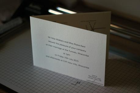
Coming soon to Artemis Stationery is a new design where things are kept perfectly simple. Eschewing the traditional cover design in favour of putting the invitation text front and centre in the style of a traditional printed invitation. This allows for a multitude of looks, not just the traditional. It’s simplicity lets it show off practically any style to match your wedding simply by changing the font. As well as a traditional look using a classic serif font it could also be modern and minimalist by keeping things spacious and using a modern clean font. It can also show off beautiful elegant fonts. We could even bring a bit of a background if you want to make a rustic, vintage or a shabby chic looking invitation. Keeping it simple though does show off the quality of the card I use and the hand crafted finish of the invitation.
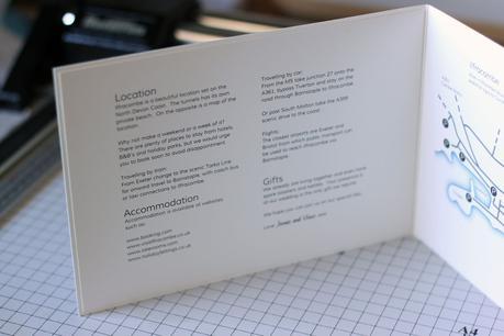
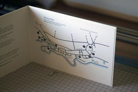
 information on the inside of the invitation By having the invitation text on what for many types of invitations I make is the front cover there is more space for information through out the rest of the invite. Seen here is a full page map along with accommodation information.
You can see some of the fonts you could use here on the Artemis Stationery website.

Although at the time of writing I only have one sample design of a large bifold invitation made and photographed any item from this collection can be ordered. Pricing will be the same as the Genoa and Padua collections unless there is a printed background. Just contact me Nathan at artemisstationery.co.uk to order or for more information.

