by The Big Sister
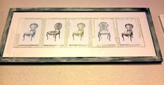
We've lived in our house for four years or so now and most of the walls remain white. I'm slowly bringing life to our home but it's much scarier then some may think. I blame my overly active brain - it brings a lot of ideas and design to the table but my ideas don't often mesh together.
Does anyone else suffer from an interior design identity crisis? Do you change your interior design style as often as you change your socks? Do you mix styles that only "a mother could love"?
....random thought------------------->>> Have you ever seen the movie Cry Baby ? The above picture has always reminded me of the character "Hatchet Face".
...and back to business... I always wanted to go to school for interior design (what's stopping me? ...excuses) and I'd imagine I break every rule every second of the day. There is a serious "Sybil" design crisis happening here.
So... my latest design "warm and fuzzy" is in the rustic / chic / modern / eclectic / warm / upcycled - FaMiLy. What does that mean? No clue.As much as I love to post "new" content and ideas that are all mine.... I must give credit where credit is due! I have a few shout outs today as I share my latest kitchen wall update.
I think most of you are familiar with The Graphics Fairy. I've used her amazing graphics for many occasions so I knew it would be a great starting point for some inspiration. I googled my tail off trying to find ideas for inexpensive printable DIY art. I stumbled upon Twigs and Twirls' great use of the Graphics Fairy Dress Forms and fell in love! I searched TGF's site looking for anything that could relate to my current style needs and I came up with ....
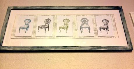
Chairs (by Graphics Fairy: Vintage Clip art French Chairs, Vintage Clip Art - Pretty Paris Tufted Chairs, Vintage clip art - Frenchy Chairs).
I took some serious inspiration from Twigs and Twirls Dress Form Wall Art (thank you!!)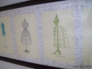
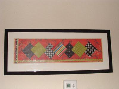
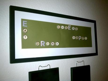
Did you know they started out looking like this?!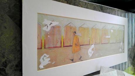
So, the latest modifications..
- Dry brushed the black frame to give it a more worn beachy look
- The background consists of old book pages
- Free printable chair graphics printed from The Graphics Fairy (cut and taped in the middle of the book pages)
- The End
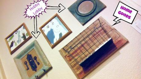
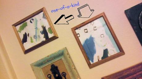
Art created by my niece, Karsyn
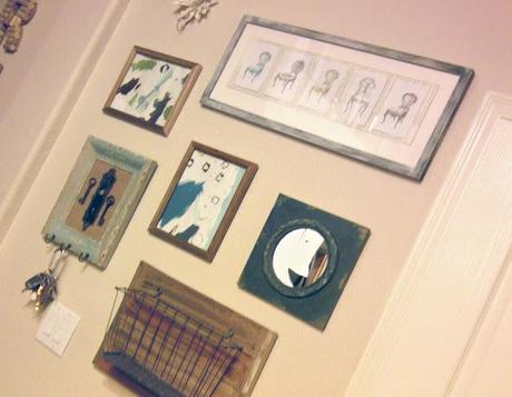
Thank you A Girl and a Glue Gun for your photo editing alternatives to Picnik now that it has shut its doors to us. I took her recommendations and used PicMonkey in today's Post. I don't mind it so far :)
Thanks for reading!!
