I love colour. LOVE IT, I tell you. Colour has the power to make us feel; be it happiness, passion, envy or calm. Colour lifts our spirits when we are down and relaxes us when we are tense. Colour gives depth, vitality and life to the every day, and if you’re not a fan of it, I’m really not sure we can be friends. Sorry.
Some of my favourite weddings are those that are not only full of colour, but have really nailed a colour scheme. And by that I don’t mean choosing hot pink waistcoats to match the hot pink bridesmaids, hot pink chair sashes, hot pink flowers and hot pink balloons. Quite the opposite in fact. I believe that some of the most stylish and creative weddings are those that manage to tell a story and evoke a mood through the use of a carefully curated palette of colour.
Take this image below:
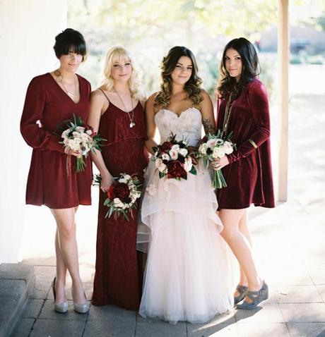
Image by Troy Grover via Green Wedding Shoes
Not only are the maids in velvet C-U-T-E, but this stylish little bridal party is rocking a colour scheme that isn’t exactly unusual, but is so perfectly curated I had to go back and study the wedding in full. The scheme consists of two lead colours of burgundy and pale pink. Then there is a ‘supporting cast’ of green (from the foliage), ivory, bluey-grey and the warmth and richness of natural wood. This palette is ever-present throughout every aspect of the wedding and the result is something that is feminine without being sugar-sweet, elegant without being stuffy, and stylish without being contrived.
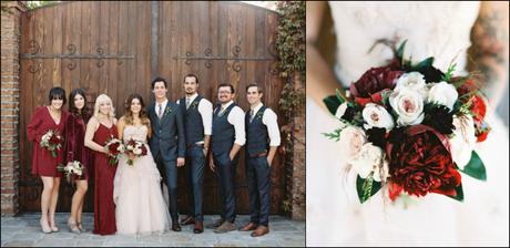
Image by Troy Grover via Green Wedding Shoes
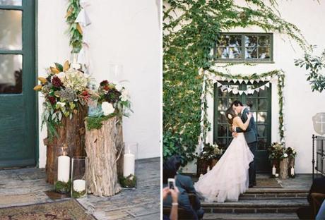
Image by Troy Grover via Green Wedding Shoes
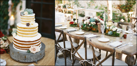
Image by Troy Grover via Green Wedding Shoes
It’s a beaut of a wedding.
“We didn’t have a particular colour scheme…”
I see this phrase time and time again when doing my daily blog check, and I have to admit, it’s one of my biggest bug bears. A bit like a wedding theme, I know that having a colour scheme can evoke negative connotations amongst some. But there is really nothing wrong with having a colour scheme. Colour schemes don’t have to be dated or restrictive. They can be as big or as small as you like; as random or as specific as you and your partner wish it to be. But whether your wedding is an explosion of colour or more muted and natural, I would argue that there is always a scheme of sorts, even if it’s not particularly obvious.
Take this Swedish wedding also featured on Green Wedding Shoes:
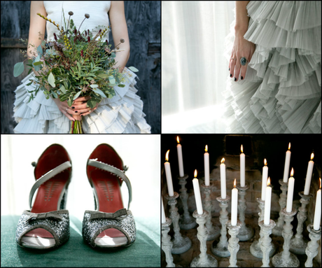
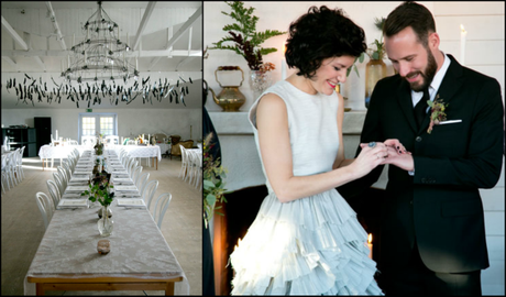
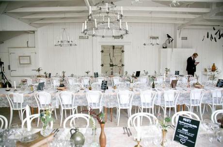
Images by Frida Iveskar via Green Wedding Shoes
At first glance there’s no colour scheme as such, it’s all very white and pale. But look closer and the silvery tones start to come through; of light grey and the palest blue as seen in her dress, her ring, her shoes. It’s a very ‘cool’ look overall- a colour scheme in itself- and to avoid this looking too ‘icy’ there are hints of natural, rustic warmth coming from the greenery and the vessels that are primarily gold and clay in colour. And then there are shots of black from his suit, the blackboards, and that evocative feather installation. It’s a complex scheme with a very simple overall effect, and I have no doubt that the couple made very deliberate design choices throughout their planning. It’s another beaut of a wedding that positively sings with style, originality and a distinctive (if subtle) colour scheme.
Choosing A Colour Scheme
Ok, so deciding on a colour scheme at the start of your wedding planning can be difficult, particularly if you’re not terribly creative or if you haven’t been thinking about your future wedding since you were in the womb. I think many couples start with a favourite colour, but that’s not always the key. My advice would always be to start with a mood. What kind of wedding do you want? If ‘relaxed’ and ‘fun’ are key words, then a combination of warm brights will work well. If ‘elegance’ and ‘class’ is more your bag, then a more muted palette will probably suit.
Next, take a look at your surroundings. Where is the wedding being held? Are you in a modern, white space? Are you going to be surrounded by natural, rustic materials? Or is a sumptuous, traditional banquet hall your backdrop? Think about the main spaces you will occupy throughout the day- from ceremony and mingling to dinner and dancing- and think about what colours will work within those surroundings. Do you want your colour scheme to ‘pop’ and ‘contradict’? Or ‘blend’ and ‘enhance’? Looking through a portfolio of previous weddings held at your venue (or similar) will help you determine which colour schemes get you excited and which very much don’t.
Finally pick a lead colour or two- those which you want to put your bridesmaids in perhaps, or be in your bouquet- and then think about the ‘supporting cast’ of tones and materials that will appear throughout. Rustic weddings in particular are full of natural colour, be it from the warmth of wood, the blue of the sea or the greenery of trees and foliage. These natural tones are just as important as the lead colours in the curation of a strong and consistent colour scheme.
When designing weddings for my clients, the colour scheme is one of the first things I like to tackle, and I do this by creating or sourcing a visual reference to work from. It helps to set the mood and dictates the design choices that are made as the planning progresses. Below are two colour palette references for two very different weddings that are taking place this August. The first is full of warm, summery brights to give a modern sports hall fun, vitality and life. The second is for a wedding taking place in a woodland setting. This palette is taking a leaf (boom boom) from it’s natural surroundings with lots of muted greens and blues, but there are also pops of purple and peach to add fun and warmth.
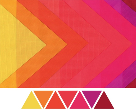
Palette 1
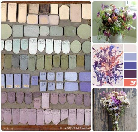
Palette 2
I’m very much looking forward to showing you how these colour schemes will be brought to life later in the year…
My final word of advice for nailing a colour scheme is to roll with it and not be too restrictive. A visual palette like the two above are merely guiding references. For many of us, the planning process will last anything from 6 months to 18, and in this time your tastes will very likely change. Whilst I wouldn’t want you to do a complete u-turn two months before your wedding date, your colour scheme will naturally evolve and that’s ok.
When I started planning my wedding way back in January 2012 (was it really that long ago?), coral and pink were my two lead colours. But as the planning progressed and my theme evolved in to some sort of Kate Spade-meets-boho glam Mexican fiesta, my palette began to broaden. Halfway through the process I decided I wanted yellow in there too, and flashes of red. At one point I considered adding splashes of light blue, but it wasn’t until the final months that burgundy entered the fray. A shot of grown-up elegance, I think, amongst a party palette of spicy brights.
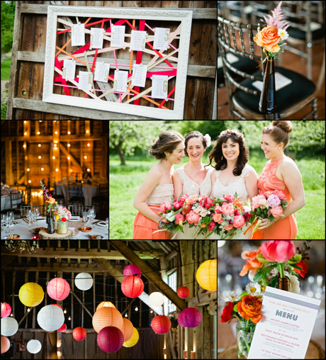
Images by Dominique Bader
When our day was featured on Rock My Wedding, the post received some amazing comments (which I will fully admit to going back and reading every time I need a bit of a lift), but the comments on colour were the ones that really resonated with me. I remember one person loving how all the colours came together and were prevalent throughout the entire wedding. Another applauded my ‘brave’ choice of spicy tones in a wedding world of dusky pinks. And in my rambling, roundabout way, I think that’s the key to nailing a colour scheme (and yes, I am totally inferring that I nailed it, I make no apologies for this extraordinary bout of arrogance): confidence and consistency.
And now it’s over to you. I’d love to know your wedding colours- past, present or future. Is your palette big or small? Random and vast or very specific? Do you agree with me that every wedding has to have some sort of loose scheme, or have I got it all wrong? I’m off work and in desperate need of social interaction so do pop on and give your tuppence worth…
Sama xxx
