The churchyard in Hawarden, North Wales, has many interesting graves including one with Crimean War connections. A more humble example caught my eye as well, for rather different reasons.

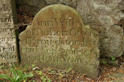
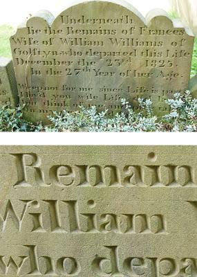
The deeply-cut lettering on this small gravestone helped ensure that it is still sharply legible, more than two centuries after the death of Ann Owen in 1793. What also survives, though, are the guidelines which the mason used to keep his lettering straight and even. I haven't noticed such clear examples on other gravestones - even ones in the same churchyard and from the same period - so I wonder whether it was an early attempt by an apprentice. (Another stone from 1825, for example, also had guidelines but they are only visible on close inspection.)

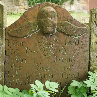
Where such lines were not used, however, chaos could result!

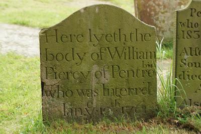
A lack of experience might also explain the way the word 'interrd' has run over two lines. It is by no means the only gravestone to include such a mistake, though. Poor William Piercy nearly got only half of his home town.

For more contemporary lettering, visit the Victoria and Albert Museum between 14-19 September 2013. As part of the London Design Festival, Type Tasting has an exhibition of creative typography which includes a ghost sign-themed contribution from Sam Roberts of Ghostsigns. His piece and others complete the phrase "London =". You can even contribute your own answer at one of the drop-in workshops.

