TAKEAWAY: In Australia, it is a new look for The Sun-Herald, a part of Australians’ Sunday routine. Is this new look appealing to a more upscale Sunday reader? Looks that way. What are the readers saying? As usual, some like it, some don’t. As for me: I like it a lot.
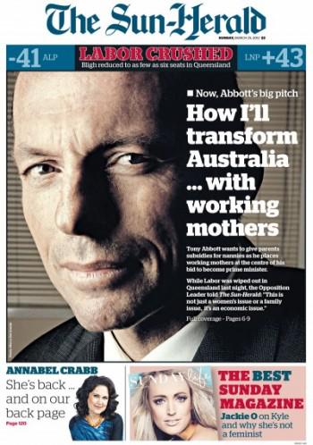
Front page of the new The Sun-Herald: more sophisticated than the previous look for this Sunday newspaper
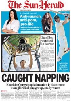
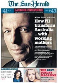
Old and new front pages of The Sun-Herald, showing a distinct contrast, as if the newspaper reinvents itself for a more upscale audience?
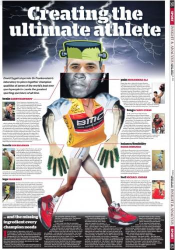
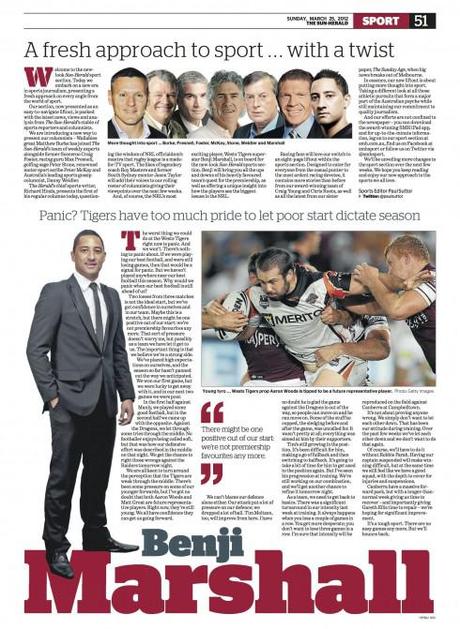
The new sports section: readers like it that it can be lifted out separately, always a plus for sports and others sections. This is value added
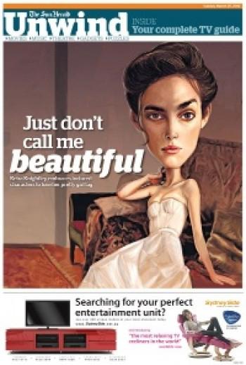
New Unwind section: very much like a magazine in look and content offerings
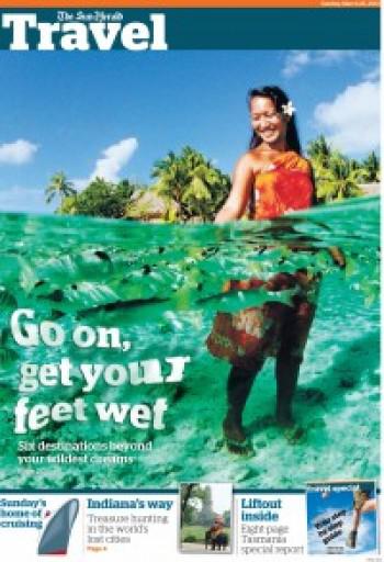
Travel section displays large images, colorful pages
It is a new look for the The Sun-Herald in Australia.
I had the pleasure of meeting with Matt Martel, managing editor, presentation, The Sydney Morning Herald and The Sun-Herald, and his team when I visited Sydney at the end of 2011, and they showed me the prototypes of how the project was shaping up. Matt worked with Steve Salmon and a team of graphic designers.
Now a happy surprise in the mail: the full project now as it has launched on March 24.
The Sun-Herald is the Sunday tab edition of the Sydney Morning Herald. It has a circulation of 406,470.
The front page is elegant, showing us how a tabloid can combine the spirit of a newspaper with navigation to the inside, but also display photography and type in an elegant way.
And, although I do not know this to be a fact, it is obvious that the editors and management of The Sun-Herald are making a deliberate attempt here to appeal to a more upscale and sophisticated audience.
Appealing to a higher level readership?
As I always mention, all it takes is 10 seconds for anyone——not just editors and designers——to evaluate and to reach conclusions as to who a publication appeals to. The new front page of The Sun-Herald is as distant from its previous self as Sydney is from Melbourne, or is it Auckland? While the old front page distilled the old vestiges of the down market tab that screams and grabs the reader by the neck, the new front page, at least the one shown here for their premiere edition, is one that is more an invitation to “lean back” with a glass of Mimosa, heavier on the bubblies than the orange juice. It invites. It seduces, and it says, we are like you, we want to be invited to your home. Read me. Use me. Come back to me next Sunday.
The navigator boxes at the bottom of the page are perhaps a salute to the more down market style, shaking hands with the past, for old times’ sake.
Inside, The Sun Herald is organized, and full of surprises. I liked the page about the perfect athlete—-playful. Photo illustrations abound, and visual storytelling ranks a 10 here.
Inside pages are also crisp, with an orderly five-column format, and a happy combination of big and bold headlines with more subtle typographic touches for secondary readings, page headers and captions.
Not a lot of bells and whistles, just systematic good use of storytelling techniques, photos and the rest.
Congrats, guys Down Under. Good job.
Now, tell me: did you really wish to go for that couple in their early 40s enjoying a Mimosa Sunday morning before going out for a ride in their Porsche Cayman?
I bet you did!
Presentation Editor Matt Martel talks about type choices: Prensa, Stag, Benton
Here is a page showing the various fonts chosen
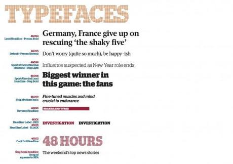
Take a look at the final type choices for The Sun-Herald
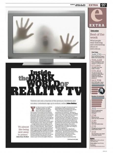
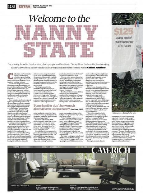
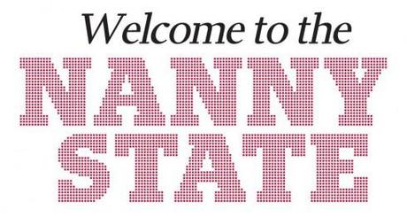
Prensa italic and Stag dot (a fun one this Stag dot!)
I asked Matt Martel some specific questions about his type choices for the new look of The Sun-Herald. Here are his remarks, via email:
“We messed around with A LOT of fonts. As I mentioned to you when you were in Sydney, we wanted to move the paper upmarket. Originally I thought we would end up looking like The Independent in London or one of the Spanish papers.
“‘On fonts, we needed the ability to have lots of weight variation so that within the same paper we could have everything from quite classical elegance through to colourful, expressive and bold design.
“The big non-traditional choice for us was The Stag family from Christian Schwartz. We particularly love the dot bold font and it is nice to see it used in a newspaper. The serif version is used extensively. After toying with lots of headline fonts, we eventually got serious with Prensa from Font Bureau for standard headlines, though we are using a lot less of it than I expected. We’ve also changed the body type to Benton Modern from FB. (I was worried about reader reaction to this but there has been none.)
“I really wanted to use Volupia from Dino Don Santos, but I just couldn’t find a home for it.
Reader reaction according to Martel
Matt says that the response to the first edition has been really great. “We changed around the way our weekly TV listings work and we’ve had some criticism for that, but the design has sailed through with largely positive response,” he said.
“We also changed the masthead colour from red to dark blue. We tried some different mastheads, but our reader research came back with them saying readers did not really mind the masthead. The blue is a big and expensive step for us, but one that our published, Peter Fray, and marketing director, Robert Whitehead, thought it was important to make,” he said.
One interesting observation from Matt about reader reaction, or NO reaction:
There was no internal resistance at all to changing the masthead if the research said readers thought it would change their impression of the paper. it would have meant a big spend over several years to change many newsagents windows, though, so it had to be worth doing.
To my knowledge, we haven’t had any negative feedback on the masthead and no one has said we made the body type smaller, thankfully.
Of related interest: what the readers said
“We ended up changing every single element of the paper, from the masthead right through to the weather map. There are new sections, more pages and what is meant to be a really strongly visual approach to telling stories,” Matt writes me.
That is a lot of change, and it is obvious, as stated above. So, what was the reaction of the readers to this first effort?
It is as much a part of a redesign as the panic and cold feet of editors 72 hours before the launch, the fear of that change in the logo (please tell me it isn’t so!), or the toast with champagne or something heavier that follows when those first copies of the new and improved newspaper come off the press.
It’s the harsh reaction of those readers who hated all that we did.
Unfortunately, they are the ones who call, write, and show up at the newspaper’s front door. The ones who loved it smile, and sip another cup of expresso.
Apparently, it has been business as usual for the The Sun-Herald after its first edition with new look last Sunday, based on this column by Judy Prisk.
But, as you would imagine, many readers also liked what they saw in their newly improved newspaper:
“Many readers were delighted sport is now a liftout.“
What is the editor/designer to do when faced with these complaints?
IN my experience, most of the complaints go away quickly. We must continue to pay attention to those complaints that persist.
And, by the way, no matter what you do with body text, many readers will call and complain that the type is just too small and they cannot read it anymore.
Nowadays, however, if we were going to be truly cruel about this, we could send them to read the newspaper on their iPad, where they increase the size of type by a pinch of their fingers.
No, not really, I am only joking. Maybe not? Satisfaction across platforms may be a customer strategy for the future.
Who is who in the team
On the editorial side, the core team on the project were Matt Martel, Sun-Herald art director Steve Salmon, publisher Peter Fray, editor Rick Feneley, deputy Nadia Jamal, project director Stefan Savva and project manager Lisa Garner.
Of related interest:
http://mumbrella.com.au/sun-herald-reverses-2010-redesign-and-says-goodbye-to-yellow-81071
http://mumbrella.com.au/sun-herald-reverses-2010-redesign-and-says-goodbye-to-yellow-81071
http://apple.copydesk.org/2012/03/27/sun-herald-tabloid-of-sydney-australia-redesigns/
One of the TV advertisements is at
https://www.facebook.com/photo.php?v=370110159687731
New website for Dagens Nyheter in Sweden
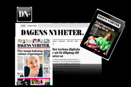
And, in a development that reminds us what has happened at The Boston Globe, where they created a website for the newspaper’s content, while retaining the popular portal, boston.com, the Swedish daily
Dagens Nyheter launched a new web site , dagensnyheter.se, on which they will publish all the contents from its printed edition, to be paid for, of course. A subscriber to the DN will get both the print and online editions, and, by paying an additional 29SEK per month, also get access to the iPad edition.
At the same time, DN will also retain its dn.se existing website and puclish free stories on it as they do currently.

