 A weekly blog series exploring different creatives view on color and its use in interiors, art and design. We will dive deep into their obsessions with color. How and why they use color. You will get to know their stories and you may even gather some tips for using color in your own home. What is better than learning from the experts!
 Hue Are You?
Designer Spotlight: Meredith Heron
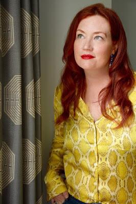
Ever met a redhead that is full of life, confidence and verve. Well of course but you have never met this redhead who is a bold and fearless with her color palette and its use in interiors. I don't mean crazy wild with color but calculatingly bold. She is Meredith Heron from Meredith Heron Design in Toronto Canada. Both a renown designer and a past host of an HGTV design show, Meredith pours her passion into every design project whether she is working in NYC, Naples, a lakehouse or a ski chalet. I can't wait to hear how she works her magic with color so here it goes .....
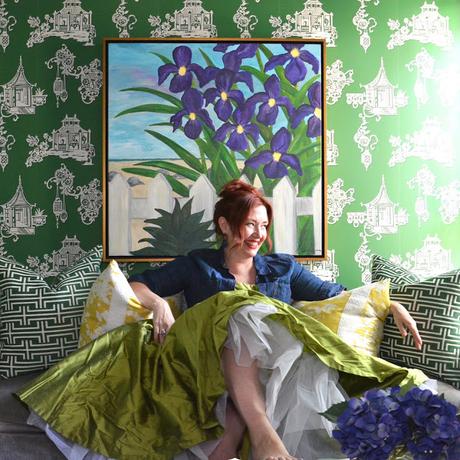
Susan Jamieson: What one color represents your design style?
Meredith Heron: WOW! Tough, tough, tough answer to give. I had to ask my team and they are a bit stumped too because I embrace color so fervently in our work.
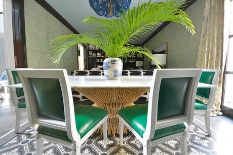
Indigo is my go to Neutral because it is universally flattering. I also use adeep Mallard Green (which has a ton of blue in it) as my other MUST usecolour. I painted my husband’s office in this rich hue and am about to do ahigh gloss kitchen in it. I look best in jewel tones so I tend to design aroundthese - does that make me incredibly vain or do I play to my strengths atwork and in fashion? On the flip side, I am pretty passionate about certainpastels. I love a Smoky Iris - not blue, not grey, not mauve but a healthy mixof all three. And I use certain shades of blush as a power color - againuniversally flattering, paint it on a ceiling and BAM you don’t need that plastic surgeon just yet.
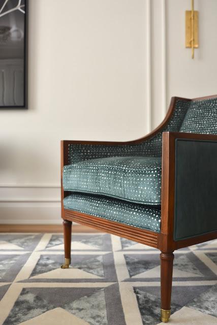
" I SEE MYSELF AS A STORYTELLER, CLIENTS HIRE ME TO WRITE THEIR BIOGRAPHY BUT NOT WITH A PEN BUT RATHER I WEAVE THEIR STORY THROUGHOUT THEIR HOME "
- MEREDITH HERON
SJ: Do you use color as a dominant role in your designs or as an accent?
MH: I’m known for using color - a lot of color but I’m judicious in it’sapplication/allocation. I love for example, to use color on my custommillwork, especially in a high gloss lacquer and I routinely paint the roomout to match the color of the millwork to make the room feel bigger - tricksthe eye when you don’t see stops and starts. I also use bold colour/patternedmarble on as many surfaces as a client will let me. Wallpaper too is usually astatement making aspect of a room’s design in my world and fabrics all havecolour and pattern in abundance. However, many of our rooms are palerwalls with colourful fabrics or my custom area rugs. Artwork too is oftenwhere we bring a huge dollop of color. So I don’t think I use it as an accentper se because our color choices are very deliberate and bold but they don’tnecessarily hit you over the head as soon as you walk into the space. I reallyenjoy designing rooms that reveal themselves to you, layer by layer eachtime you visit. You get more from the subsequent visits… love a room with afew secrets too.
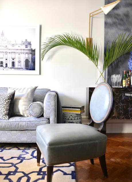
SJ: How do you feel about matching colors in a room?MH: I am a woman and a designer with many opinions that I’m not afraid to share and one of these is that I am religiously opposed to Matchy Matchy. I go out of my way to purposefully and skillfully UN-match colours in a room. Theyrelate, they have to, but if all the shades of green in the room are the same,the room feels fake, forced and well amateur. Nuancing a color palette inthe room is a lot like nature. If you look out your window you’ll seehundreds of variations of green and they all work together. Knowing whichones to combine in a room together and how that combination will play outas your eye drinks in the room is a skill. I have it. I also go out of my way toinclude what I call “Some Ugly” in a room. Again, it’s a tactical decision tobreak up a space that looks too perfect, too in unison - I want some tension.That’s what makes a space feel lived in and fully appreciated.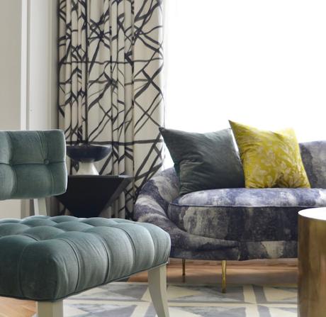
" MY POINT OF VIEW AS A DESIGNER IS THAT OF A STRONG FEMININE - IT IS MAXIMAL. MORE IS ALWAYS MORE. "
- MEREDITH HERON
SJ: What color represents your personality?
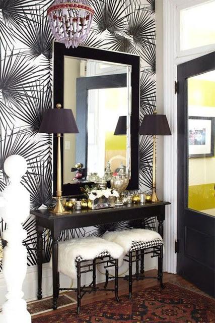
MH: I’m a redhead - you want me to just pick one? If I wear Cobalt or Emeraldgreen I am stopped in the street by strangers to comment on how striking myoutfit is. I’ve also learned to embrace that I look good in an Acidic Citrinetoo - I always thought any variation of yellow was verboten for me but I wasproved wrong. Same with Fuchsia. I tend to prefer cooler hues though. Myliving room used to be accented with Pomegranate and Blush but it was toowarm for me so I switched it to Smoky Iris, Citrine and a deep mossy greenwith cobalt lamp shades in my foyer and that feels decidedly more like me.
SJ: What color comes to mind when you talk about: Your Favorite City .........
The House You Grew Up In .........MH: I moved A LOT as a kid but I always remember this Palm Frond Wallpapermy mom had in our kitchen. It was mossy green on white. Ironically I have aPalmetto Palm wallpaper in my foyer in black on white that is SO much likethis paper my mom had. You do become your mother it would seem.

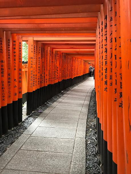
The Last Fabulous Dinner You Had ...........MH: We had the best meal of our lives in Hakone, Japan at Nobu. I mean it wasmind blowing. I think of a Japanese Maple Leaves - that burnt red. Wearrived in the middle of a typhoon and when we left, the rain had stoppedand the trees were all lit up. It also reminds me of Tuna Sashimi -OBSESSED.
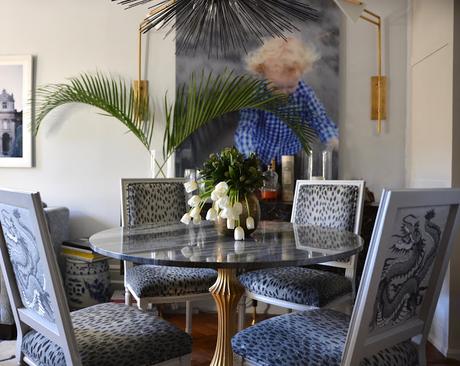
Your Favorite Flower .............MH: Lilies are my favorite flower for their smell and I love to include them inclient reveals because the scent is so evocative and happy to me. I prefer thecitrine ones that are a white/yellow/green ombre. Your Favorite Season .............MH: I used to think Fall was my favorite time but it may now be spring. I lovewhen the deep violet Irises come up on our lawn or my clematis comes backto life. I’m so proud that I have enabled the clematis to thrive and each yearwhen it comes back I’m so proud. Your Favorite Piece of Art ...........MH: My husband and I both are photographers and we travel a lot so for sure our own photos are my faves - we have a huge photo of our son Luke when hewas 3 blown up in our dining room. It’s a shot I took when he was in theAtlantic Ocean and all you can see is his white blonde curls and this cobaltblue plaid shirt he had on which stands out against the gray sand and therushing water of the ocean.
" AT MEREDITH HERON DESIGN WE CONSPIRE TO EXCEED EXPECTATION "
- MEREDITH HERON
Your Favorite Room in a Home .........
MH: I never have a fave room going in to a project. To me the favorite roomreveals itself to me at the end of a project - kind of the way you know whichwall feels right to have your bed against. As for having a favorite project/room that we’ve done - that’s like picking which kid you love the most. I’malways thrilled with Navy or Deep Green rooms though. If you want a deepsaturated room design, I’m your girl. Your Favorite Beauty Product ............MH: I have this miracle mineral spray exfoliator that literally removes your faceand gives you baby fresh skin (I’m not using it at the moment because I justreturned from Mexico and I have a tan that I’m trying to keep!). It’s in aparchment and charcoal package. Love that combo. So chic. I’m not givingaway the brand, I don’t want it to sell out. HA!

Your Favorite Article of Clothing ...........MH: Now you want the Sophie’s Choice of clothes? I love blue denim is aparticular medium -dark finish. Not too dark, not too light. I know it when Isee it.
SJ: Name a Color You Never Use?
MH: Anything Tan. If you have a yellowy-beige undertone, GO AWAY SATAN!SJ: Name a Color You Use Frequently?
MH: My living room is painted Benjamin Moore Full Moon, We use a lot of White Dove OC-17 oh and I love SOOT also from Benjamin Moore.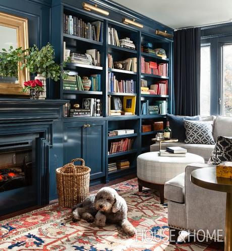
SJ: If You Could Pick a Name for a Color What Would It Be?
MH: You’d think I’d be good at this but I always relate colours to somethingeasily identifiable and I’m not very pithy about it. Mallard Green speaks tome because I can see the feathers of the duck and know that that is the greenI’m after. Maybe I’d be better at this if I had a drink.SJ: Do You Have a Pet? What Color Reminds You of Him/Her? Do You Havea Nickname For This Pet?MH: Currently Pet Free and rather happy about it however, I used to have tworedhead cats Dave and Lil Red. They were orange tabbies and they were theBEST! They sort of looked like they were white but had rubbed themselvesin Cheezies (they were both huge fans of Cheezies too I mean I think,hypothetically - who would feed their cats Cheezies after all?)
"REPETITION, WHILE ESSENTIAL AS A DESIGN ELEMENT, CAN QUICKLY MAKE A DESIGNER BECOME PREDICTABLE. I WOULD HATE TO BE PREDICTABLE. "
- MEREDITH HERON
SJ: What is The Now Neutral?MH: Navy or Blush are power neutrals - Strong Feminine is sexy.
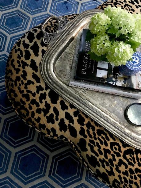
SJ: What is Your Prediction for the Next Big Color Trend?MH: I see that fabric companies are trying to bring back sand/gold/beige and spa blue/jade green and I’m decidedly NOT a fan of this. I’m sticking with myfavourite rich saturated hues and their tonal variations. I think as far astrends go though, painting out all trim and millwork to match the walls is ontrend vs contrasting. It’s a great tip if you are on a budget and don’t have themoney to replace casing and millwork to something more Wow. Make itdisappear and use an interesting color to do so.I’m SICK of seeing white on white on white with a little gray or walnutthrown in. So bloody dull and without merit.
SJ: What Are the Best Color Combinations?MH: The best color combinations are the ones that move your eye around aroom and help to tell the story. I’m a professional story teller. My mediumhappens to be interiors. Finding the touchstone moments in a room and usingthese to generate that story and highlight/feature the personal vs contrivedfocal points really speak to me. I love connecting rooms through repetitionof color too. A wall color in one room becomes a major furniture piece’sground in the next and so on. It feels thoughtful. The colours themselvescome out of this. I choose the wall colours at the very end when I’m beingpressured to commit. Until then, I’m constantly revising and editing thedesign to improve the story.
SJ: Best Advise When It Comes to Picking Paint Colors?MH: • Paint should be picked last.• Don’t decorate around a $40 can of paint - changing the wall color isn’tgoing to make your tired, outdated and ugly sofa suddenly look better.Change the sofa and then pick your paint.• If you are on a budget pick one color and paint everything that colour,put your sofa in that color reduce contrast.• If you are going to go for a more dramatic colour, stay away from vividcolours and opt for your blue but look at more saturated or greyedversion of it.• Pink and Yellow get 20% brighter on the wall so look at whites that havea hint of the hue you are after…• Never let your child choose their paint color outright - let themparticipate give them a choice but you preselect the choices and let themchoose from there. Barbie Pink IS NEVER A GOOD CHOICE nor isSUPERMAN BLUE for walls.
________________________________________________________________
