 A weekly blog series exploring different creatives' views on color and its use in interiors, art and design. We will dive deep into their obsessions with color. How and why they use color. You will get to know their stories and you may even gather some tips for using color in your own home. What is better than learning from the experts!
_______________________________________________________________
Hue Are You?
Designer Spotlight: Libby Langdon
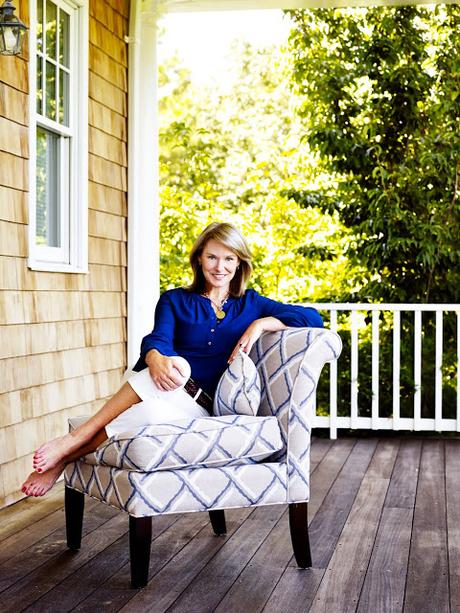
Libby Langdon is an interior designer, author, product designer and makeover television personality, as well as the creative force behind New York City-based design firm, Libby Interiors, Inc. She is fast becoming known for her growing collections of branded home furnishings for Crystorama Lighting, outdoor furniture for North Cape and indoor/ outdoor rugs for KAS rugs. Libby’s interior designs and home products have been featured in leading shelter magazines: Architectural Digest, Traditional Home, House Beautiful, Better Homes and Gardens, Hampton’s Cottages and Gardens and is a contributing editor to House Beautiful magazine. Langdon has been a regular makeover design expert on NBC’s TODAY Show, HGTV’s Small Space - Big Style, The View, The Rachael Ray Show, FOX’s Design Invasion and NBC’s Open House. She’s written a book, Libby Langdon’s Small Space Solutions, and travels across the country presenting informative seminars to consumers, designers, and retailers about all things design. How does color play a part in her cool elegant style? Let's find out....
Susan Jamieson: What one color represents your design style?
Libby Langdon: Blue, it represents my Easy, Elegant, Everyday Style.
SJ: Do you use color as a dominant role in your designs or as an accent?
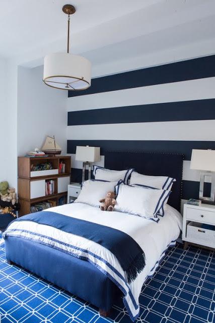
LL: I would say usually color is used as an accent in most of my projects, but that come from what will be timeless and so often they are worried they will tire of a color if it's a dominant part of the design. That being said I'm working on a wonderful project in Vero Beach where color will be front and center in each and every room, I love when a client wants to go there!
SJ: How do you feel about matching colors in a room?
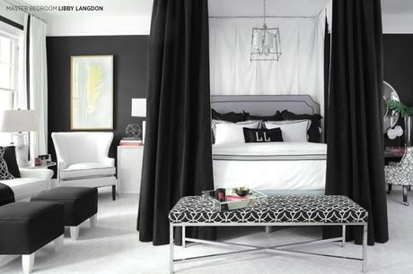
LL:I don't really feel like colors need to "match" but rather play well together. In every design I usually start with what I call a "connector" fabric, it's a multi-color print or pattern that weaves several of the colors l'll use in the space together, that becomes the springboard for the room’s palette. This helps the client see we have a roadmap and something that's guiding the design. I also know if they like the color combo in the fabric, they will love the way I work with those colors on different items, and ultimately adore the room design.
SJ: What color represents your personality?
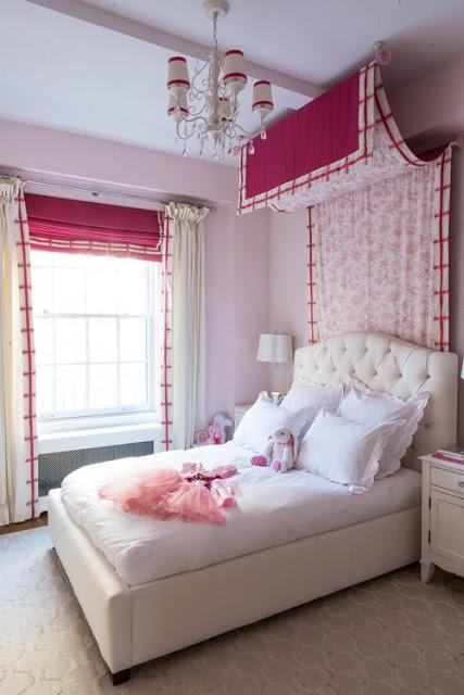
LL: I think it might be yellow, I'm a pretty perky, positive person and I'm always smiling and usually happy, sort of like human smiley face. I was once referred to as a cross between a self- help interior designer and a bubbly life coach, I like that!
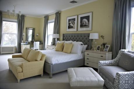
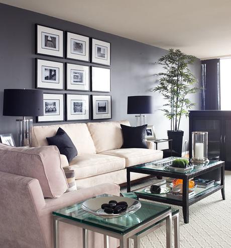
SJ: What color comes to mind when you talk about:
Your favorite City ....... Sag Harbor - blue because it's surrounded by water and the sky goes on forever.
The House You Grew Up In ......... Brown- it was a gorgeous old English Tudor house with wonderful chocolate exterior woodwork and amazing stained mahogany paneled walls throughout the interior of the house.
Last Fabulous Dinner You Had ........ Pink- I made the yummiest fresh grilled shrimp from the fresh fish stand near our house and the color of the shrimp didn't look real, it was so fresh.
Your favorite Flower ....... H
ydrangeas - the cornflower blue color makes me swoon...my Mom calls that color "Libby Blue" because she knows how much I love it.Your favorite season ...... Fall - orange, it's my husband’s and mines favorite time of the year, it's when we got married, we love the cooler temps and the romantic feel in the air. I love that back-to-school mentality, I always think it's the new year for me rather than January.
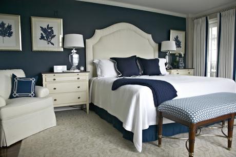
Your Favorite Art ...... L
ime green- it may not be my favorite piece of art but it's the most recent one I've bought and it's a wonderful abstract hanging over the fireplace in our master bedroom. It's got all sorts of bright colors like hot pink, bright blue and I don't normally use lime green but I'm loving it as an accent in our room right now.Your Favorite Room in Your Home ..... T
an- family room - this is where the life really happens in a house and people get to rest, relax, play games, watch movies, spend easy time together...I design so many family rooms with tan as a base neutral and I'm ok with that. Rather than thinking its uninspired I like to think of it as creating a room when people can gather and feel like they are getting a big fat hug, kind of like putting on your favorite broken in pair of khakisYour Favorite Beauty product .... W
hite - Creme De La Mer is hands down my go to skincare product, I feel like I'm doing my skin a favor when I use it!Your Favorite Article of Clothing ...... C
obalt blue - 2 years ago for Christmas my husband gave me this awesome fleece zip up Cubs sweatshirt, it was the year they won the World Series and I became a total Cubs baseball fan. It's at our house in Sag Harbor and that's where I get to wind down and relax and even if I'm working when I'm out there, that fleece is so comforting...I take deeper breaths when I wear it, now that's a fave article of clothing!SJ: Name a color you never use?
LL:
Rust and olive green...had to name two!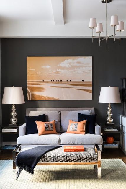
SJ: Name a color you use frequently?
LL:
Blue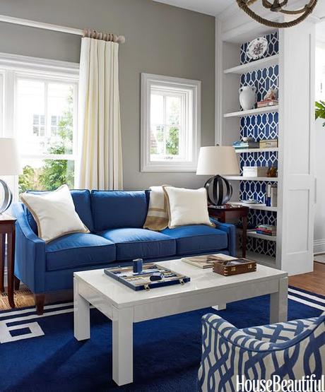
SJ: If you could pick a name for a color what would it be?
LL:
Magic Hour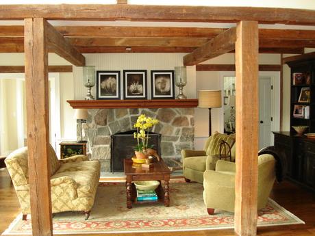
SJ: Do you have a pet? What color reminds you of him/her? Do you have a nickname for this pet?
LL:
No, still working on trying to keep our house plants alive!SJ: What is the Now Neutral?
LL:
Navy Blue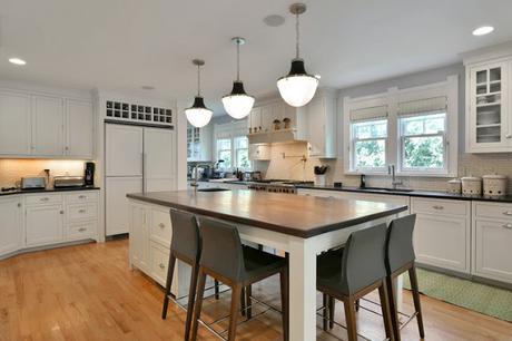
SJ: What is your prediction for the next big color trend?
LL:
Turquoise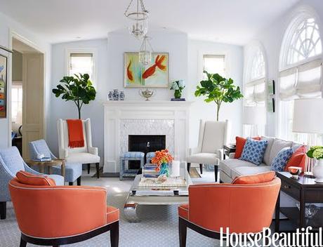
SJ: What are the best color combinations?
LL:
Red/Gold/Black - Navy/Green/White- Spa/Tan/cream- Teal/Gray/ Navy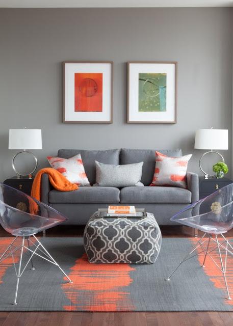
SJ: Best advice when it comes to picking paint colors?
LL:
- Choose colors with more gray undertones than you think, it may look dull on a paint chip but a super clear, bright color on a paint chip can read like a kids playroom fun house when you actually get it up on the wall. Also, don't paint a million test patches on your wall, you will never know what it looks like from that, if you're working with an interior designer trust them, they know what it looks like because they've probably used it a million times and can send you a picture of it in a room. Otherwise look at your paint color and Google if you can see what it looks like in a space or see if the paint company has a virtual tool where you can see it in a room. ________________________________________________________________