I've always had a soft spot for colors and not just colors- but the brightest of brights. Seldom do I wear an outfit that has no color. Be it through my accessories or even my lipstick, there has to be a punch of color.
As much it is easy for me to say that I adore colors, there are people who get intimidated by colors day in day out. Colors are like riddle to them- t hey don't know where to begin, what colors to pair together and so on and so forth????
If you are one of the aforementioned, then look no further- keep reading for a simple guide on how to wear more colors all year round. Use the guidelines below as baby-steps towards decoding the art of wearing colors. Worst case let the color wheel be your guide.
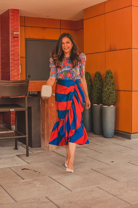
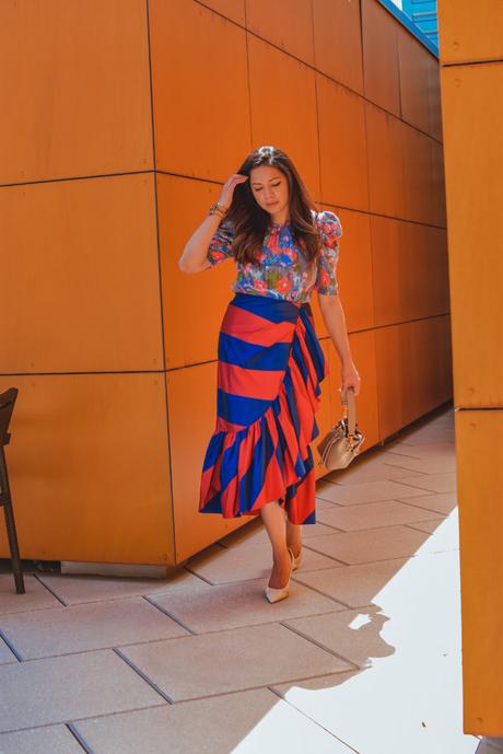
Outfit details

1) Go Monochromatic - Even a slimmest idea of which color suits can be of great help. Choose a couple of shades from the same color family and you would never go wrong. Just play around with texture to break the monotony and you are all set.
2) Add a neutral - when in doub t add a neutral. A pair of jeans in a lighter wash is a must-have and works the best. Keep your bottom as the focal point and work your outfit from bottom up. Choose brighter tops and blouses and accessorize appropriately.
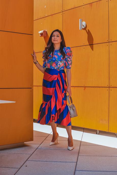
3) Play up your accessories - Adding an accessory is an effortless way to add color, especially in spring/summer. All those low cut, deep backs, backless tops and dresses definitely need some accessorizing. FYI, tassels and beads are hot this summer. So, go forth and get yourself a bright handbag or a statement necklace and add some life to your outfit.
4) Think prints - Prints are a smart way of integrating some color into your look. Pick out fun summery prints and you would have added color to your outfit- effortlessly !!!
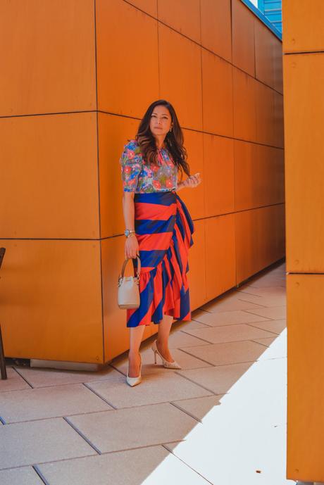
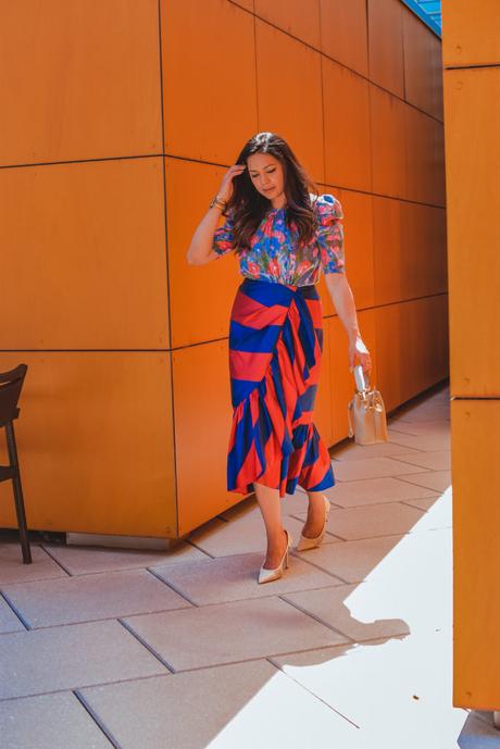
5) Add a third piece - the rule of thumb for making any outfit pop!!! A coat, jacket, a blazer or even a vest would count as the third piece. They are like add-ons, instantly taking any look up all notches.
Now that you've eased into wearing colors, it's time to talk about the timeless color combinations. Color schemes that never expire and are flattering on everyone.
I. RED AND BLUE - Red and blue look very appealing as they follow a triadic color scheme. A triadic scheme is made up of hues equally spaced around the 12-spoke color wheel. A color combination that follows this pattern always looks visually interesting.
II. BLUE AND GREEN - Blue and green follow an analogous color scheme. Colors that are next to each other on the color wheel are always great together.
III. RED AND PINK - another color combination that fall next to each other on the color wheel is RED and PINK. Hence it is always appealing.

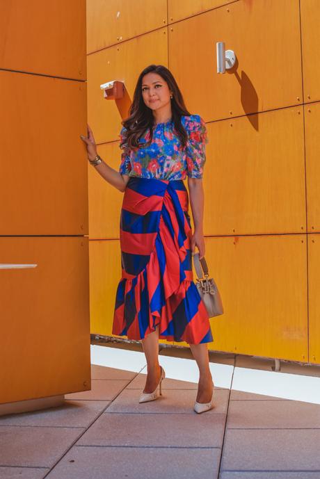
IV. PINK AND GREEN - Pink and green are complimentary colors and hence so flattering. They fall on the opposite sides of the color wheel and are therefore referred to as complimentary colors. Opposite attract and they always pair so harmoniously!
V. PURPLE AND ORANGE - Orange and purple are also analogous colors, because they are close together on the color wheel. They make quite a modern-chic color combination overall.
Which of the above color schemes is your favorite?
Get my look

JavaScript is currently disabled in this browser. Reactivate it to view this content.

