This is a mini Photoshop tutorial that contains a larger lesson: when you paint yourself into a corner, you can sometimes paint your way out of it. That’s good to know if you’re
an illustrator who sometimes makes poor color choices. Like me, for example… : (
I featured a caricature of Jennifer Aniston in a recent post. The colors of the original were so ghastly, however, that I adjusted them prior to the post. Here’s the Before and After:
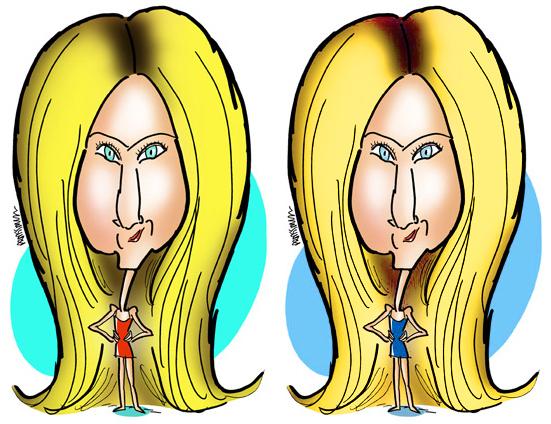
Yes, a change for the better, I think.
It was done with a single adjustment layer and a mask– one of my favorite combinations for achieving effects in Photoshop.
I began by first duplicating my Background Layer. (First rule of Photoshop: always protect your original in case disaster ensues.)
Then I selected Layer>New Adjustment Layer>Hue/Saturation. This causes two things to happen: a new layer appears in my Layers Window (below, left), and the Hue/Saturation Window displays (below, right). I’ll be using the sliders in this second window to adjust the colors.
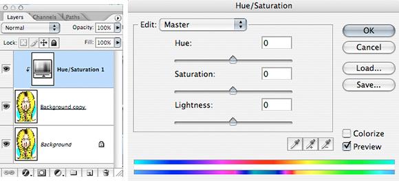
When it first pops up, the Hue/Saturation Window shows an Edit setting of “Master.” The Master setting will affect all colors.
I want to be more precise, however, so instead of using Master, I use the drop-down menu to select individual color channels, starting with the Reds.
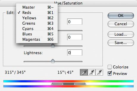
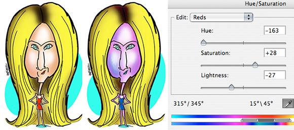
Are there any rules for using the sliders? Not that I’m aware of. I slide them right and left until I get the effect I want. As you can see below, I got decidedly mixed results.
I changed her dress from red to blue, and I also destroyed her complexion. Was I worried? Not really. Because I know I can always mask out color changes to specific areas.
Next, I adjusted the Yellows and got rid of that awful green tinge in her hair.
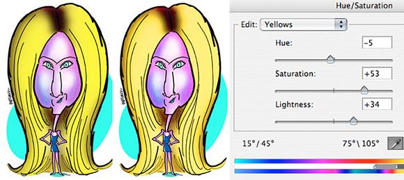
Finally, I adjusted the Cyans, changing that garish aquamarine to light blue.
At this point you may be raising your hand and saying, “But sir–! There were three other color channels: Greens, Blues, and Magentas. What about those??”
Good question, glad you asked. I did tinker with those other three channels, and got negligible results. So I left all their settings at zero. It’s surprising, but individual channels often contribute little or nothing to the colors in a photo or illustration.
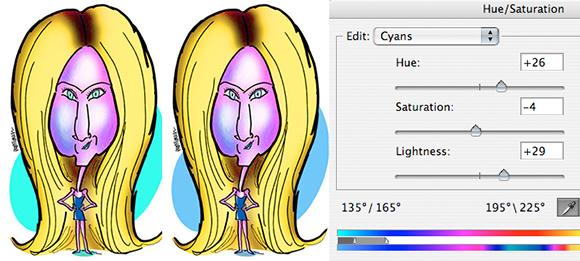
So we’ve achieved a much nicer color combination than the original red, greenish yellow, and aquamarine. All that’s left is to recover her original skin tones using a layer mask.
With my adjustment layer active, I select Layer>Layer Mask>Reveal All. The last part– Reveal All– simply means create the mask, but leave it transparent (i.e., it’s not actually masking anything yet).
Below we see the Layers Window before the mask is added (left); immediately after the transparent mask is added (middle); and what the mask looks like after we’ve applied black to the areas where we want to mask out the color change (adjustment).
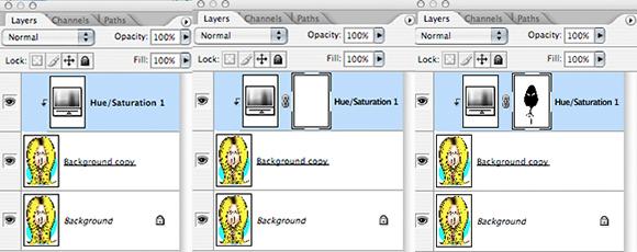
With the mask selected, I use the Pen tool to careful select those areas where I want to mask out the change and recover my original color.
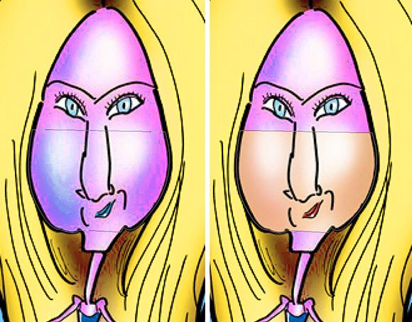
Below, you can see a portion of the face selected with the Pen tool (left), and the result (right) when that area is then filled with black. I repeat this process until I’ve masked out all unwanted portions of the color change.
Point of interest: see the “jags” in the magnified images below? That’s because I was working with a very small JPEG at 72 dpi. (I lost my 300 dpi original in a computer crash many years ago.)
What this means: you can apply a color adjustment and a mask to even small, low-quality images, and still get pretty good results. (Admittedly, this is a simple image. It would be harder to achieve good results with a complex image with many color gradations.)
Here’s the Before and After again. If you look closely, you’ll see her eye color is different.
I liked her “corrected” eye color better, and decided not to mask it out. Nice to think one can be that precise, even with a low-res image.

What do you think? Any color theory people out there? Can anyone explain why Cyans are a big factor in this illo, but not Blues?
Does a post like this boost your appreciation for non-digital artists (think of someone splashing real watercolor onto watercolor paper) who can’t change their colors by clicking on a few computer keys? (Me, I’m ready to kiss their feet.)
Hope you’ll leave a comment.

