I got the idea for this post after reading Will Mitchell’s 8 Questions Successful People Ask Themselves—That You Should, Too.
One of those questions was: What Easy Thing Are You Doing Too Much?
i.e., What are you doing just because it’s easy, when you should be working on something more productive?
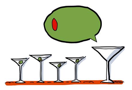
It conjured up a martini calling for an olive: boring, safe, and utterly predictable.


What I should be doing more of is researching and prospecting for clients.

Speaking of Facebook: brands have seen huge declines in organic reach in recent years. Organic reach is how many people you can reach for free on Facebook just by posting to your page (as opposed to paying Facebook, i.e., buying ads, to promote your posts).
Hubspot’s Sophia Bernazzani lists some ways to maximize your organic reach on FB, but concedes that it’s “likely only a matter of time before organic reach hits zero, so you might as well hone your paid strategy now…”

Many brands have taken the hint. According to Maddy Osman of Sprout Social,
“93% of marketers use Facebook advertising regularly, which translates to about 3 million businesses.” (Interestingly, 70% of those businesses are outside the U.S.)

Are Facebook ads basically the same as other ads?
No.

Copy Hacker’s Joanna Wiebe says that with Facebook, images matter more than copy. She cites a Consumer Acquisition study that found that images are responsible for some 75 to 90% of a Facebook ad’s performance.
She notes that with traditional print ads, the copy usually comes first– then the art. Not so with Facebook ads, where the image is the most important thing. 
Do Facebook ads actually reflect this? Are the images unique, compelling, attractive?

I had a chance to find out thanks to another HubSpot post written by Ms. Bernazzani:
13 of the Best Facebook Ad Examples That Actually Work (And Why). The post also covers Facebook ad best practices, and the associated formats and templates.
13 ads with 13 images: 10 photos, 1 illustration, 1 video, 1 animated GIF.
I found some of the images rather bland– that’s just my opinion.

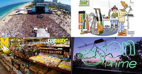
I’m going to look at 4 of the photos here, and suggest alternatives and/or improvements.
Finally I’m going to contrast 3 of the photos with the 1 illustration, and compare their visual impact.

Here’s the first ad:


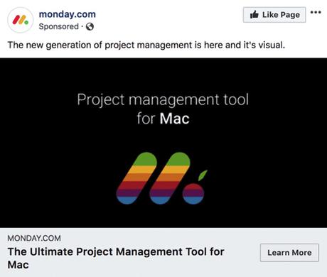


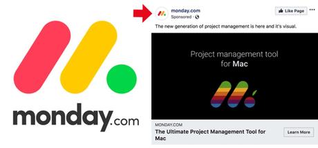
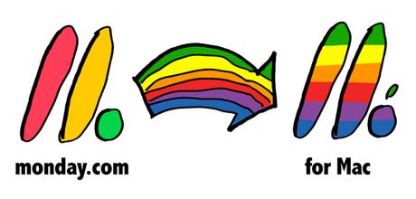
I’d never heard of Monday, and I’d never seen their logo. Here’s what it looks like:






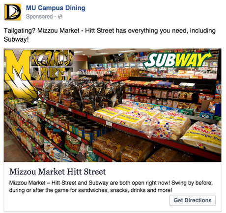


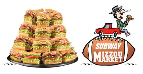
My suggestion: use a photo, but restrict it to a single food item on a white background. Something “snack-ish.” Add a spot illo for entertainment value, and to show someone eating, sitting on a tailgate. A football provides context, and a plain backdrop to help the business names stand out. Like so:




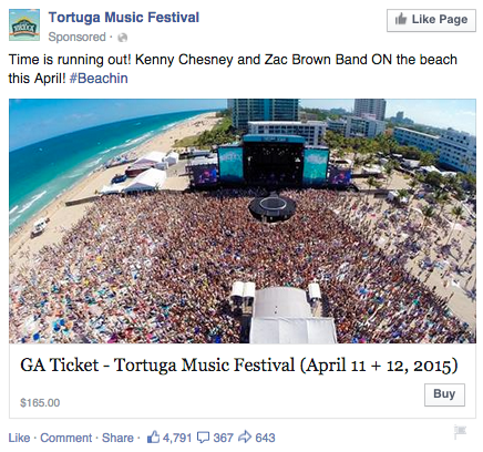


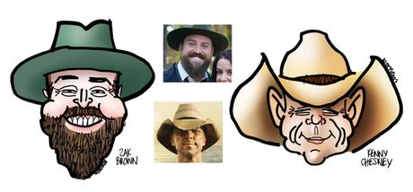
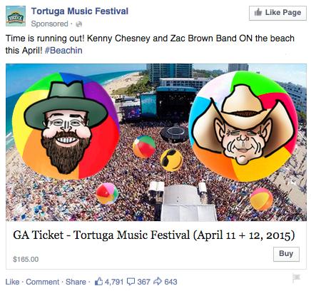
My suggestion: Add the two faces in a way that retains the energy and power of the photo. Caricatures would add a fun element, adding beach balls would help them blend in.






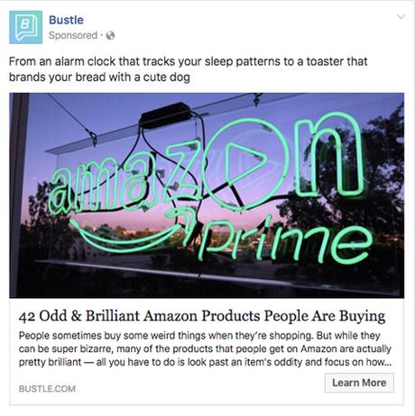

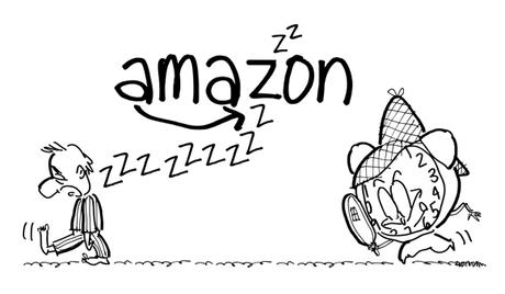
My suggestion: Have some fun with that to pique people’s interest. A cartoon illustration would be a great fit, and you could include the Amazon logo as well. Here’s a quick B&W sketch idea:


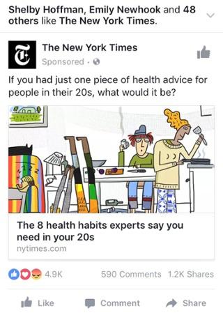

at Millennials. Bright colors, lots of white space. It’s a good example of how an illustration can grab your attention. It’s more eye-friendly than the photos.


