Young House Love
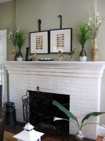
The first guideline I will talk about is symmetrical decor. Symmetrical means that if you were to fold this photo in half, each side would be nearly identical. This is the easiest way, in my opinion, because it doesn't require as much planning as other designs would. In the photo above you can see that the focal point of the fireplace are the two framed prints hanging side by side in the center of the wall. On either side are two vases holding foliage, both arrangements are the same on either side. The little wooden bird statues are balanced out on either side, one side has two birds and the other side has one bird and the letter "L". Although either side in this case is not exactly the same, they are balanced symmetrically.
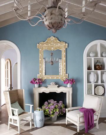
Here is another beautiful example of symmetrical mantel decor. What makes this space interesting is that although the fireplace mantel decor is perfectly symmetrical, the chairs in front of the fireplace are not. The chair to the right has more visual weight because of the cushions, but the chair to the left balances the look when combined with the little pillow and ceramic stool. Lovely!
Unknown source-Email me if yours!
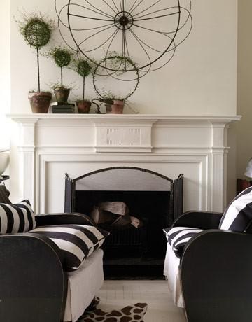
The next guideline is asymmetrical decor. In this design, the piece in the center of the wall creates a focal point and is accessorized with the potted topiaries to the left. Since there are no items on the right side of the mantel, this decor is considered asymmetrical. When creating this type of design, make sure that your furniture in front of the fireplace is arranged symmetrically, like the chairs in the photo, so that the look will appear balanced.
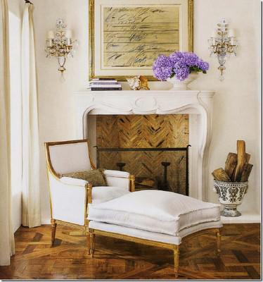
Another example of asymmetry. The items decorating the mantel itself are arranged asymmetrically, but the sconces on either side of the fireplace balance out this look. This photo is one of my favorites! The decor is very elegant and I love the pop of purple that the flowers add.
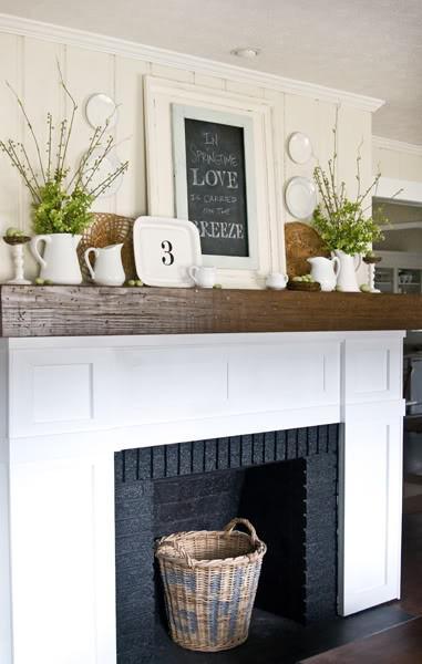
The Lettered Cottage
This next look is not necessarily a guideline, but I'm loving the layered look! This mantel is a good example of how to layer your decor without it looking cluttered. Although there are many items decorating this space, the look is balanced out by the foliage in pitchers on each side and the plates hanging on the wall. Layla from The Lettered Cottage created this look herself with thrift store finds and a little DIY work. The pitchers were all different colors so she spray painted them all white for this beautiful cohesive look. Genius! When creating this look, make sure that your decor items are balanced. They don't have to be an exact pair, like the pitchers and rattan plates above, but it's best if they are similar in color and size. For more info on how to create the look you see here, head over to The Lettered Cottage.
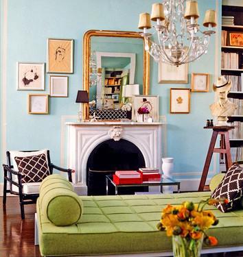
I love this layered look! The frames on either side of the mantel not only make a lovely focal point of the fireplace, but they also balance out the look of the mantel decor.
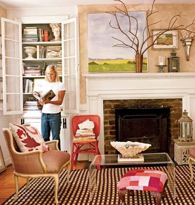
Instead of a frame or mirror being the center focal point of the fireplace, the potted branches are the centerpiece here! The layered look is balanced by the four items on the right and by the painting on the left. Beautiful and original!
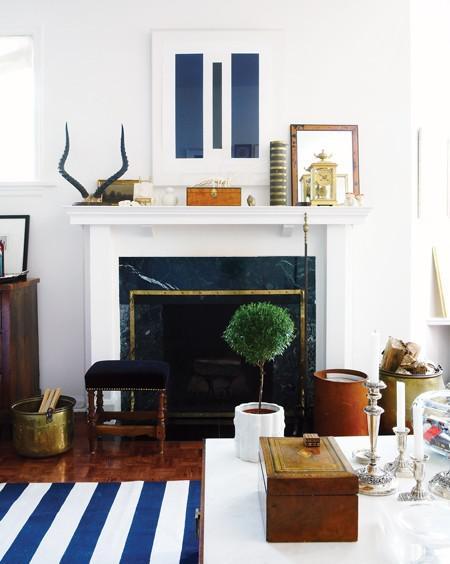
House and Home
When creating this layered look, think of arranging your decor in the shape of a triangle. There should be one tall centerpiece in the middle, and two smaller pieces on either side that are similar in size to each other. Here we see that carried out by the tall print in the middle, the horns on the left and the frame on the right. Notice that the height of the horns and the frame on the right are the same. Fill in the open space with even smaller items and your look is complete!
These guidelines are only here to get you started or to help you along the way. If you are lucky enough to have a fireplace in your home, decorate it in a way that works for you and makes you happy. :)
Have a Great Weekend!
-Forever Lovely
