TAKEAWAY: The waiting is over for readers of the Gulf News (UAE) who have been anticipating the switch from broadsheet to Berliner format. Starting today, the Gulf News is more compact, easier to read and wears a new design, too!
This is the weekend edition of TheMarioBlog and will be updated as needed. The next new blog post is Monday, June 4.
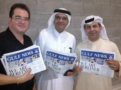
A happy trio with fresh copy of the first Gulf News as Berliner: (from left) Miguel Gomez, design director; Abdul Hamid Ahmad, editor in chief;Mohammad Al Mezel, managing editor
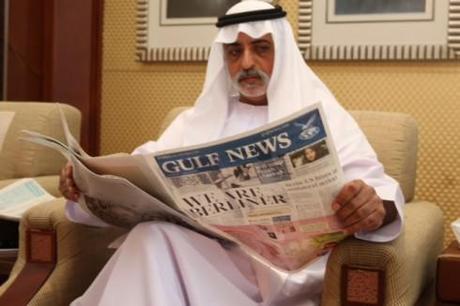
His Highness Sheikh Nahyan , United Arab Emirates Minister of Higher Education and Scientific Research, reads the new Gulf News today
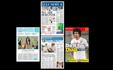
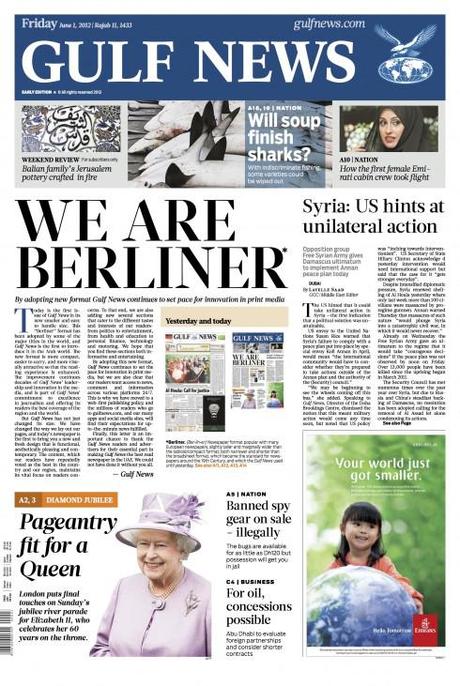
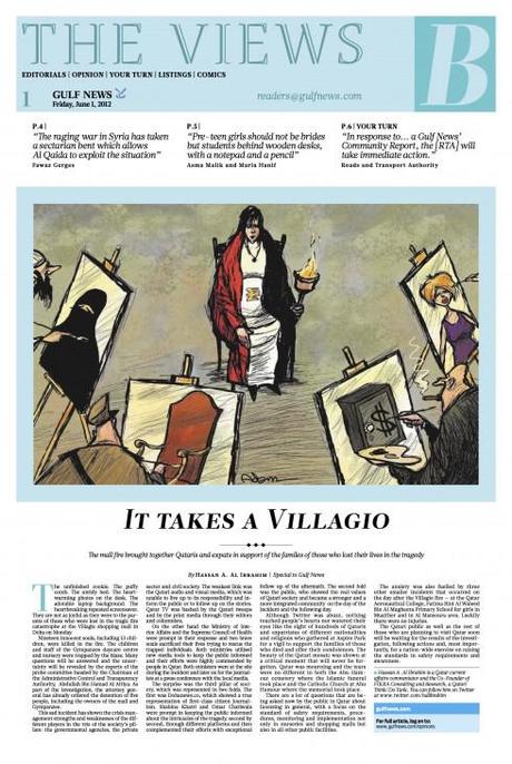
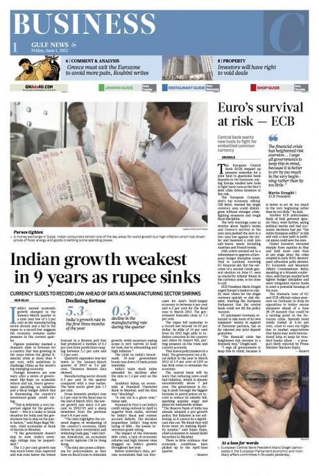
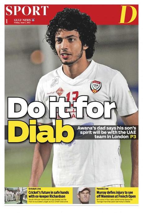
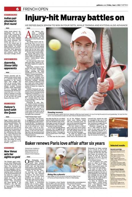
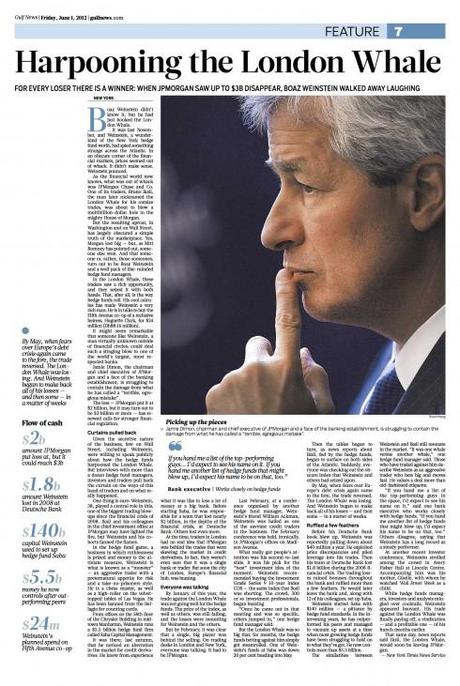
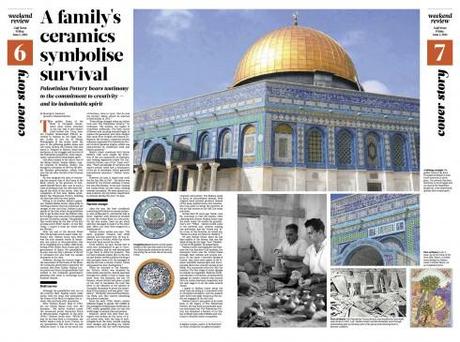
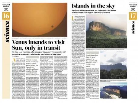
It is June 1 and a historic day for the
http://www.gulfnews.com
http://www.gulfnews.com” title=“Gulf News”>Gulf Newsof Dubai: it launches its new Berliner format and look today, becoming the first daily newspaper in the Middle East to adopt the smaller, easier to carry size.
Newspapers around the world have made the move to Berliner in the past few years.
For broadsheet format newspapers, it is the logical evolution if they wish to become mor economical, cater to the readers’ preferences for more compact printed products and still maintain the sectionalizing that is so popular with users.
We at Garcia Media are proud to have been invited to participate in the rethinking of the Gulf News as it moved into this new format. More than the size of the pages has changed, however; the Berliner project has given the Gulf News team an opportunity to evaluate every aspect of the newspaper—-from content flow, to headline writing, to editing of stories, to display of photos and graphics, and, of course, the overall design of the newspaper.
Benefits of the Berliner format
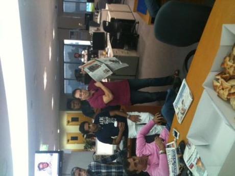
Design director Miguel Gomez conducts a critique of the first Berliner edition for the newsroom
It is a smaller canvas in which to present the information and this presents special challenges and opportunities:
Readers will probably not fold their newspaper as they read, giving designers better opportunities for double page spreads.
Advertisers will benefit from a “cozier” positioning of ads in terms of how they appear next to editorial content.
Readers will see more one-page topics that facilitate reading a story from beginning to end
At a time when people consume their news through various platforms, the smaller pages will be more synchronized with what happens visually online, the phone and the tablet.
The design changes
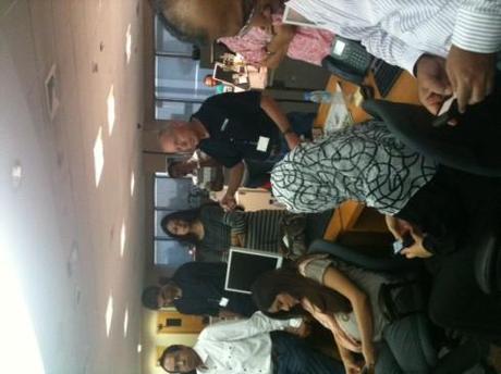
J Ford Huffman, formerly of USA Today, conducts critique in the newsroom. J Ford has come to the Gulf News for two weeks to work with the editors on content/writing/editing strategies
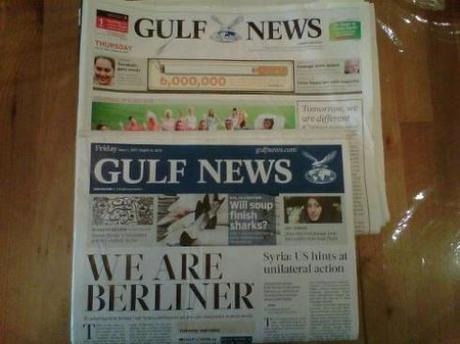
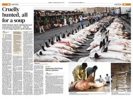
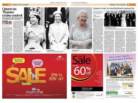
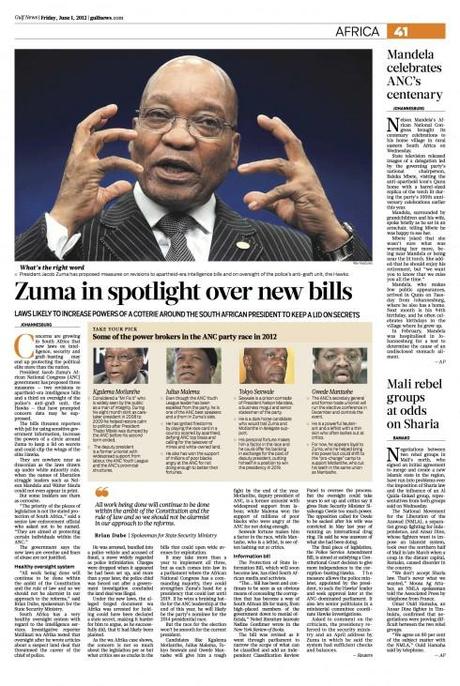
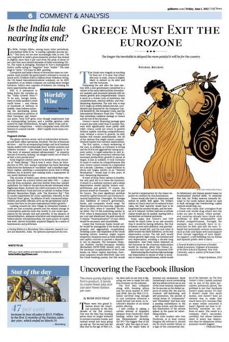
Compare the old broadsheet Gulf News and its new, leaner Berliner format
A change from broadsheet to Berliner must be accompanied by some necessary changes in the design as well, starting with the grid. At the Gulf News, we worked closely with the talented team of design director Miguel Angel Gomez to guarantee that the new, fresh format will unveil changes in the design:
Typographically —-The new fonts adopted are: Glosa and Salvo Sans.
Glosa will be the main typeface of the Gulf News, was designed especially for publications. It is elegant, modern and delicate. It was created by the Portuguese type designer Dino dos Santos, who worked with Miguel and his team to produce various styles exclusive to Gulf News.
Salvo Sans,a highly expressive and friendly typeface with many styles—from light to black and from regular to extra condensed— is used throughout used the paper. Designed by the Font Bureau’s Cyrus Highsmith for magazines, the Gulf News emphasizes Salvo Sans in the Sport and tabloid! section. But it is also a distinctive element of the weekend edition’s identity.
For the text of the Classified section, we selected Retina, designed by Tobias Frere-Jones for the stock pages of The Wall Street Journal. Retina is recognized worldwide for its superb legibility at very small sizes.
The grid —A six column grid prevails throughout, with variations for specific pages within the design.
The color palette —-The new Gulf News is color coordinated. But it also offers surprises for the readers. For example, the logo of the newspaper is NOT in one specific color, but may vary from day to day, covering some six different hues. Each of the sections will have its own identifying color.
According to Abdul Hamid Ahmad, editor in chief of Gulf News, early reactions are positive: “Everyone happy and proud,“ he said.

