Next up on my Gray's degree show tour was Design for Digital Media and Communication Design. I really enjoyed the variety of work on display in this section and was captured by the interesting details on show. It was great to see so many different ways in which illustration can be used. Some of my favourites included....
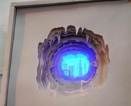
Ben Dexter
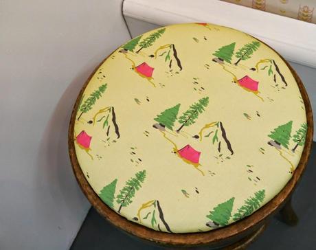
Emma Keir
I love it when people use light boxes in their displays and Ben Dexter's use of them was particularly magical. Mixed with layers of paper cuts the lighting really drew me into these tiny worlds. Ben's focus was all about creating an interactive story and his display really helped to show this.
The print on this little stool by Emma Keir is just perfect. I loved the colours, especially the little pink tent. It almost makes me want to go camping, almost. Designed for the YCN Student Awards with Cath Kidson in mind, this print definitely captures the brands recognisable aesthetic.
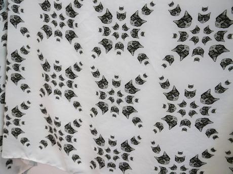
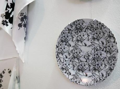
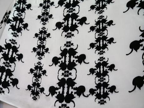
Winnie Shek
There is one sure fire way to my heart and that is with cats. So Winnie Shek's prints were complete winners in my eyes. I loved the simple black and white mixed with lots of different interpretations of cat designs. From silhouettes, to illustrated, to more photographic kitties, I loved them all.
Can I also say how much I enjoyed each students information boards in this section. It may be a blogger thing, but having contact info, web address and a bit about the work in one easy to see place is so helpful!
Catch up with my first Grays post here and watch out for more coming soon.
