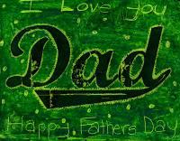
 This scratch art project was a huge hit. Also a mess, but so worth it when I heard students say “this is so cool!”1. I foundthe perfect Dad font called “Marcelle Script” and “Swashes” at www.stereo-type.net. I printed “Dad” with a swash on letter size paper, and made copies to 9" x 12" drawing paper.
2. I handed out all my odds and ends of oil pastels, and instructed kids to heavily color the entire paper with first a bright color (such as yellow or orange) and then a dark color (such as blue or purple). Note: Even the black letters are colored over. Only after two layers are complete do they take a wooden stylus and scratch lines to their liking. To get the best results, they should test combinations on another paper before they begin. Not all combinations create a lot of contrast, which is needed for the scratches to have impact. Also, the only oil pastels I do this with are the Portfolio® brand found at Staples and art stores like Dick Blick. They have the soft slippery quality needed for the scratches to work. This sample was made with green pastel over bright yellow.
