 Facebook redesign features after almost one year that the company initially announced a major overhaul and redesign of its website.
The social media giant has now gone back to basics with latest News Feed redesign.
Facebook spent months refining its new design, which touted huge photos, a dynamic navigation bar, and Tumblr-esque profile photos.
The company rolled out its new design to a fraction of its billion users, and then called the whole thing off. Users hated the new design. So for its next News Feed, Facebook went back to square one.
The social network is unveiling its latest design for News Feed, which takes learnings from its failed trial and applies them to a familiar but fresh design that it plans to roll out globally over the next few weeks.
Facebook Redesign, News Feed & Fonts
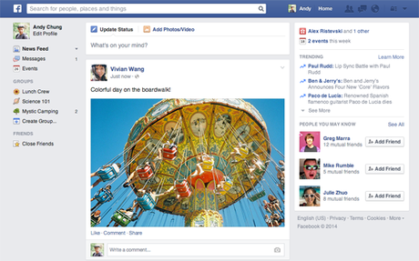
The new look includes font changes and more prominent photos that span the entire news feed, but the overall look is more subtle than the changes Facebook promised a year ago when it first announced the redesign.
The new News Feed looks almost exactly like Facebook’s mobile News Feed, bearing new iconography, bigger photos, new fonts (Helvetica and Arial), and story cards.
The design ditches the prominent drop-down menu of feeds Facebook championed in its designs last March, and sticks them back in the left sidebar.

In other words, Facebook’s dreams about turning your News Feed into a newspaper of RSS-like feeds are officially over. News feeds like “All Friends,” “Groups,” and “Photos” have been removed entirely.
“People who tested it told us that they liked the bigger photos and images, but found it more difficult to navigate Facebook overall,” wrote Facebook on Thursday, explaining why the redesign was never rolled out to all users. Now, Facebook has unveiled a new look.
Facebook Redesign: What Will Change?
The desktop version of the site will appear less cluttered, in an effort to look more like the mobile site. The biggest difference is the photos – they will now span the entire width of the News Feed.
The site will also feature a new font and darker background. In the left-hand column, users will notice a lot less clutter, with categories like “Photos” and “Browse” getting the boot. Time-stamps will move from the bottom of posts to under the user or page name.
What Will Stay The Same
Pretty much everything else! The algorithm that determines what you see in your News Feed is not changing. The mobile site looks the same. Overall, this is not a drastic overhaul.

